standardize print collateral
Want to win a job like this?
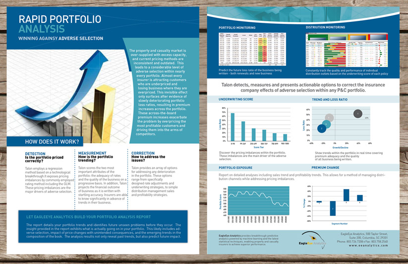
This customer received 40 brochure designs from 7 designers. They chose this brochure design from san011 as the winning design.
Join for free Find Design Jobs- Guaranteed
-
 US$610
-
 40 designs
-
 7 designers
Brochure Design Brief
we need help standardizing all print collateral and website. top priorities:
1. standardized case studies template
2. standardized marketing slicks template
3. standardized powerpoint template
Updates
Project Deadline Extended
Reason: We are extending the project to allow current design submissions to be tweaked while providing the opportunity for new designs to be submitted.
We will need all 3 collateral designs submitted to make a final decision. Please note, these 3 designs should all look different, needless to say they should all compliment eachother.
As for some direction, the powerpoint main color should not be yellow since yellow does not show up the same shade on any screen. The case study and marketing slicks will be printed and often sit next to our competitors marketing material - think high end product, technology, revolutionary, edgy, professional. The designs should compliment eachother and feel like the EagleEye Analytics brand (which you are determining) and should stand out professionally. We are open to introducing new colors into our brand, the only thing that must remain the same is our logo. Have fun, make it edgy, and keep it professional. Looking forward to seeing what you submit!
Added Monday, January 23, 2012
Target Market(s)
Property Casualty Insurance Companies: Executive level wording with actuarial credibility
Industry/Entity Type
Marketing
Look and feel
Each slider illustrates characteristics of the customer's brand and the style your logo design should communicate.
Elegant
Bold
Playful
Serious
Traditional
Modern
Personable
Professional
Feminine
Masculine
Colorful
Conservative
Economical
Upmarket
Requirements
Must have
- professional layout for existing collateral and 2-page marketing slicks. style guide/colors can be transferred to powerpoint. logo must stay; everything else (i.e. color, font, layout/structure etc.) is flexible. The three components should not looks the same, they should only compliment eachother.
Nice to have
- we are revolutionizing a conservative industry, so adequate level of edgy/advanced technology/impactful feel to layout
Should not have
- no need to stay within color constraints of yellow, but need to appropriately work well with the eagle head logo