People should come with a user's guide because they're messy!
Want to win a job like this?
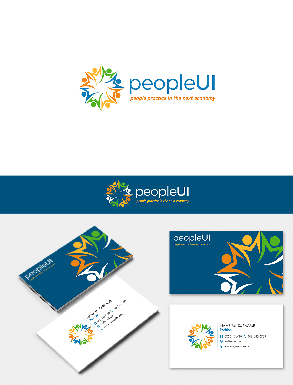
This customer received 66 logo designs from 28 designers. They chose this logo design from nivleik as the winning design.
Join for free Find Design Jobs- Guaranteed
-
 US$150
-
 66 designs
-
 28 designers
Logo Design Brief
I need a logo that is professional, modern, and clean. I would love for it to somehow depict interaction between people in the context of relationships in the work place without becoming to cartoon-like. People practice (human resource management) is about understand your relationships with the people who are most important to you (i.e., consumers and employees).
Target Market(s)
Company leaders and executives and human resources professionals who need assistance with sticky employee relations issues (e.g., harassment, grievance) or need an external third party for background checks, reviews, and adjudication.
Industry/Entity Type
It Professional
Logo Text
PRIMARY TEXT: PeopleUI SUB TEXT: people practice in the next economy
Logo styles of interest
Emblem Logo
Logo enclosed in a shape
Pictorial/Combination Logo
A real-world object (optional text)
Abstract Logo
Conceptual / symbolic (optional text)
Wordmark Logo
Word or name based logo (text only)
Lettermark Logo
Acronym or letter based logo (text only)
Font styles to use
Other font styles liked:
- Designer discretion: modern, not traditional
Colors
Colors selected by the customer to be used in the logo design:
Look and feel
Each slider illustrates characteristics of the customer's brand and the style your logo design should communicate.
Elegant
Bold
Playful
Serious
Traditional
Modern
Personable
Professional
Feminine
Masculine
Colorful
Conservative
Economical
Upmarket
Requirements
Must have
- 1. a catchy logo (icon)
- 2. the logo must be on the left or right of the text and subtext (see the attachment)
Nice to have
- 1. it would be very cool to have some depiction of a person-to-person connection across some technology type mechanism. I've tried to give some ideas in the attachment.
Should not have
- No screen bean-type figures.
- I like any of the logo styles EXCEPT the character logo.