Logo needed for the San Francisco Eye Institute
Want to win a job like this?
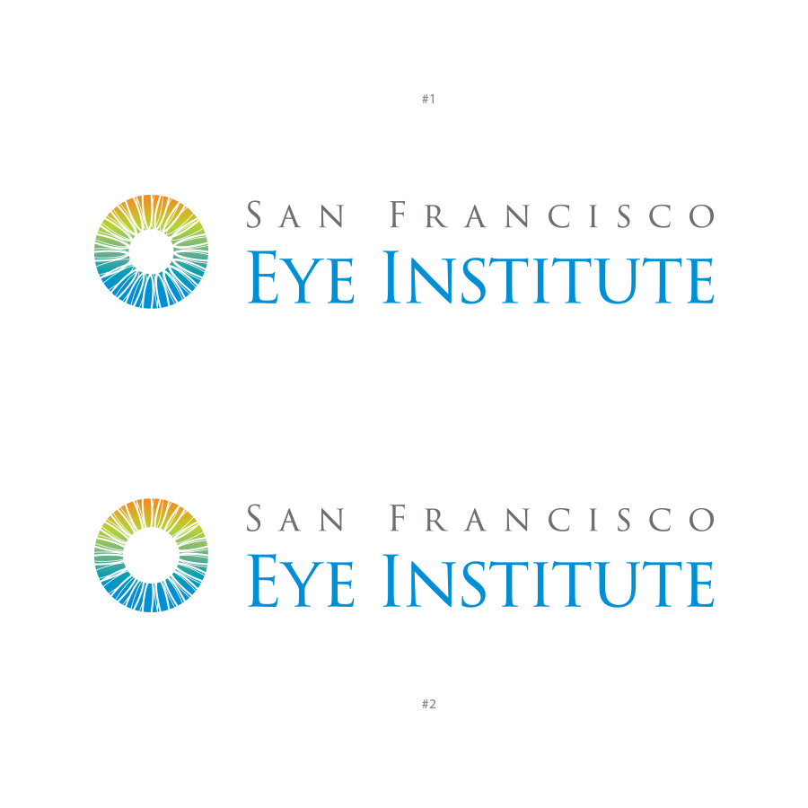
This customer received 209 logo designs from 52 designers. They chose this logo design from Brando ST as the winning design.
Join for free Find Design Jobs- Guaranteed
- Bundled Project 3
-
 US$270
-
 209 designs
-
 52 designers
Logo Design Brief
The San Francisco Eye Institute provides ophthalmology and optometry services to patients and it is based in, not surprising, San Francisco. The url for the site is:
http://sfeyeinstitute.com (it does redirect to drmargaretliu.com)
We would like the style of the logo and the site design to be modern, clean and not too complex. It should also convey that we provide state-of-the-art services/procedures to help patients with vision or eye problems.
Updates
Project Deadline Extended Reason: The project has been upgraded and I would like to give time to current and new designers a chance to make their edits and make new submissions. Added Thursday, August 31, 2017
Thank you for all your submissions so far. It's been really exciting seeing all the creativity in the designs. We just wanted to say that many of the eyes are reminiscent of the one that are usually drawn with the Egyptian pyramids which has a sinister appeal. We'd prefer the eye and the bridge be more abstract and friendly looking. Thank you. Added Thursday, August 31, 2017
Target Market(s)
Patients with medical issues related to the eyes or patients that have vision correction needs.
Industry/Entity Type
Medical
Logo Text
San Francisco Eye Institute
Number of Pages Required
1 page
Logo styles of interest
Character Logo
Logo with illustration or character
Font styles to use
Look and feel
Each slider illustrates characteristics of the customer's brand and the style your logo design should communicate.
Elegant
Bold
Playful
Serious
Traditional
Modern
Personable
Professional
Feminine
Masculine
Colorful
Conservative
Economical
Upmarket
Requirements
Must have
- Emphasis should be on "Eye Institute" rather than "San Francisco" and the text accompanying the logo should reflect this.
- Would like the graphic left of the text. The first line of text "San Francisco" should be the same width as the second line "Eye Institute" and "Eye Institute" should stand out a little more.
Nice to have
- It would be nice to see something that is iconic of San Francisco such as the Golden Gate Bridge.
- It would be nice to see an abstract version of an eye as the sun.
Should not have
- We cannot use SFEI in the logo since the acronym is already used.
- Please don't use the eye that usually accompanies the Egyptian pyramids. They have a certain appeal that we are not looking for.
Files
Payments
Total
US$270
Project Deadline
08 Sep 2017 15:32:40 UTCProject Upgrades
Bundled project(s)
- offering US$109 web design to winner
- offering US$49 stationery design to winner
- offering US$39 business card design to winner