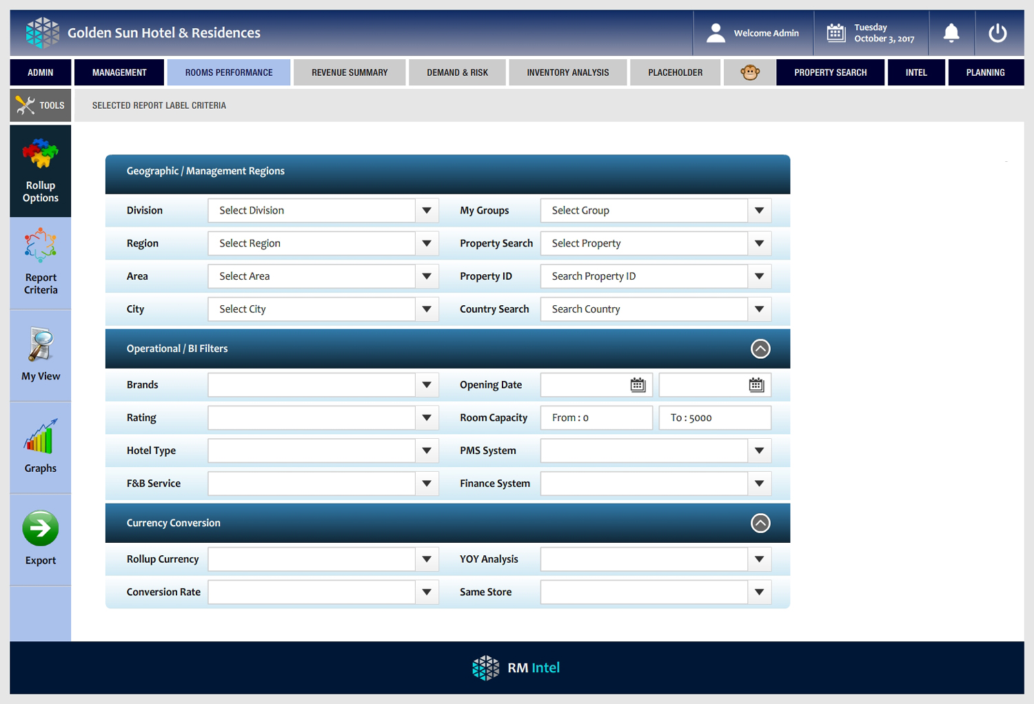
Business Intelligence Application - Reporting Menu and Report Criteria Design

Want to win a job like this?
This customer received 69 web designs from 6 designers. They chose this web design from -Marc- as the winning design.
Join for free Find Design Jobs- Guaranteed
Web Design Brief
Looking for a fresh, effective and user friendly view for the menu structure and reporting criteria screen format for a business reporting application. Initial format completed, content structure is in place, but we need the 'wow' design.. as its a serious professional report/BI tool it has to fall within certain guidelines for clarity and graphics..but we want it to be slick, friendly, great user experience. There is a large amount of complex content to fit into a small space and we need it to be very inviting, modern and intuitive.. If interested, please review the attachment. We have live screens in operation, but feel these could be improved and looking forward to seeing what great creative suggestions could be made. Please review work done to date in the attached.. We are not looking for a total re-design of everything, all the basic business content/structure is there.. but tell us what we could do to improve this in terms of graphic design... particularly the criteria screens.. thanks!
Updates
Project Deadline Extended
Reason: Need a few more days to review designs - thanks for all submissions so far, we will make a selection shortly.
Added Saturday, October 14, 2017
Target Market(s)
Business analysts, hotel operations teams, finance analysts hospitality industry
Industry/Entity Type
Hospitality
Coding
Coded - Design and coding required
Number of Pages Required
4 page
Font styles to use
Other font styles liked:
- Candara, please see example in deck
Colors
Colors selected by the customer to be used in the logo design:
Look and feel
Each slider illustrates characteristics of the customer's brand and the style your logo design should communicate.
Elegant
Bold
Playful
Serious
Traditional
Modern
Personable
Professional
Feminine
Masculine
Colorful
Conservative
Economical
Upmarket
Requirements
Must have
- sharp clear, logical menu structure, (currently it has 'clicks to sub-menus, we need hover over, slide to sub-menus..) colour, styling.. and most focus on revision of criteria.. right now is somewhat heavy, cumbersome.. keep colour and friendly intuitive process steps.. its heavy analytical stuff.. best of luck!
Should not have
- No grey fonts on white or grey screens! many business apps are not readable or sharp.. or fonts are too small.. colourless, so please avoid that.. see our deck - sharp dark (navy) or black fonts on white, or light shading..