Logo Design for Online Course
Want to win a job like this?
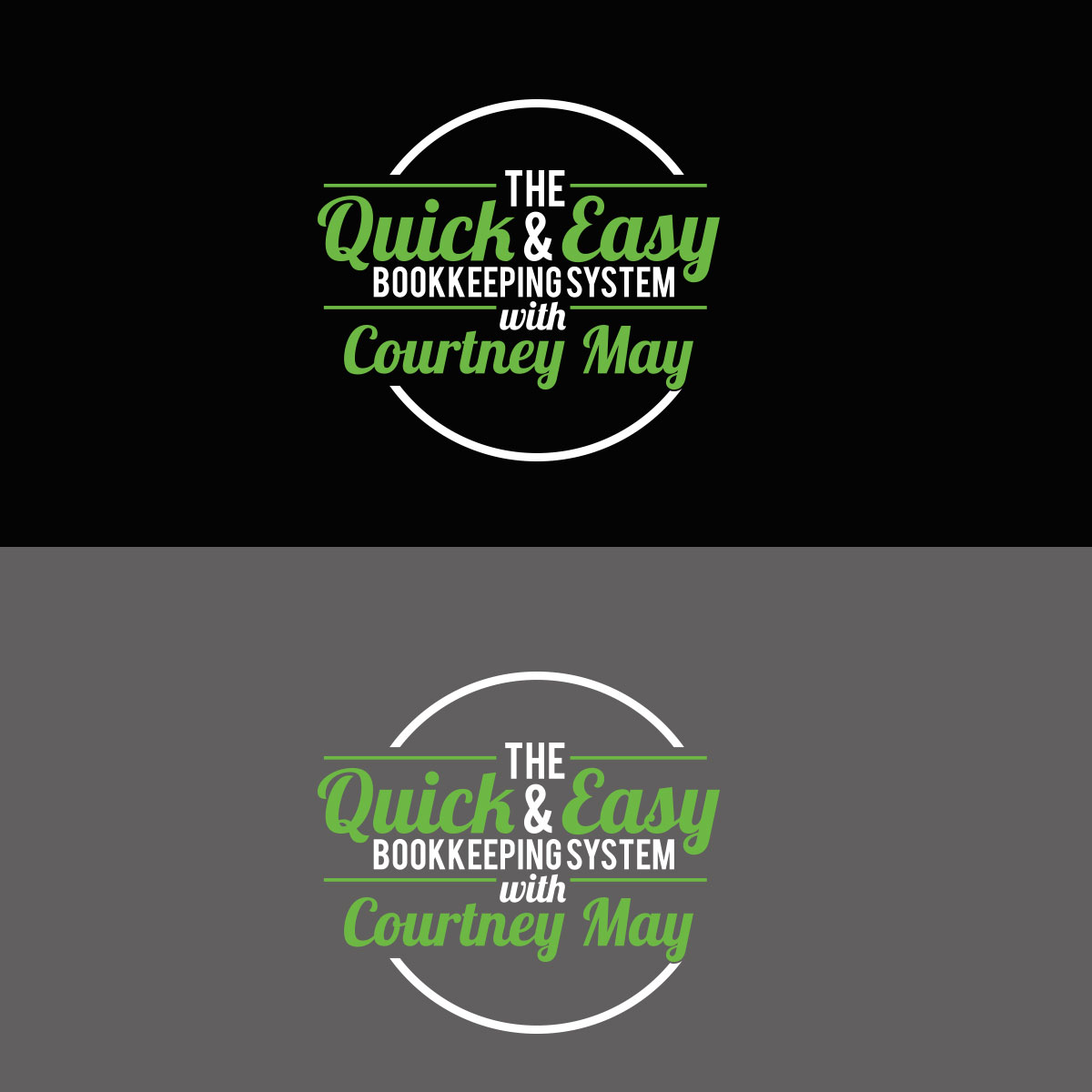
This customer received 109 logo designs from 41 designers. They chose this logo design from :) as the winning design.
Join for free Find Design Jobs-
 US$150
-
 109 designs
-
 41 designers
Logo Design Brief
I need a logo for an online course I created. The course is called "The Quick & Easy Bookkeeping System with Courtney May". I have attached a logo that I like from another course that implements the instructor's name. I like this logo a lot and I would like to use the same mixture of fonts that this designer used. Obviously I do not want to copy this logo exactly but I like the way it pops off the page, is very dynamic and strong. Since I am a QuickBooks ProAdvisor I use the QuickBooks green in my logo for my business and I would like to implement this same shade of green where you see red in the other logo I attached. I would like to see the wording as white and also maybe another color that would accent the QuickBooks green (maybe black). Please give me options on the coloring. You can see the QuickBooks logo and color at this website: https://quickbooks.intuit.com/ .
Updates
Project Deadline Extended
Reason: I need more time to decide. Thank you for your efforts.
Courtney
Added Thursday, November 2, 2017
Target Market(s)
Business owners/entrepreneurs looking for an easy to follow bookkeeping system.
Industry/Entity Type
Online
Logo Text
The Quick & Easy Bookkeeping System with Courtney May
Font styles to use
Other font styles liked:
- I like the combination of fonts or something similar to the logo I attached for "Courses That Convert"
Colors
Designer to choose colors to be used in the design.
Look and feel
Each slider illustrates characteristics of the customer's brand and the style your logo design should communicate.
Elegant
Bold
Playful
Serious
Traditional
Modern
Personable
Professional
Feminine
Masculine
Colorful
Conservative
Economical
Upmarket
Requirements
Must have
- All the words in the "Logo Text". The word "The" can be smaller. Please see the logo for "Courses That Convert" that I attached as a great example.
Should not have
- I would think with so many words in the logo that it would be better not to have too many graphics. I will let you make that call.