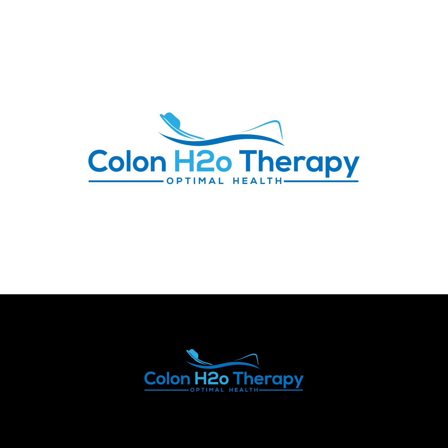
A Modern and funky , yet professional logo for my Colon Hydrotherapy business

Want to win a job like this?
This customer received 232 logo designs from 50 designers. They chose this logo design from DesignDUO as the winning design.
Join for free Find Design Jobs- Guaranteed
Logo Design Brief
Primarily the business is about achieving “optimal health” and the service that we offer to obtain this is Colon Hydrotherapy Sessions . This provides our clients with a natural and effective "kick start" on their journey to optimum health by releasing as much toxicity in their bodies to allow the body to function at its best and have more energy and vitality. We also offer supplements to support ongoing maintenance of their gut health. We offer support by providing guidance around food and exercise ensuring that they give their body what it needs to THRIVE. Our clients will be very health conscious and value their health. They understand that health is very important and they will have it as a high priority. They would be high income earners on $80,000+ per annum and will have no problem paying for this service on an ongoing basis to maintain optimal health. They understand it’s never too late to look after their health so the age groups will vary from late 20's to 60's with the majority being 30's to 50's years of age. They are open minded and see these sessions as a "must have".
Colon Hydrotherapy has been around for a long time but not a lot of people are aware of it. I want to change that. Most Colon Hydrotherapy clinics have an outdated name and feel to them.
We are a new business and I would like our name "Colon H2oTherapy" or
"COLON H2O THERAPY" to have a logo that conveys a fun and modern feel and still have a professional vibe to it as well. It gives you the feel that it’s a business that is solid, trustworthy and will be around for a long time. Not too clinical but clean. Use bright colors that convey trust, freshness and strength. I think blue would be one of the colors. Id like to see some creativeness with the H2O part of the name, being that the flow of water is a big part of the sessions.
The logo design will be used for
- Website Page
- Media
- Email Signature
- Business Cards
-T-Shirt (Print or Embroidary)
- Banners/Posters/Billboards
I will need it in all formats including PDF, Jpeg, png, vector
and high resolution.
Updates
Project Deadline Extended Reason: Currently overseas and have limited access to internet for next 4 days so will need an extension to make final decision.Thank you Added Tuesday, October 24, 2017
Target Market(s)
Health Conscious , Fitness fanatics, Athletes, Body builders , Crossfitters, etc, Corporates , people that would too look and feel good long term. They are aged 25-60's , good incomes and put their health first. They are both male and female (predominantly females) who want to feel good and look younger and can afford it.
Industry/Entity Type
Health And Wellness
Logo Text
Colon H2o Therapy
Logo styles of interest
Pictorial/Combination Logo
A real-world object (optional text)
Abstract Logo
Conceptual / symbolic (optional text)
Font styles to use
Colors
Designer to choose colors to be used in the design.
Look and feel
Each slider illustrates characteristics of the customer's brand and the style your logo design should communicate.
Elegant
Bold
Playful
Serious
Traditional
Modern
Personable
Professional
Feminine
Masculine
Colorful
Conservative
Economical
Upmarket
Requirements
Must have
- The colours must be fresh and bold but no too masculine or feminine.
- I want the colours to purvey trust and strength, yet they need to be inviting and approachable. I'd like the writing to also be bold but neither masculine or too feminine. The writing must be easy to read. The logo must look fresh and quirky so it comes across as modern and eye-catching and to some extent peaks someone's curiosity if they don't know what it is but are inclined to find out because of the way it comes across. So I'd like to see some creativity with the words and how they are positioned ( namely the h20 ) remembering that the h20 is there because the Colon Hydrotherapy works with water, so I've replaced the Hydro with H2o. I want the end result to be fresh and dynamic yet still refined enough to look professional as well.
Nice to have
- Creativity around using the h20 in a creative way between Colon and Therapy, May be the "o" being a water drop symbol etc or something similar to work around the concept of water and cleansing.
- I think that blues would be a good colour bit will leave that to the designer
Should not have
- Dark colours
- Too masculine
- Too Feminine
- Too gimmicky