Roofing Product Needs a Logo Refresh and Redesign
Want to win a job like this?
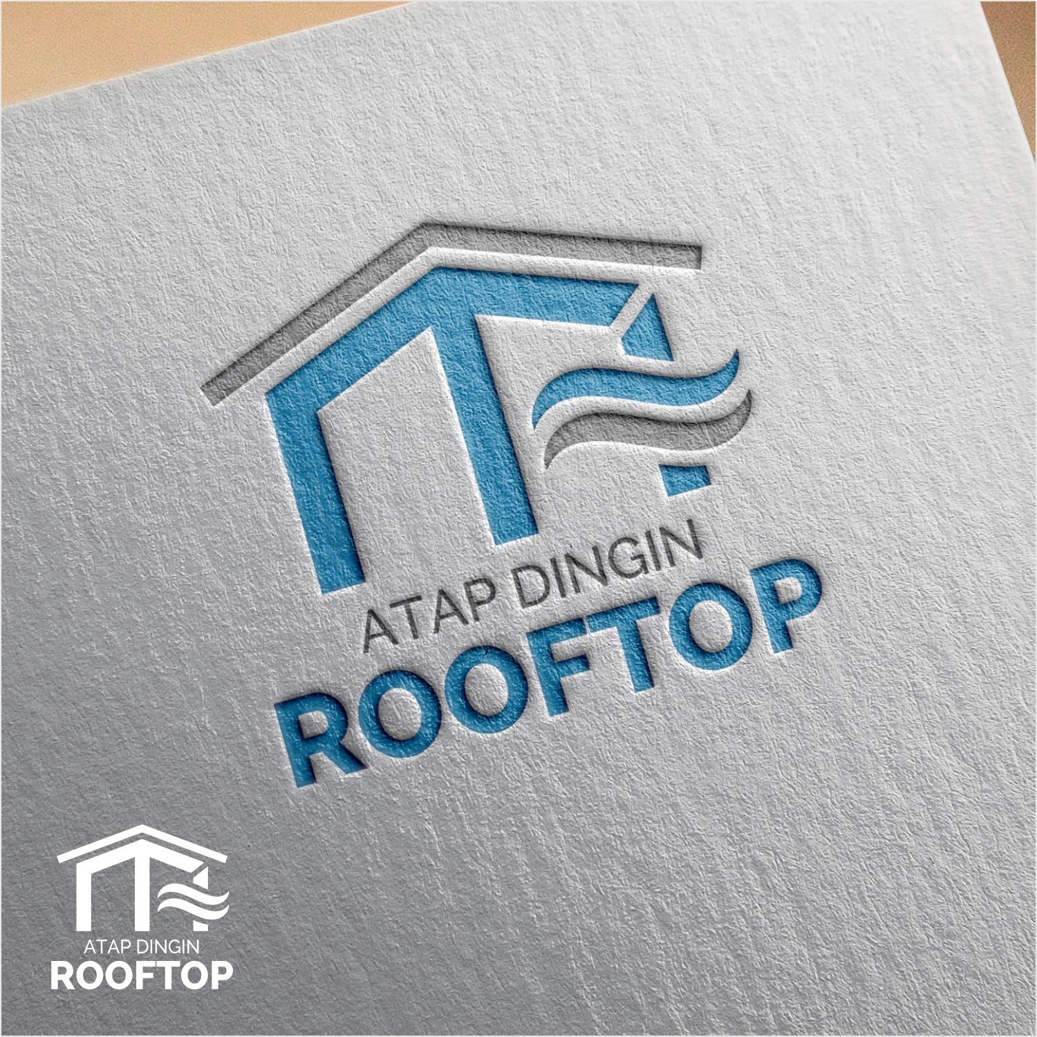
This customer received 182 logo designs from 66 designers. They chose this logo design from manto.bjb as the winning design.
Join for free Find Design Jobs- Guaranteed
-
 US$150
-
 182 designs
-
 66 designers
Logo Design Brief
We are a plastic product manufacturing company based in Indonesia that are currently producing a pioneering roofing product made of uPVC plastic under the brand of Atap Dingin ROOFTOP (Atap means Roof and Dinding means Cool - as in low temperature). We are the first company in Indonesia to introduce this type of roofing since 2004, and we also have the original design patent. You can visit our website: www.rooftop.co.id
Here in Indonesia, the most common material used for roofing are metal, polycarbonate, ceramic, clay and absestos roofing. While all of this materials are quite affordable, they have a short product lifespan because they are prone to rusting and cracking, and therefore customers will have to replace their roof every 3-5 years. With ROOFTOP, we provide our customers with the best solution for their roofing investment. What makes our roofing product different are: ROOFTOP provide significantly better heat and noise insulation, have very strong and rigid construction, virtually requires no maintenance, will never corrode (rustproof), have very long lifespan (we provide 15 years warranty), and many other benefits.
After more than 14 years of using our original logo, we think that it already looks very outdated and needs a refresh or a makeover that it deserves. What we would like to see is modernization and overall fresher design of the logo without causing too many changes that result in it becoming unidentifiable to our audience and hence lose our branding. Some things to take note of:
1.) We think the font of our logo needs to be changed as it looks really outdated and it does not look professional (it looks too "cartoonish").
2.) The word "Atap Dingin" still needs to be on the logo, but only in small text, the emphasize still lies on our brand, ROOFTOP.
3.) Our dominant color is blue (light blue preferably) and white (blue symbolizes the coolness of heat insulation ability that ROOFTOP provides)
4.) The logo should communicate the main benefits that we provide to our customer, which are providing the best heat insulation ability and long product lifespan.
We have attached our old logo as well as our product brochures in case you want to learn a little bit about our product. Many thanks before and we are looking forward to see your wonderful designs.
Target Market(s)
Our target market is divided to:
1.) Retail market: Our roofing is used for residential houses roofing as well as carport or terrace. The target for this market are homeowners across Indonesia.
2.) Projects: Additionally, our main market is for big projects such as warehouse, factory or other commercial buildings (malls, amusement parks, etc.). For this market, we target general contractors, consultant, interior designer, architect, and other professionals.
Currently, the majority of our target market are in Indonesia.
Industry/Entity Type
Building Product
Logo Text
Atap Dingin ROOFTOP
Logo styles of interest
Emblem Logo
Logo enclosed in a shape
Pictorial/Combination Logo
A real-world object (optional text)
Abstract Logo
Conceptual / symbolic (optional text)
Wordmark Logo
Word or name based logo (text only)
Colors
Colors selected by the customer to be used in the logo design:
Look and feel
Each slider illustrates characteristics of the customer's brand and the style your logo design should communicate.
Elegant
Bold
Playful
Serious
Traditional
Modern
Personable
Professional
Feminine
Masculine
Colorful
Conservative
Economical
Upmarket
Requirements
Must have
- 1.) The word "Atap Dingin"
- 2.) Dominant Color: Blue (light blue preferably), white and gray.
- 3.) The logo should communicate the main benefits that we provide to our customer, which are providing the best heat insulation ability and long product lifespan.
Should not have
- 1.) Logo that are significantly different compared to our current logo. The modernization and refresh of the logo should not cause too many changes that result in the logo becoming unidentifiable to our audience and hence lose our branding.
- 2.) Logo that have no association with our brand, and that does not represent the values and offerings that ROOFTOP provide.
- 3.) Logo that are overly complex. We believe that an overly complex logo will leave customers confused and difficult to relate nor recollect the brand on hearing or seeing a part of our marketing materials.