WINECLUB, WINE TOURISM, WINE INVESTORS, WINE DISTRIBUTION
Want to win a job like this?
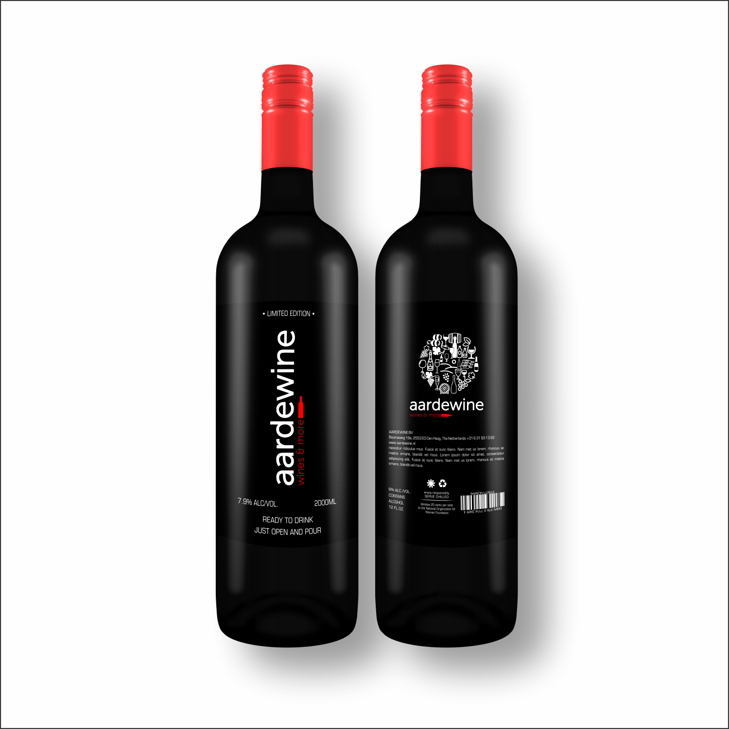
This customer received 149 logo designs from 57 designers. They chose this logo design from Amit Sharma 2 as the winning design.
Join for free Find Design Jobs- Guaranteed
-
 €110
€110
-
 149 designs
-
 57 designers
Logo Design Brief
Aardewine – the story behind the name
• Aarde means earth in Dutch. Aarde is also the terroir, the land of wine.
• Aarde also sounds as the Spanish word Arde with one A, which is what fire does and represents the passion for what we do and also the “pairing”of different elements that produce a special welcoming result.
• Wine from the English which sounds similar to the singular in Dutch and is recognizable globally and inspires many.
• Mixing the languages also shows the importance of pairing: a common joy from finding the best wine for the best food; and the best people for the best teams and projects; the best pairing of friends in life.
We seek to create a logo for aardewine then we adapt to aardebeer and aardefood (other business units we work under a group called AARDEGROUP. We are looking for an impact in the Netherlands. Our products have latin american roots since they come from LATAM or have been developed by LATAM people.
We seek that the logo has in mind primarily wines but can also adapt to beers, food, tourism, Argentina.
We have Nespresso brand as a reference of style: stylish, unique product, quality, great marketing, eco friendly.
Words that summarize our intent: fire, earth, wine, flavor, colors, enjoy, life, happy, family, community, join, club, expand, horizon, live, terroir, Spanish, Latin, passion, tango, entrepreneur, pairing
Latest update to this brief: We have added our latest brochure for more ideas!!!
Updates
Need extra days to review
Need extra days to review
Need extra days to review
Gathering more feedback
Target Market(s)
wineclub, enotravel (wine oriented tourism), investments (land and bottles), wine shop
Logo Text
AARDEWINE
Logo styles of interest
Pictorial/Combination Logo
A real-world object (optional text)
Font styles to use
Look and feel
Each slider illustrates characteristics of the customer's brand and the style your logo design should communicate.
Elegant
Bold
Playful
Serious
Traditional
Modern
Personable
Professional
Feminine
Masculine
Colorful
Conservative
Economical
Upmarket
Requirements
Must have
- Simple, stylish, modern, zen style
- Colors must be in the autumn pallete (see attached file
- We expect the main image to be used alone without the brand name if necessary
- Please consider to use the current logo as basis. Maybe even to adapt for BEER and FOOD (such as changing the current grouped images)
Nice to have
- Please see current logo - The current logo has all the element related to the production and enjoyment of wine: barrel, bottles, glassess. The main center piece is the land which is the heart of the wine industry and our brand. There are decorative aspects like leaves and corkscrews.
- Currently we use Museo Sans 300 for the name and Museo Sans 100 for the motto: wines&more
- Rounded logo allows to use it on the cap of the bottles or as a single image which might be useful.
- Idea 1: adapting the color within the same pallette to adapt to our other LOBs could be an option AARDEBEER / AARDEFOOD / AARDEGROUP.
- Idea 2: Please consider to use the current logo as basis. Maybe even to adapt for BEER and FOOD (such as changing the current grouped images)