Logo design for personal Jewellery
Want to win a job like this?
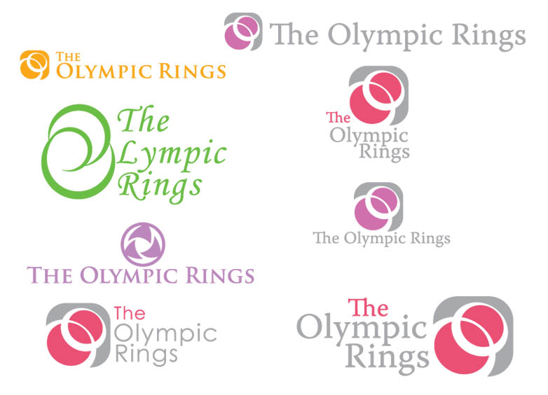
This customer received 16 logo designs from 10 designers. They chose this logo design from Dale Hutchinson as the winning design.
Join for free Find Design Jobs- Guaranteed
-
 £100
£100
-
 16 designs
-
 10 designers
Logo Design Brief
I am re-starting the company selling (mainly on the web)called "TheOlympicRings.com". The starting products are small Silver or Gold rings worn by women on their nipples (No Piercing). This is NOT a taccy, smutty, crude or cheap product but one that enhances the natural beauty of a woman. I am not in the sex market! Real Jewellery (Jewlry). Customers 1st receive a specially designed gauge for sizing. There is NO PIERCING! Linked to the rings site will be DVD"s on subjects like massage & beauty treatments. The logo should be in 2 parts (think ,psd layers) 1 very simple, the addition completing the full logo. Some may feel sensitive to the concept of the the rings or be buying as gifts "so the plain logo (layer 1) will appear on the outside of postal packaging.
The company slogan is, "Fun, Remember Fun!" & the rings slogan, "Stand out in a crowd". Don"t think Playboy, think beauty and Fun.
Target Market(s)
From experience fashion concious women & their partners aged 18+ are those to be attracted.
Initially the rings & DVD"s are targeted at the Bitish market. Basic rings start at about 30 UK pounds. DVD"s are physical products, not downloads produced by us.
Logo Text
TheOlympicRings and/or Fun, Remember Fun?
Logo styles of interest
Abstract Logo
Conceptual / symbolic (optional text)
Requirements
Must have
- The simple logo must be able the be hot-foiled/embossed or therm raised so must not have fine lines or shading etc. & be in one colour (Black!) Must reflect the elegance of the rings. Think simplicity.
The 2nd part should embellish the 1st part & can have shading, shadows, text or whatever. Think elegance.
See how in Gold pair.jpg a complex shape could be part of layer 2 (with some company ID) but the self same image (shown in black) would be the simple layer for blocking.
Nice to have
- The product is Fun, the wearers are young at heart. The rings are long lasting quality jewellery & this image should be reflected.
Layer 1 curvey & simple. Layer 2 incorporates layer 1 but is elegant & fun!
Should not have
- The design should not contain anything alluding to nudity or sex.
There is no connection with the Olympic Games (but I quite like the ideas related to impossibly linked rings like 3 rings.png or rings_a.gif)