Local Community Pharmacy needs a new logo and rebranding. has not changed for over 30years!!
Want to win a job like this?
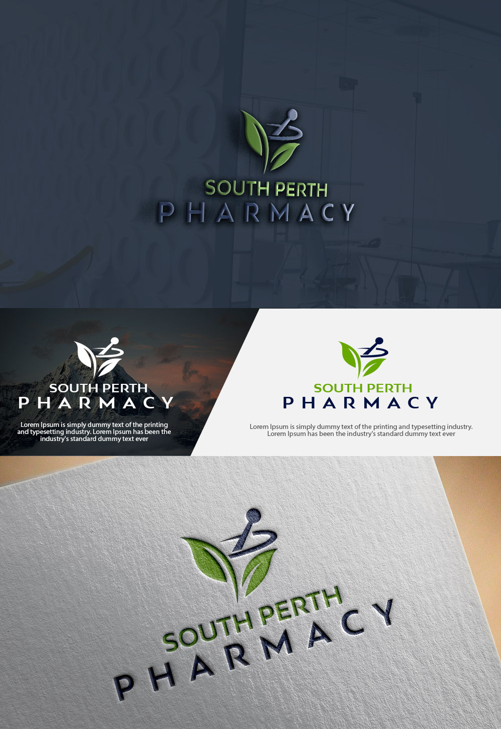
This customer received 397 logo designs from 140 designers. They chose this logo design from MF ki creation as the winning design.
Join for free Find Design Jobs- Bundled Project 2
-
 A$490
A$490
-
 397 designs
-
 140 designers
Logo Design Brief
Why are we seeking to re-brand and re-define our business?
Our chemist has been servicing the South Perth suburb of Perth for 35 years.
It is iconic and synonymous with pharmacy in South Perth.
But it is time for a change (in addition to a new logo we will be refurbishing and replacing the old shop awning with a new modern profile)
Our chemist still operates on an old model which relies heavily on script business, and of course retail which offers what you’d expect to find in a chemist.
We believe our business is changing, because chemists are moving towards being community health hubs providing customers with a range of services which hopefully will prevent serious health issues down the track.
We don’t intend to change what we do best: Good old fashioned, reliable, customer service, excellent health advice and prescription services between the hours of 7am to 10 pm every day of the year
But we want to do it better. We want a new, fresh, identity – but still retaining strong links to the past.
Some quick facts:
We were established 35 years ago, in a stand-alone building with its own car park and we open every day of the week, right up until 10pm.
In close proximity we have at least three competitors, but our point of difference is that we are the only chemist to open past 7pm (till 10pm). We are there to help families after hours because we know that health needs do not stop at 6pm.
Our other point of difference is that we are not part of a franchise. We are independent.
And our location, on a busy main road, means we have lots of passing traffic.
How do we describe South Perth? It is a beautiful and older suburb with a mixture of middle class and wealthier families. It has become quite an expensive suburb to live in, but there is still a mixture of young and older families. Family incomes would generally be higher than the norm, although pockets of South Perth are still very much middle class, with working class families.
Its proximity to a university, prestigious private and state schools, its location next to the river and the Perth CBD means we are in a prime location.
In regards to health, the area has a hospital, many medical centres and a range of health professionals and specialists have located their offices in South Perth.
What are we trying to achieve?
We want to grow our clientele. As simple as that. Our growth has stagnated.
Our concern is that we now simply serve a clientele which has been with us for many years.
Our aim is to renovate our building, change the look of the business to give it a more modern feel, give it new signage and perhaps a new identity. But we stress: We don’t want to totally recreate the wheel. We have built a reputation as a reliable, friendly chemist which has been there for generations of families.
We still want to retain that Neighbourhood Pharmacy feel and move to be the leading health hub of the area.
We believe we should be aiming to be the best of an independent pharmacy, unique ranges, not competing with the big franchises, and offering our services and clinics at times outside of business hours – ie flue clinics on the weekend, dietitian and healthy weight lessons on Saturday afternoon, - because life doesn’t happen between 9 and 5.
We have an opportunity to work with our heritage ( we have had a mortar and pestle as part of our pole sign or in our front window since inception as a tribute to the heritage of pharmacy and compounding).
Do we incorporate this into the logo?
We want to make our pharmacy as a destination for good health, access to advice , great health care, and good display of product and health and lifestyle products that put on clinics for the community at hours that work for working mums and dads, as well as retired people.
That way we can capture the locals, and people who drive past every day to work
A new logo:
In designing a new logo, we firstly should consider not referring to ourselves as a chemist, but a pharmacy. Chemist is an old-fashioned term.
In designing a new logo, please consider:
We have always had a mortar and pestle out the front of our store, since the beginning.
Our name is
What we would like to do is to expand our services so that we become more of a “community health hub”, operating seven days a week, still opening till 10pm, but offering a range of “preventative health” services.
We want to do:
1: Head Lice clinics/treatments
2: Flu vaccinations. We will build two new consultation rooms.
3: Provide access to an on-site dietician.
4: Provide a weight loss programme.
5: Expand our range of products to perhaps dabble in health foods, health supplements, exercise foods/protein shakes, etc.
Logo colours: Ink Navy and White, with options to include an accent colour.
Updates
Sick
Target Market(s)
we would like to attract the younger affluent families, plus retain our older generation
Industry/Entity Type
Pharmacy
Contact Information for Business Card
South Perth Pharmacy
143 Canning Hwy, South Perth WA 6151
PH; 08 9474 1958
Fax: 08 9474 1971
Logo Text
South Perth Pharmacy - emphasis the wording 'Pharmacy' and have South Perth a smaller text.
Logo styles of interest
Pictorial/Combination Logo
A real-world object (optional text)
Wordmark Logo
Word or name based logo (text only)
Font styles to use
Colors
Designer to choose colors to be used in the design.
Look and feel
Each slider illustrates characteristics of the customer's brand and the style your logo design should communicate.
Elegant
Bold
Playful
Serious
Traditional
Modern
Personable
Professional
Feminine
Masculine
Colorful
Conservative
Economical
Upmarket
Requirements
Must have
- different to normal pharmacy logos - fresh and clean
- emphasis on PHARMACY - rather than South Perth when visually viewing the design
- to also include the wording 'open 7 Days"
Nice to have
- please read the project description
Should not have
- please read the project description, no red, yellow or orange colours
Files
Payments
Total
A$490
Project Deadline
04 Jun 2018 01:50:21 UTCProject Upgrades
Bundled project(s)
- offering A$49 stationery design to winner
- offering A$39 business card design to winner