The Bowerbirg Group Property Development
Want to win a job like this?
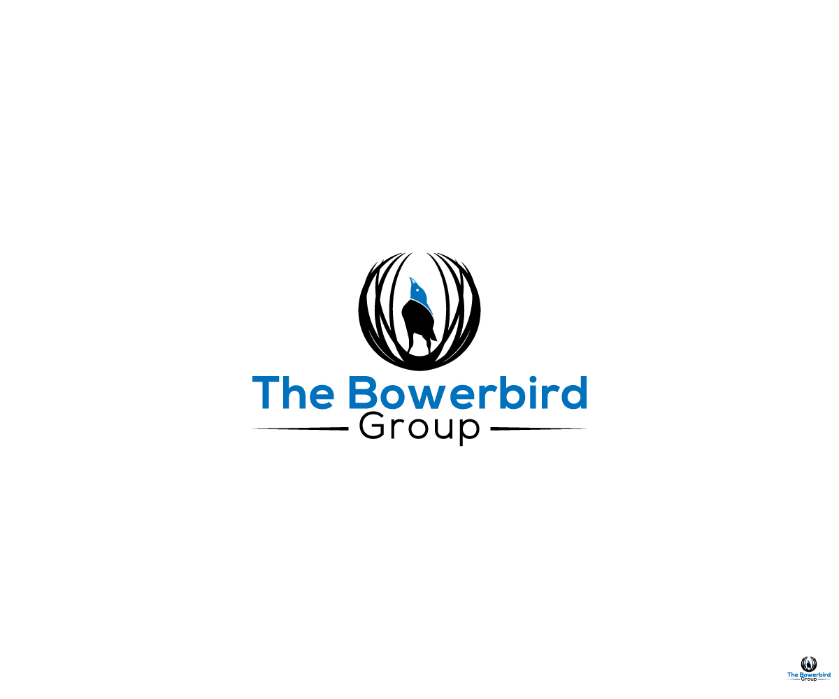
This customer received 144 logo designs from 58 designers. They chose this logo design from Related to logo design1 as the winning design.
Join for free Find Design Jobs- Guaranteed
-
 A$150
A$150
-
 144 designs
-
 58 designers
Logo Design Brief
We are a sydney based property developer.
We specialize in collective developments, that is we bring individual people together to form a collective that will then develop a medium density residential property as a group.
Our parent company is called The Bowerbird Group and we would like our logo to include the bowerbird and it's nest and also to reflect the collective development nature of our business.
Our development arm is called The Bowerbird Collective, so the logo should be interchangable with both these names.
The bowerbird has a distinct black colouring with piercing blue eyes, and has an obsession with collecting blue objects to adorn it's bower (nest).
The bower also has a very distinct shape (reference pics supplied incl. current temporary logo).
Thanks in advance for your efforts.
Darrin Craig.
Updates
Need extra days to review
Industry/Entity Type
Property
Logo Text
The Bowerbird Group
Colors
Designer to choose colors to be used in the design.
Look and feel
Each slider illustrates characteristics of the customer's brand and the style your logo design should communicate.