Holding company logo design
Want to win a job like this?
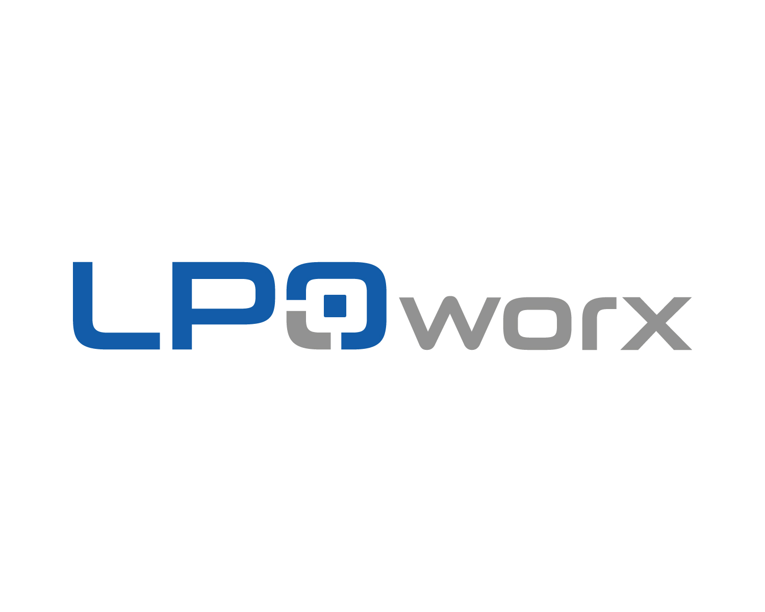
This customer received 315 logo designs from 136 designers. They chose this logo design from Atec as the winning design.
Join for free Find Design Jobs- Guaranteed
-
 US$216
-
 315 designs
-
 136 designers
Logo Design Brief
The U.S.-based business is a holding company that is being created to provide an efficient mechanism to create, own, and operate multiple legal process outsourcing (LPO) services.
We are sorry, but we will not have time to provide feedback on every design submission. if we feel your design submission does not meet our minimum standard of quality, we will eliminate it without comment or feedback. Feel free to submit additional designs.
If your submission is of high quality, we will provide feedback.
We will not respond to any messages such as "I just submitted my design, please give me feedback" - that will just waste your time and ours.
We will communicate fully with the 3 - 5 finalists and work with them to get an overall winner.
Target Market(s)
Investors, strategic buyers, and private equity firms
Industry/Entity Type
Legal
Logo Text
LPO Worx
Logo styles of interest
Emblem Logo
Logo enclosed in a shape
Abstract Logo
Conceptual / symbolic (optional text)
Font styles to use
Colors
Colors selected by the customer to be used in the logo design:
Look and feel
Each slider illustrates characteristics of the customer's brand and the style your logo design should communicate.
Elegant
Bold
Playful
Serious
Traditional
Modern
Personable
Professional
Feminine
Masculine
Colorful
Conservative
Economical
Upmarket
Requirements
Must have
- The logo can either have a space or no space between "LPO" and "Worx". The logo colors should be blue and silver. The fonts really matter and should be professional and elegant.
- The logo element needs to be of a shape and design that turns into a very nice social media avatar, ideally it is square in shape.
- Please do not post multiple versions of the same design on different backgrounds. That only clutters our inbox. Please only post one full-color logo on a white background of each design submission. We will just eliminate redundant submissions.
Nice to have
- It will probably be best to use different colors, boldness, or font styles on "LPO" vs. "Worx"
- Ideally the logo element is square.
Should not have
- We will not respond to any messages such as "I just submitted my design, please give me feedback" - that will just waste your time and ours.
- We are sorry, but we will not have time to provide feedback on every design submission. if we feel your design submission does not meet our minimum standard of quality, we will eliminate it without comment or feedback. Feel free to submit additional designs.
- Please do not submit a word mark logo by simply writing out LPO Worx with a box around it - we've had 50 such submissions. Note below that we want an emblem or abstract logo element that is square in shape.