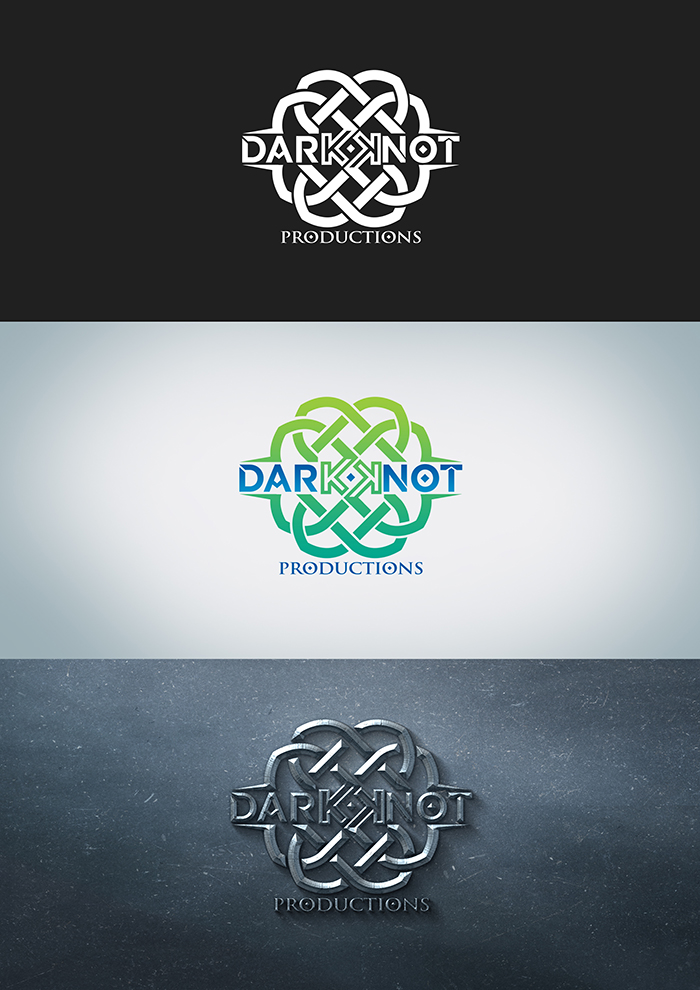
Logo for film production company

Want to win a job like this?
This customer received 110 logo designs from 45 designers. They chose this logo design from Aidaverse as the winning design.
Join for free Find Design JobsLogo Design Brief
design and update logo, we need a logo that can stand alone but also involves a celtic knot feel, but a more simplistic version then the one attached. We are a production company looking to grow and need a strong identity. Needs to be delivered as a AI vector file that is editable. we specialize in films that are dark in nature and are puzzling and uncomfortable to the viewer.
Dark Knot Productions creates palpable, reality smashing, character driven, transformative films and TV series. We don’t do heartwarming, poignant’, or family films, that’s why God created Disney!
If you want multilinear storytelling, multi-layered, duplicitous, and down-right evil characters with seemingly no redeemable qualities, you’ve come to the right production company.
Our characters can take you to that dark place and bring you back out the other side. We create films that grab your soul and shake it!
Think Merchant Ivory films… and then slap yourself.
Warning: Our characters have been known to make people question their own authenticity. Enter at your own risk.
And always remember…. deeds have consequences….
Target Market(s)
Movie producers
Industry/Entity Type
Film Production
Logo Text
Dark Knot Productions
Logo styles of interest
Pictorial/Combination Logo
A real-world object (optional text)
Abstract Logo
Conceptual / symbolic (optional text)
Font styles to use
Colors
Colors selected by the customer to be used in the logo design:
Look and feel
Each slider illustrates characteristics of the customer's brand and the style your logo design should communicate.
Elegant
Bold
Playful
Serious
Traditional
Modern
Personable
Professional
Feminine
Masculine
Colorful
Conservative
Economical
Upmarket
Requirements
Must have
- My project must have a stand alone logo and symbol, preferably with some sort of celtic knot design due to the title and background of the company. May have the name implemented, but we would like the symbol to also be able to be identifiable without the name. NEEDS TO LOOK LIKE A KNOT
Nice to have
- would be nice to have some negative space implemented
Should not have
- not a lot of bright colors