International fitness business needs a logo. Launching world wide first half of 2019.
Want to win a job like this?
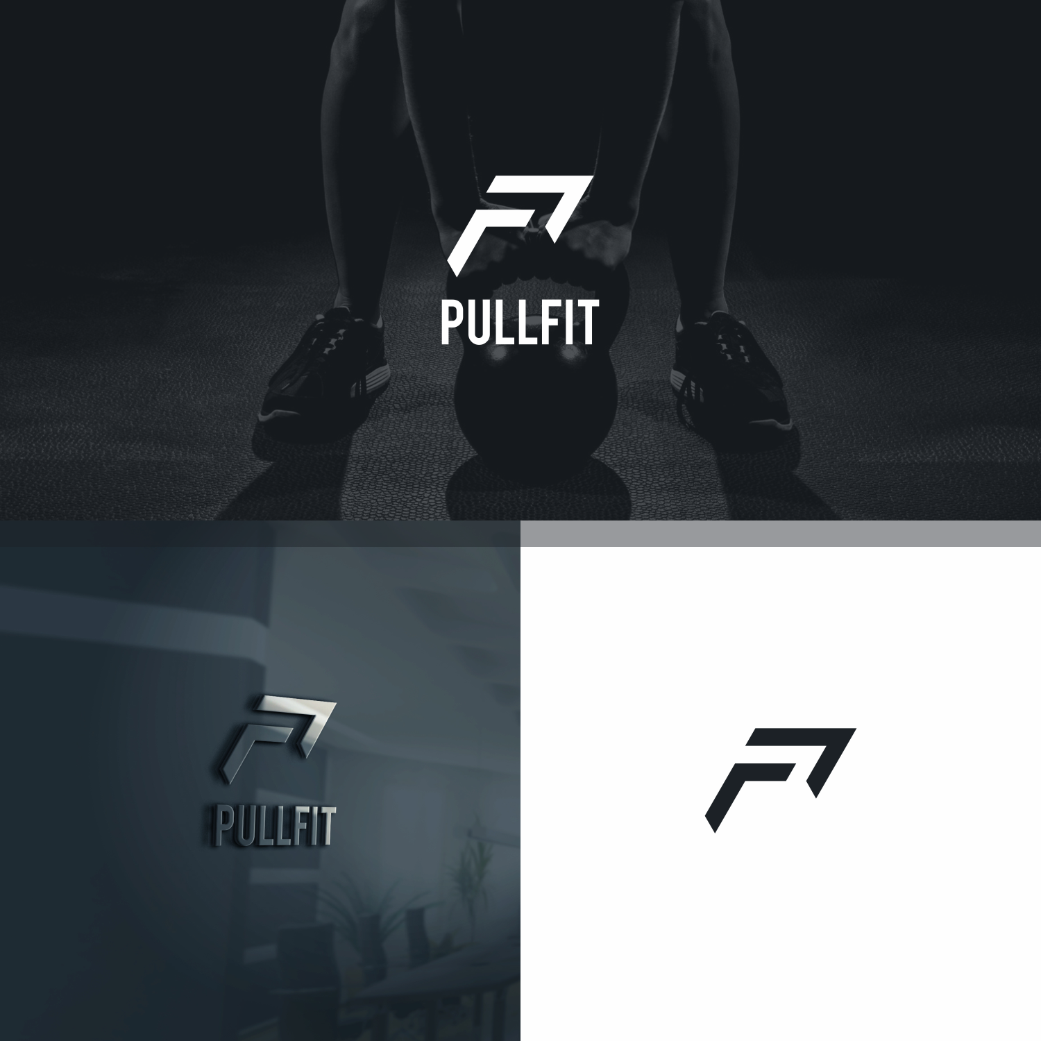
This customer received 427 logo designs from 155 designers. They chose this logo design from FireBlaster as the winning design.
Join for free Find Design Jobs- Guaranteed
-
 A$300
A$300
-
 427 designs
-
 155 designers
Logo Design Brief
The winning logo will incorporate the letters (PF) which is short for PULLFIT / pullfit. The (PF) will be a major branding logo used on our unique patented personal-gym equipment, plus marketing items such as baseball caps, backpacks etc.
Our new fitness equipment incorperates - BUNGEE-CORD / SHOCK-CORD.
A (bungee / shock-cord) theme in logo would be an advantage but not completely necessary.
Updates
Hello DesignCrowd The design work I have received is fantastic. I need to make a final design decision with my team on Monday 15th. However you have a close off (deadline) time listed as 2:12am UTC. Can you please change this to 8:00pm UTC (2000hrs). This is 6pm our local time on Monday. Kind Regards Rick
Industry/Entity Type
Fitness Equipment
Logo Text
PF
Font styles to use
Colors
Designer to choose colors to be used in the design.
Look and feel
Each slider illustrates characteristics of the customer's brand and the style your logo design should communicate.
Elegant
Bold
Playful
Serious
Traditional
Modern
Personable
Professional
Feminine
Masculine
Colorful
Conservative
Economical
Upmarket
Requirements
Must have
- All artistic (intellectual property) rights to individual logo chosen/selected for our international business.
- Telfit Pty Ltd T/A Pullfit needs to own all intellectual property rights to winning/chosen logo.
- Our company needs to submit winning/chosen logo for registration and Trade Marks.
- Please do not submit any logos you are not prepared to pass-on, sell outright on DesignCrowd.
Nice to have
- The PF logo needs to look great on its own or sitting besides the Pullfit company name.
- If you can submit the (PF) logo sitting besides PULLFIT, so they look compatible together, then this is an advantage.
Should not have
- Have uploaded 3 x files of our companies current registered logo.
- It is a bit bland in its appearance.
- The P & F need to stand out more.