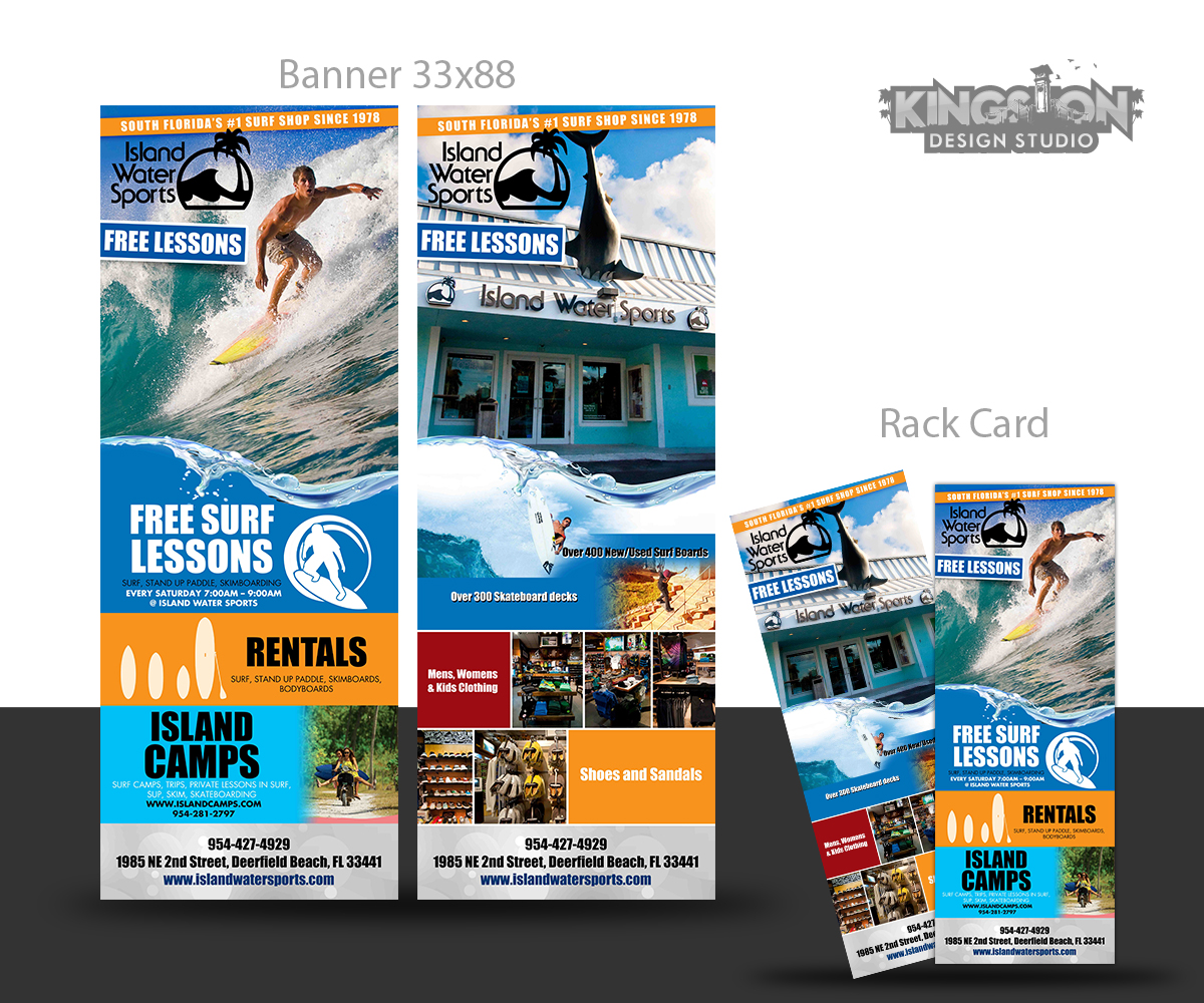
Surf & Skate Store - Rack Card
Want to win a job like this?
This customer received 10 print designs from 5 designers. They chose this print design from insert name here as the winning design.
Join for free Find Design Jobs-
 A$200
A$200
-
 10 designs
-
 5 designers
Print Design Brief
Overview: The rack card will be used to promote the store and our camps, lessons, etc. I will be including a link to previous work, logos, artwork, etc. However, I want a fresh, new design.
NOTE: The front of the rack card will also be used for a large banner 33"x88" to used at events. Keep this in mind when choosing artwork that can scale. I will create a separate project for this though.
Usage: This will be placed at local hotels, passed out in store, and passed out at special events.
Side One: Focus on our Free lessons, camps, rentals, private lessons, trips, etc.
Side Two: Focus on our store and the types of products we carry in surf and skate.
Design:
a. Colors: stick to our core colors of black, white, blue, seafoam and minor in red/orange
b. Header The top ¼ to 1/3 area of a rack card is what sticks out in a rack stand at hotels, this should be the graphic portion that really draws attention.
c. Footer: we should have phone, address, website on the footer of both sides
1985 NE 2nd Street, Deerfield Beach, FL 33441 954-427-4929
www.islandwatersports.com
Somehow for the front near camps, we need to mention the website for camps as www.islandcamps.com
Side One Content, in order of importance
a. Free Surf Lessons: surf, stand up paddle, skimboarding
Every Saturday 7:00am – 9:00am @ Island Water Sports
b. Rentals: surf, stand up paddle, skimboards, bodyboards
c. Island Camps
- surf camps, trips, private lessons in surf, sup, skim, skateboarding
www.islandcamps.com 954-281-2797
Side Two Content: info about the store. See example from old rack card.
Our websites:
store: www.islandwatersports.com
surf camps: www.islandcamps.com
artwork: https://www.dropbox.com/sh/j19u39ijt0si7l4/4U3sm3pA2H
Updates
Project Deadline Extended
Reason: I had to leave town and was unable to respond to designs being posted. I am back in the office and able to comment.
Added Tuesday, January 14, 2014
Target Market(s)
Our target market is ages 13-40. Parents will mostly be taking the rack card for a reference to what we do and our contact information. The pictures attract the kids on the fun things we offer.
Industry/Entity Type
Store
Look and feel
Each slider illustrates characteristics of the customer's brand and the style your logo design should communicate.
Elegant
Bold
Playful
Serious
Traditional
Modern
Personable
Professional
Feminine
Masculine
Colorful
Conservative
Economical
Upmarket
Requirements
Must have
- I want the front of the rack card about our lessons, camps, etc in the initial design mockup. The back of the card can be done after we pick the look we like.
- The top 1/4 to 1/3 of the rack card is what will draw their attention. Must have our logo and a great pic to draw their attention.
Should not have
- I do not want pricing on the cards. Only services, attractive pics, and the contact info to go for more info.