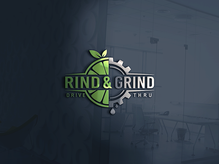
Rind & Grind Drive Thru
Want to win a job like this?
This customer received 361 logo designs from 151 designers. They chose this logo design from NATURAL SRI as the winning design.
Join for free Find Design Jobs- Guaranteed
-
 US$490
-
 361 designs
-
 151 designers
Logo Design Brief
Need a logo to represent our juice bar concept. Rind & Grind will feature health based smoothies, fresh squeezed juices, and premium coffee. The business is geared towards creating a fun, social atmosphere for individuals looking for a nutritious option to gather over. The store will be family friendly and logo should be playful with the fruit and show a little masculinity with the grind portion.
Updates
Need a couple of days before selecting a winner
Target Market(s)
Individuals of all ages looking for something nutritious and healthy to drink.
Industry/Entity Type
Juice Bar
Logo Text
Rind & Grind
Logo styles of interest
Pictorial/Combination Logo
A real-world object (optional text)
Colors
Designer to choose colors to be used in the design.
Look and feel
Each slider illustrates characteristics of the customer's brand and the style your logo design should communicate.
Elegant
Bold
Playful
Serious
Traditional
Modern
Personable
Professional
Feminine
Masculine
Colorful
Conservative
Economical
Upmarket
Requirements
Must have
- The rind of a fruit to represent the Rind portion of the name. The Grind portion of the name could be represented with coffee bean or some kind of machinery like the cog. This signifies an active motion and "Grind" to represent the coffee portion of our menu. When using the cog please refer to "Smoothie Factory" logo and make sure we have a different look. Logo must be in one color with no gradients, shadows, or special effects. Solid outlines are fine. Logo must be easy to invert and create outdoor channel letter signage. Font can be in different color.
- The concept will have drive thru so below the Rind & Grind saying there should be an optional Drive Thru tagline. The Drive Thru tagline should be removable for stores that do not have a drive thru.
- The logo should be clear, precise, simple, yet unique it its look. The design we have submitted is a good base but it is complicated and font is hard to read. Logo must be balanced between feminine and masculine. Must be fun and healthy. Also we are not wanting R&G font in the logo as shown. Maybe more fruit, a straw, special design, etc.
Nice to have
- Would be nice if logo can represent fruit, and active lifestyle. In the logo we wish for the "Rind" portion to be feminine or family friendly while the "Grind" portion to be masculine. Coffee is secondary to our business and should not dominate the logo.
Should not have
- No gradients, shadows, special effects. 2 color max but logo must look good in single color and not dependent on multi color. Coffee is secondary to our business and it should not dominate the logo. We initial felt the cog wheel could represent The Grind and coffee but realized another company Smoothie Factory uses this and we must look significantly different. There should be no fonts in the logo itself. We submitted a sample with R&G in the logo but that needs to be eliminated.