Australian rail construction company looking for a strong/modern logo design
Want to win a job like this?
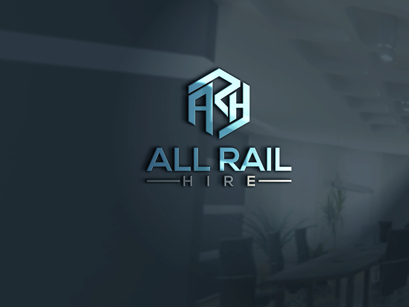
This customer received 75 logo designs from 46 designers. They chose this logo design from Mr.Paul as the winning design.
Join for free Find Design Jobs- Guaranteed
-
 A$150
A$150
-
 75 designs
-
 46 designers
Logo Design Brief
We need a logo design for an Australian based company called 'All Rail Hire'. We work in the rail construction industry and specifically provide a unique welding service called aluminothermic welding (welding two pieces of rail together). Attached is a 'B' grade logo that we originally started with but we're looking for a more professional modern version. We would like to keep the same concept of the circle style logo if possible while making it look more dynamic or perhaps even a bit more 3D (it looks a bit flat/2D at the moment). We like our initialism font of 'ARH' because it has a rail industry vibe with the letters resembling train tracks / rails so if that can remain similar that would be good. We would like the 'ALL RAIL HIRE' to be positioned under 'ARH' if possible, either linking with the circle logo like we have or centered inside the circle logo. The circle logo can be as minimal or as 3D as you like but ultimately we're looking for a sleek, strong, modern design that relates to the rail industry. We look forward to working with you, thanks!
Target Market(s)
Corporate rail and construction human resources
Logo Text
Initialism - ARH Company name - ALL RAIL HIRE
Logo styles of interest
Emblem Logo
Logo enclosed in a shape
Abstract Logo
Conceptual / symbolic (optional text)
Wordmark Logo
Word or name based logo (text only)
Lettermark Logo
Acronym or letter based logo (text only)
Font styles to use
Other font styles liked:
- Currently using 'DAYS' however open to other strong similar fonts
Colors
Colors selected by the customer to be used in the logo design:
Look and feel
Each slider illustrates characteristics of the customer's brand and the style your logo design should communicate.
Elegant
Bold
Playful
Serious
Traditional
Modern
Personable
Professional
Feminine
Masculine
Colorful
Conservative
Economical
Upmarket
Requirements
Nice to have
- A blue colour has been selected that is close to the colour we are currently using. We are using it to break up the initialism with the 'R' being blue in between the 'A' and 'H' that are black. We would like to keep a similar colour concept with the blue breaking up the design a bit and creating a colour trademark. The blue colour is to stand out so perhaps not make the entire logo blue but have key sections in blue to make it pop and stand out.