Logo Design for Portfolio Think Tank, an Investment App
Want to win a job like this?
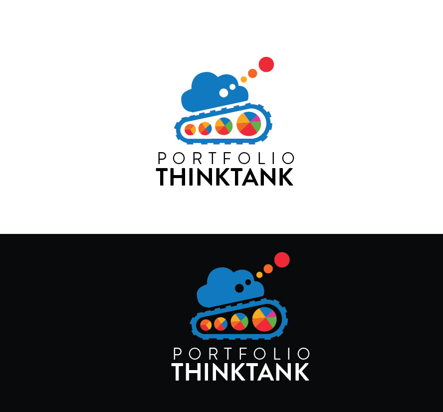
This customer received 159 logo designs from 33 designers. They chose this logo design from #ANGELO as the winning design.
Join for free Find Design Jobs- Guaranteed
-
 US$150
-
 159 designs
-
 33 designers
Logo Design Brief
We are a U.S. based investment software platform. This is a web based portfolio optimization / automation / analytics / backtesting & recommendation engine
The tank idea is preferred but nothing is locked in.
probable slogan: where the best minds in finance compete to improve your portfolio.
// Taking aim at Wall Street
Themes
Scientifically Validated, Objective, Personalized. Anonymous, High performance, trusted
Colors:
still flexible about colors but leaning towards a colorful model to accommodate the portfolio Wheels presuming that they are included in the design. prefer stronger Bolder colors.
Current direction and refinements to date:
We've come to like the three wheels inside the tank tread is it really ties the tank to the investment domain and then those types of charts operate at the portfolio level which is what we are all about.
Those charts also show a progression in size (bigger portfolio!) and diversification (we are literally the diversification experts, but the branding around this is more about the think thank - the ability to get crowd sourced recommendations on you portfolio.) moving to the right. You seem that the spacing around the charts in the wheels helps to make it look less busy.
the tank tread going around the wheels is representative of the optimization and back testing, Two core strengths of the system.
Its fun to consider having Einstein drive the tank around. Some fun and some humor without corrupting the seriousness of wealth could make this logo a great mascot for Portfolio Think Tank!
The tank images attached are a bit light on conveyance of the crowd-sourced recommendation engine.
We know there is a lot that we want to put in here and that the logo wont have everything. Can you get us a logo with the RIGHT STUFF?
Updates
Time for Final Refinements and Versions
Target Market(s)
active investors, traders, investment professionals
Audience
do-it-yourself investors, especially those who don't want to settle for the average, typically our investors will be smarter and richer and often business owners. we want to appeal to a wide swath of ages.
Industry/Entity Type
Investment Advisory
Logo Text
The name of the company is Portfolio ThinkTank but we are flexible about what words appear on the logo, including perhaps none
Logo styles of interest
Emblem Logo
Logo enclosed in a shape
Pictorial/Combination Logo
A real-world object (optional text)
Character Logo
Logo with illustration or character
Font styles to use
Colors
Designer to choose colors to be used in the design.
Look and feel
Each slider illustrates characteristics of the customer's brand and the style your logo design should communicate.
Elegant
Bold
Playful
Serious
Traditional
Modern
Personable
Professional
Feminine
Masculine
Colorful
Conservative
Economical
Upmarket
Requirements
Must have
- we think its more important that this icon be memorable. we are not afraid of a little complexity but everything it contains should be purposeful.
- People take their money seriously so we want it to convey strength & trust but don't mind being a little playful.
Nice to have
- Ideally the design would work equally on a light or dark background.
- It would be ideal if this logo could serve as an icon for Android and Apple apps. That would mean I believe it would have to be 48 by 48. This would seem to be a challenging simplification. so there is definitely a balancing act between simplification and conveyance.
- Multiple versions will likely be needed for various use cases including versions with and without words and greater and lesser fidelity.
- we do expect to create animated versions of the icon where both the portfolio wheels and the tank tread are animated possibly including other features are elements.
Should not have
- In Investments were always careful not to exaggerate or overstate, nothing cheesy.
- Stay away from the obvious gaudy coins and dollar signs.
- Common Clipart or toyish designs may also fail to instill trust and confidence