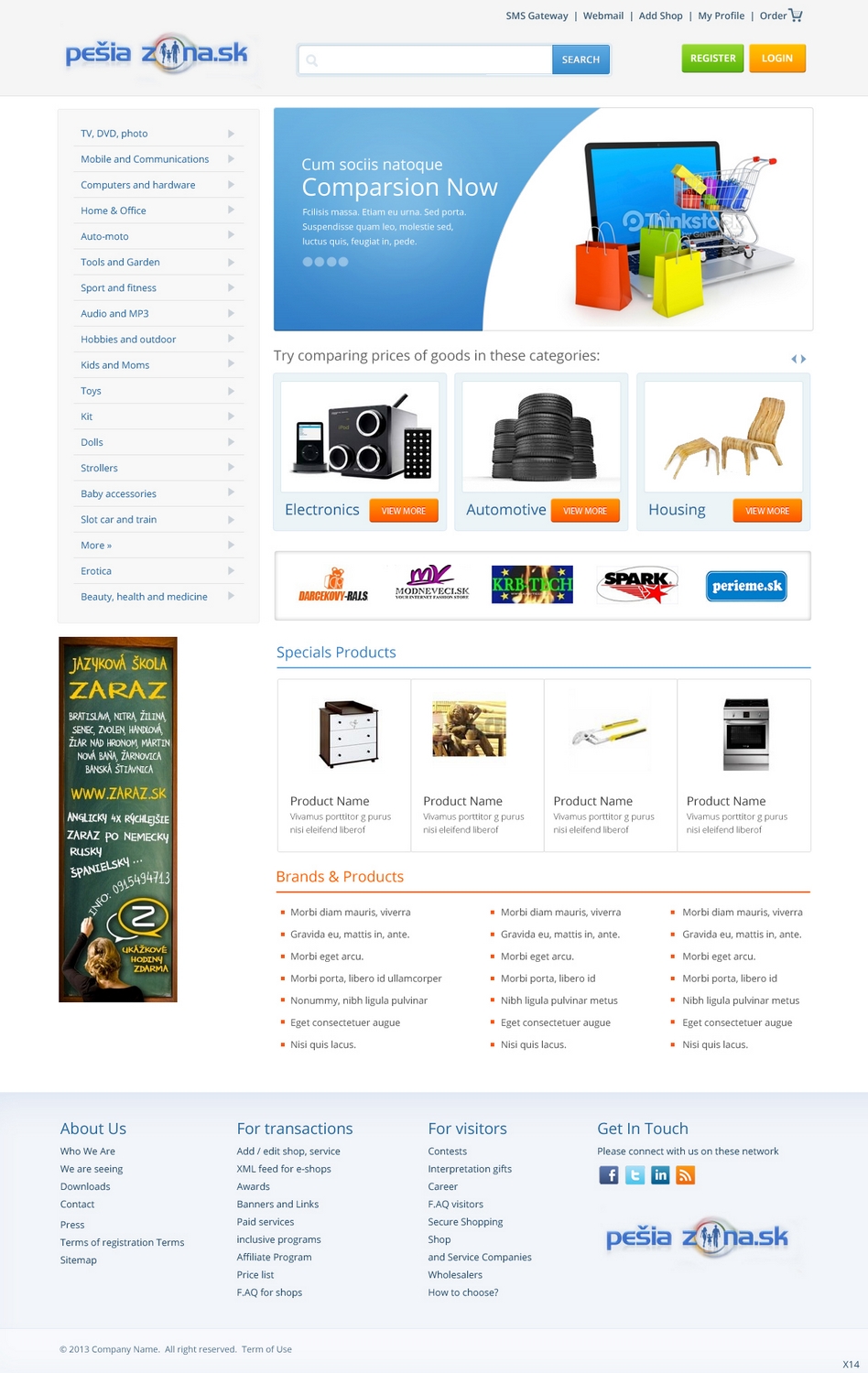
Local price comparison site needs a new design
Want to win a job like this?
This customer received 21 web designs from 4 designers. They chose this web design from pb as the winning design.
Join for free Find Design Jobs-
 US$700
-
 21 designs
-
 4 designers
Web Design Brief
We need new, prettier and especially more efficient, design for local (Slovak Republic) price comparison site. The old one (www.pesiazona.sk) is kind of ugly, but more importantly, it doesn't work for consumer audience (performance indicators are kind of bad). We've started something already, but we're just a bunch of amateurs in this area.
Our first attempt is in the attached file. Colors are such because of the logo (which is dark blue and the only given thing at the moment). The design is a combination and inspired by two other similar sites here:
www.heureka.sk
www.srovname.cz
We tried, but we're not designers...
Industry/Entity Type
Consumer
Colors
Designer to choose colors to be used in the design.
Look and feel
Each slider illustrates characteristics of the customer's brand and the style your logo design should communicate.
Elegant
Bold
Playful
Serious
Traditional
Modern
Personable
Professional
Feminine
Masculine
Colorful
Conservative
Economical
Upmarket
Requirements
Must have
- Efficient design from performance perspective (we want people to click a lot, content will be attractive enough, we don't want the design to be in the way, but support this)
Vertical banners stripe on the (right) side (see both old and our attempt at new design)
We will need several pages designed (main, category page, product page, search page), but I am not sure how to indicate this in the parameters of the project details
Nice to have
- Please make it simple and easy to read for consumers
Visual design with big pictures