Store Front Signage for an Upscale Cake & Dessert Bakery
Want to win a job like this?
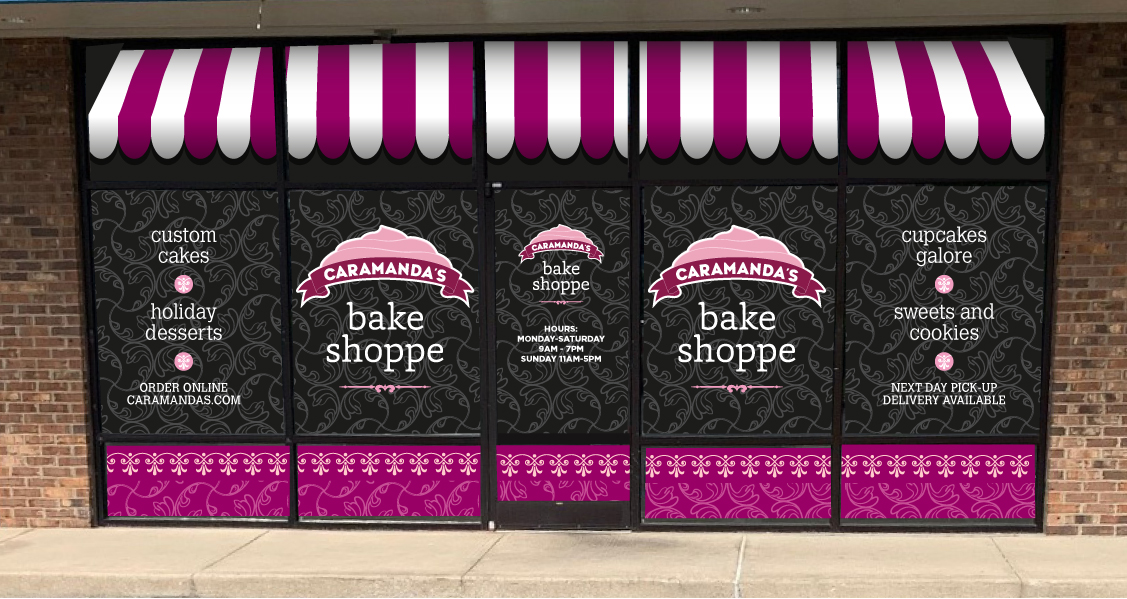
This customer received 41 signage designs from 19 designers. They chose this signage design from Bittersweet as the winning design.
Join for free Find Design Jobs- Guaranteed
-
 US$190
-
 41 designs
-
 19 designers
Signage Design Brief
We need a design for store front windows. We are a 12 year old bakery specializing in cakes, cupcakes, cookies, pies, and other desserts. We recently moved to a high traffic location.. and we would like to boost our visual presence; we can be seen from the main road but are competing with other businesses for attention. Attached is a photo of our store front with posters but this signage will be for window film for the entire window span. (see the store front to the left of the photo to see the green and yellow as a film example)
Our logo and store sign (not like in photo, that is showing more red) are in shades of pink. The most visible part of the signage is in the upper third to upper half of the 60" panels.
The signs in the window currently say Life's Short. Eat Cake.
We now use Enjoy Life. Eat Cake.
The design should span all the windows and door -- this can be individual panels or one design that covers all panels. I have pink and greys chosen but please DO NOT let this constrain you. The inside of the bakery has grey floors and walls. white cabinetry, black granite countertops. The only thing with color is the baked goods and display cakes, pictures of cakes, the logo and menu and employee shirts.
Target Market(s)
we are located at a busy intersection --- we would like to capture the attention of people in cars as they pass by and entice them to stop in
Font styles to use
Colors
Colors selected by the customer to be used in the logo design:
Look and feel
Each slider illustrates characteristics of the customer's brand and the style your logo design should communicate.
Elegant
Bold
Playful
Serious
Traditional
Modern
Personable
Professional
Feminine
Masculine
Colorful
Conservative
Economical
Upmarket
Requirements
Must have
- I would like the design to be easily discernible at the road way that is about 75 feet from store front. If you look at the photos I provide, note that the font size that is easily readable from the road are the ones in the top panes (although the shadow from the building makes them difficult to see -- the best visibility is the top 1/3 of the 60" panels.
Nice to have
- would like to have some non-photo graphics of a cake ( like a birthday cake), tiered cake, cupcakes, and cookies or pie for the panels --- but DO NOT let this constrain you. I need something to grab attention while cars are stopped at the nearby traffic light.
- If this design works well... I will be changing the panel on a seasonal basis
Should not have
- words that cannot be read from a distance.