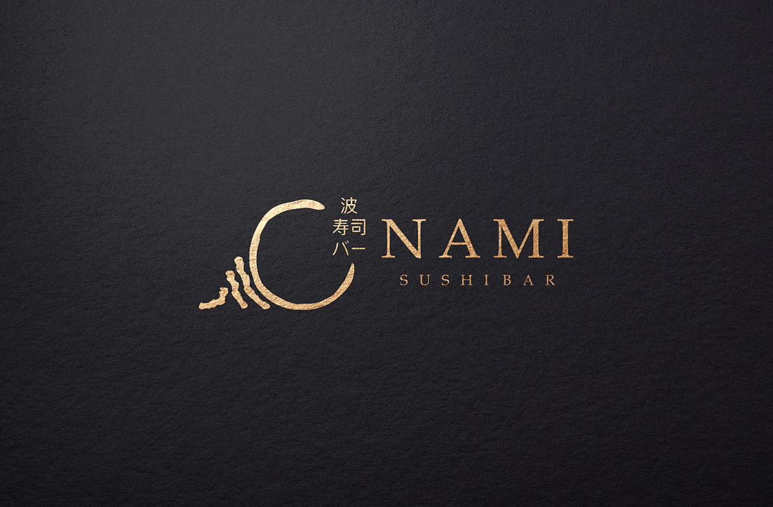
Nami Sushi Bar - Traditional inspired, easy to read

Want to win a job like this?
This customer received 35 logo designs from 15 designers. They chose this logo design from GLDesigns as the winning design.
Join for free Find Design Jobs- Guaranteed
Logo Design Brief
Looking for a logo for our Japanese Sushi Bar. Nami means 'the wave' in Japanese. For the window design I am looking to use the colours of the traditional Japanese wave' as attached (dark blues, light blues, mustard, ect). I have attached the file 'sushiwindow' just as a reference as to the simplicity of it (no bear, using the wave instead). We have a 5 working day turnaround - are you able to meet this?
We are looking for a traditional design and would like to incorporate the Japanese symbols if possible.
Target Market(s)
Japanese, sushi.
Industry/Entity Type
Hospitality
Logo Text
Nami Sushi Bar
Logo styles of interest
Pictorial/Combination Logo
A real-world object (optional text)
Font styles to use
Other font styles liked:
- Japanese inspired
Colors
Colors selected by the customer to be used in the logo design:
Look and feel
Each slider illustrates characteristics of the customer's brand and the style your logo design should communicate.
Elegant
Bold
Playful
Serious
Traditional
Modern
Personable
Professional
Feminine
Masculine
Colorful
Conservative
Economical
Upmarket
Requirements
Must have
- The traditional Japanese wave. Japanese inspired font, but easy to read. The Japanese symbols. Black and white would be preferable.
Should not have
- Should not to too 'busy'.