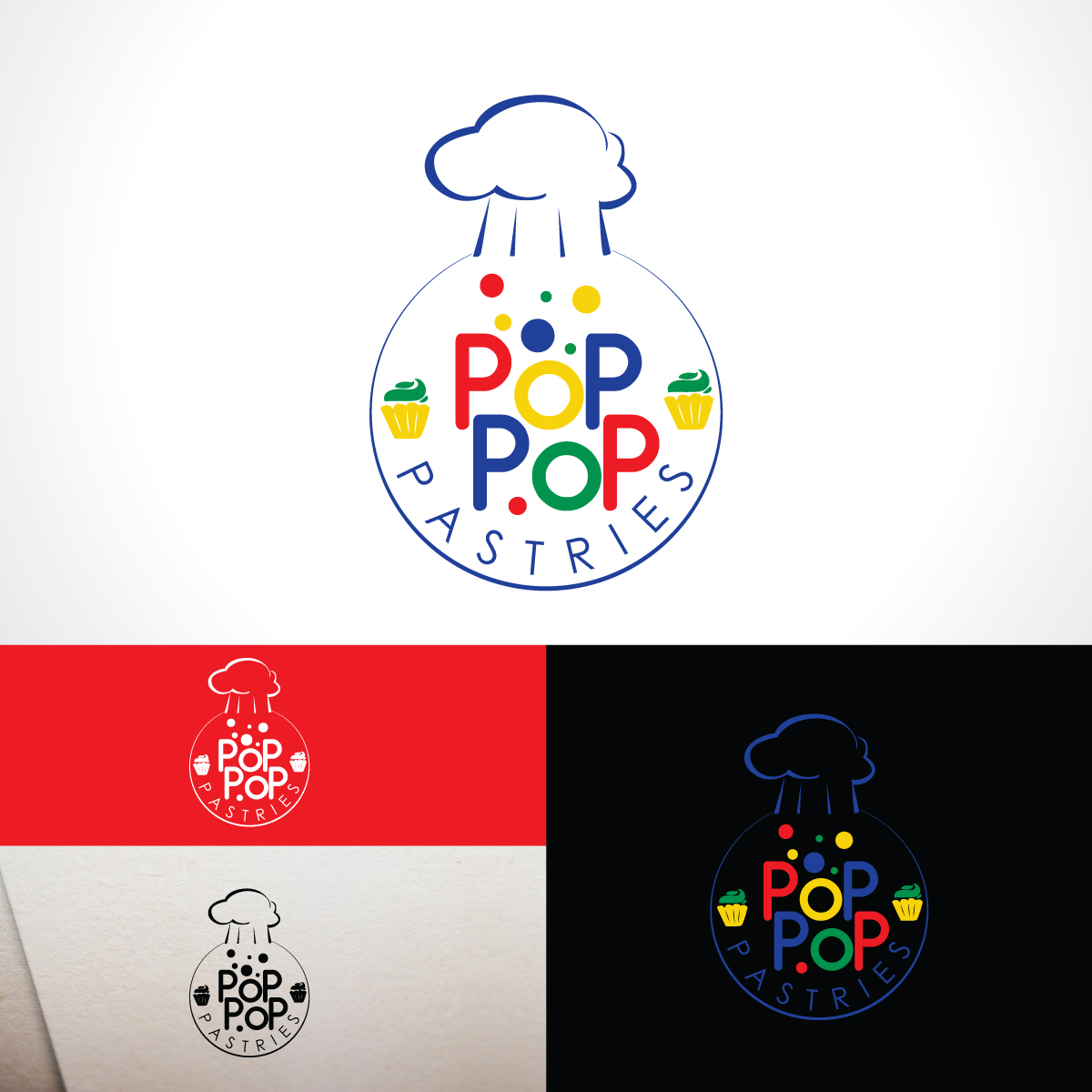
Logo for a small pastry shop and bakery in the Pacific Northwest

Want to win a job like this?
This customer received 83 logo designs from 45 designers. They chose this logo design from Kreative Fingers as the winning design.
Join for free Find Design Jobs- Guaranteed
Logo Design Brief
Logo for pastry, cake, cupcake small business. The name PoP PoP is inspired by the Fisher Price Corn Popper Toy which was the baker/chef's favorite toy as a child. She loves the bright colors and the almost cupcake like shape of the popper dome. The business is part of the Grassy Pond Farms operation and will operate out of a small commercial kitchen in the farms 1920's house being renovated as a bed and breakfast. Located in wine county in the Willamette Valley of Oregon. The chef, Bri, loves bright colors and fun flavors.
Target Market(s)
Pacific Northwest, wine country tourists, locals, guest of Grassy Pond Farms
Logo Text
PoP PoP Pastries
Logo styles of interest
Emblem Logo
Logo enclosed in a shape
Abstract Logo
Conceptual / symbolic (optional text)
Font styles to use
Colors
Colors selected by the customer to be used in the logo design:
Look and feel
Each slider illustrates characteristics of the customer's brand and the style your logo design should communicate.
Elegant
Bold
Playful
Serious
Traditional
Modern
Personable
Professional
Feminine
Masculine
Colorful
Conservative
Economical
Upmarket
Requirements
Must have
- Bright colors and use of circles/balls based on the inspiration of the fisher price corn popper toy
Nice to have
- if "by Bri" could be work in to the logo it would be cool but not necessary. Exampls: PoP PoP Pastries by Bri
Should not have
- No use of an image that too closely resembles the actual corn popper toy. It's just the item of inspiration