Apollo Pizza Logo modernization - possible color change?
Want to win a job like this?
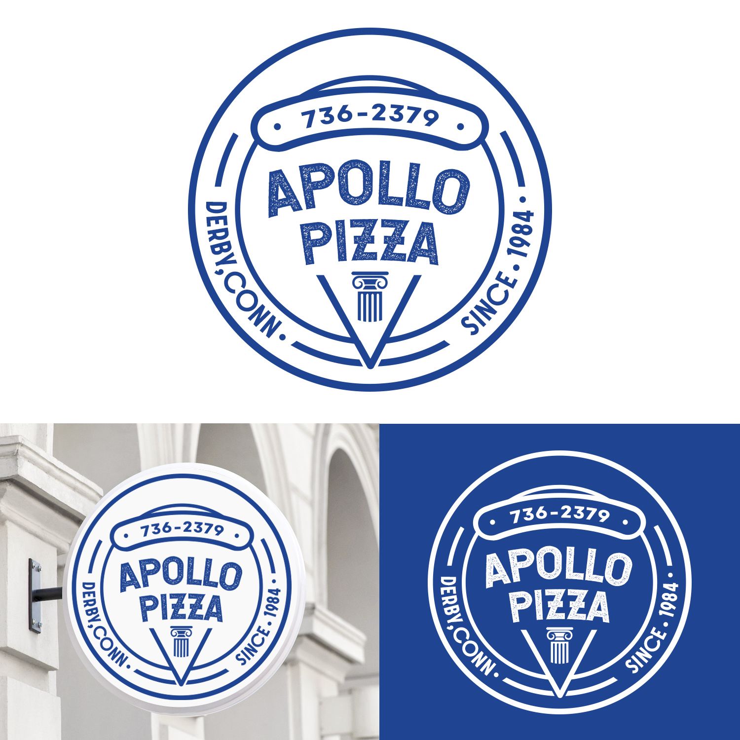
This customer received 90 logo designs from 44 designers. They chose this logo design from TSU Creations as the winning design.
Join for free Find Design Jobs- Guaranteed
-
 US$210
-
 90 designs
-
 44 designers
Logo Design Brief
Please refine what we have designed. We are asking it be modified to look a little more polished. We love our idea but we made it in MSPaint and it looks like a 10 year-old made it. We would like to stick to the idea of the words looking like an actual slice of pizza. Maybe modify "Apollo Pizza" so it's arced ? We'll give some creative liberties with the placement of the words. The color is my Dad's fave - he's Greek and this is the color of ALL THINGS GREEK. We are open to other suggestions, though. Thank you!
Target Market(s)
30-40's middle/upper-middle class - "quick bite" carryout, not full-service fine dining
Logo Text
Apollo Pizza - [incorporate the words into a pizza slice and pie somehow. Also add "Serving Since 1984" along the bottom on the left side of the circle and "Derby, Conn." on the right side. This is a re-branding of my father's 35 year-old pizza place. We are modernizing!]
Logo styles of interest
Pictorial/Combination Logo
A real-world object (optional text)
Font styles to use
Colors
Designer to choose colors to be used in the design.
Look and feel
Each slider illustrates characteristics of the customer's brand and the style your logo design should communicate.
Elegant
Bold
Playful
Serious
Traditional
Modern
Personable
Professional
Feminine
Masculine
Colorful
Conservative
Economical
Upmarket
Requirements
Must have
- a pizza theme, but be clean and eye catching
Nice to have
- Open