Fresh and Modern Chiropractic Office Logo Design
Want to win a job like this?
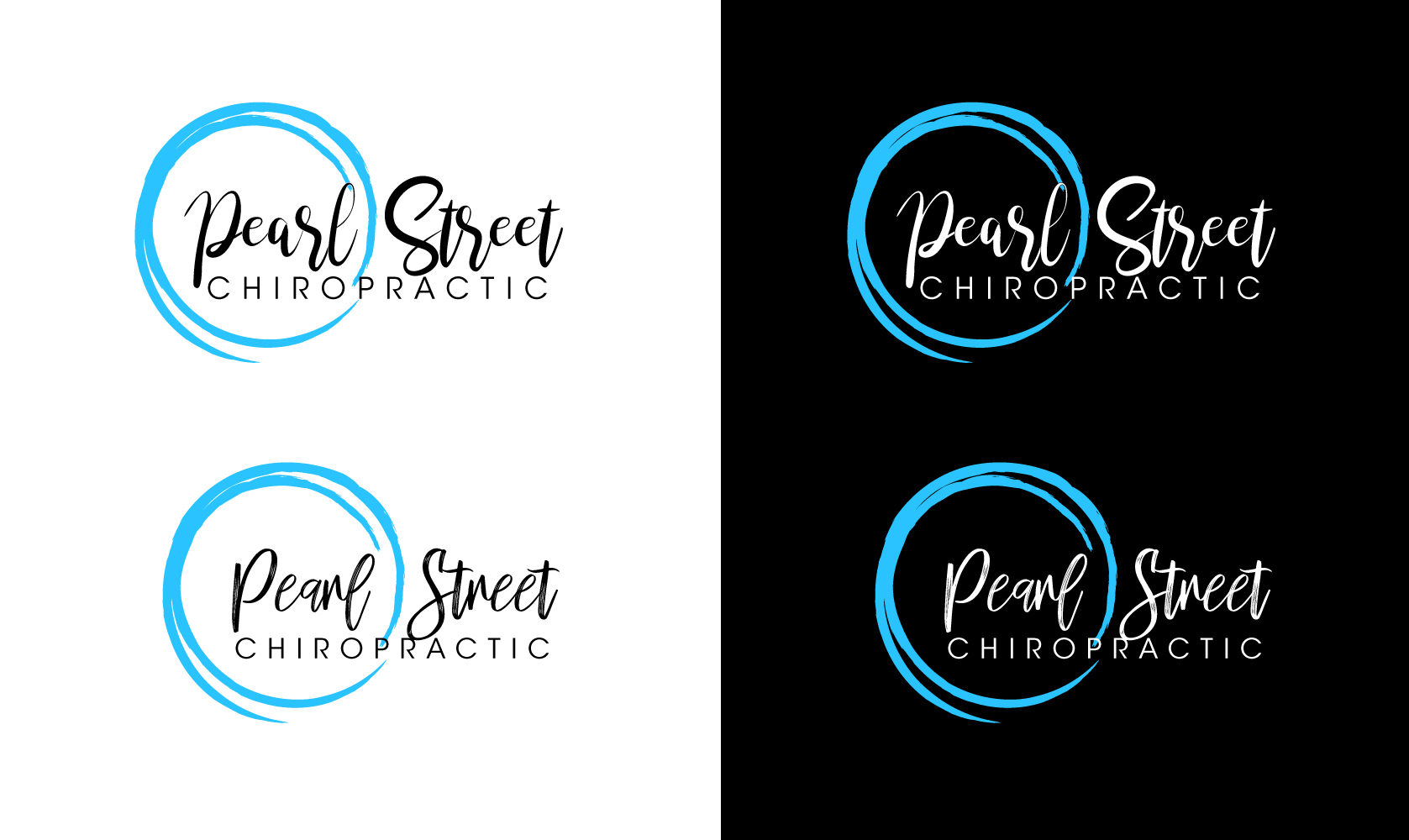
This customer received 108 logo designs from 40 designers. They chose this logo design from logograph as the winning design.
Join for free Find Design Jobs-
 US$110
-
 108 designs
-
 40 designers
Logo Design Brief
Hi there! I received a logo design and don't quite love it. I would like to keep the blue 'pearl' but remove the dot between 'pearl' and 'street' as well as experiment with the text. Our current logo is fully in a sans serif-style font. I would like to see either "Pearl Street" in a modern script with "Chiropractic" beneath it in a sans serif style font, or vice versa with sans serif-style on top and script on the bottom. I like the location of the 'pearl' tagged onto the left side, slightly overlapping (behind) the font, but I'd also like to see a design with it encompassed (I included an example of another logo that does that). Our primary color is #2AC3FF. Our target market is modern women ages 25-40 who are starting a family.
Logo Text
Pearl Street Chiropractic