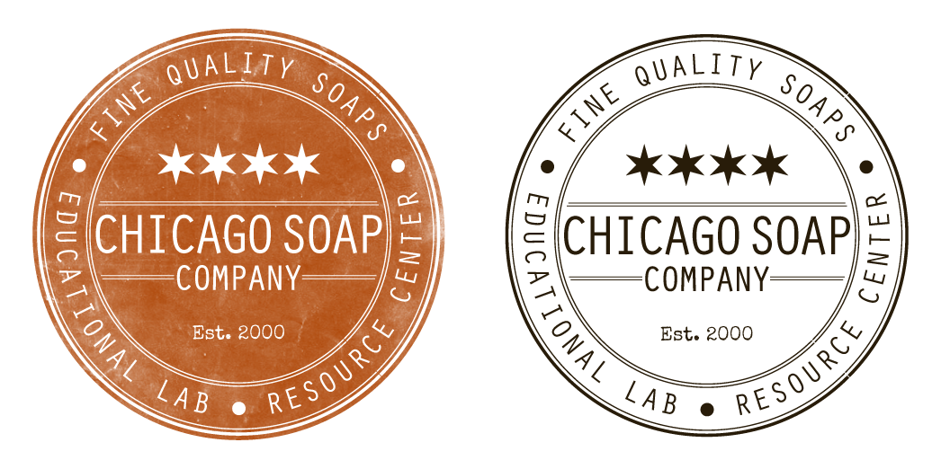
Chicago Soap Company Logo

Want to win a job like this?
This customer received 68 logo designs from 29 designers. They chose this logo design from Scott O'Toole as the winning design.
Join for free Find Design JobsLogo Design Brief
We are currently launching a new company called Chicago Soap Company that will act as a teaching facility and a resource center (were you can buy raw materials and tools to make soap). We are looking for a logo for Chicago Soap Company that has a historic, old, genuine, and industrial feel.
Updates
Project Deadline Extended
Reason: I am extending the deadline by 5 days to allow the owner to review the submitted designs and offer any feedback before choosing one. Thank you!
Added Friday, January 17, 2014
Hi everyone,
Thanks so much for your submissions. The owner will be reviewing them and giving any last feedback before we pick a winner. One thing she has commented on on multiple designs is that we would like to see the words SOAP and CHICAGO the same size. Since we are a soap company we don't want to only highlight the word CHICAGO. Ideally we would like to see Chicago and Soap the same size and larger then the word COMPANY or CO
Added Tuesday, January 21, 2014
Industry/Entity Type
Industrial
Logo Text
Chicago Soap Company OR Chicago Soap Co
Logo styles of interest
Emblem Logo
Logo enclosed in a shape
Pictorial/Combination Logo
A real-world object (optional text)
Character Logo
Logo with illustration or character
Colors
Designer to choose colors to be used in the design.
Look and feel
Each slider illustrates characteristics of the customer's brand and the style your logo design should communicate.
Elegant
Bold
Playful
Serious
Traditional
Modern
Personable
Professional
Feminine
Masculine
Colorful
Conservative
Economical
Upmarket
Requirements
Must have
- A pictorial/combination logo that the text can be separated and used on it's own if needed. The image should have an industrial feel or be illustrated.
Nice to have
- Though we make soap and bath products this logo needs to speak more towards our teaching facility and resource center.
Should not have
- We do not want this design to look cartoon-y or too childish. Some images we do not want to see are: people, tubs, bubbles or cityscapes