Climate Change Podcast Needs a Logo to Launch a Movement.
Want to win a job like this?
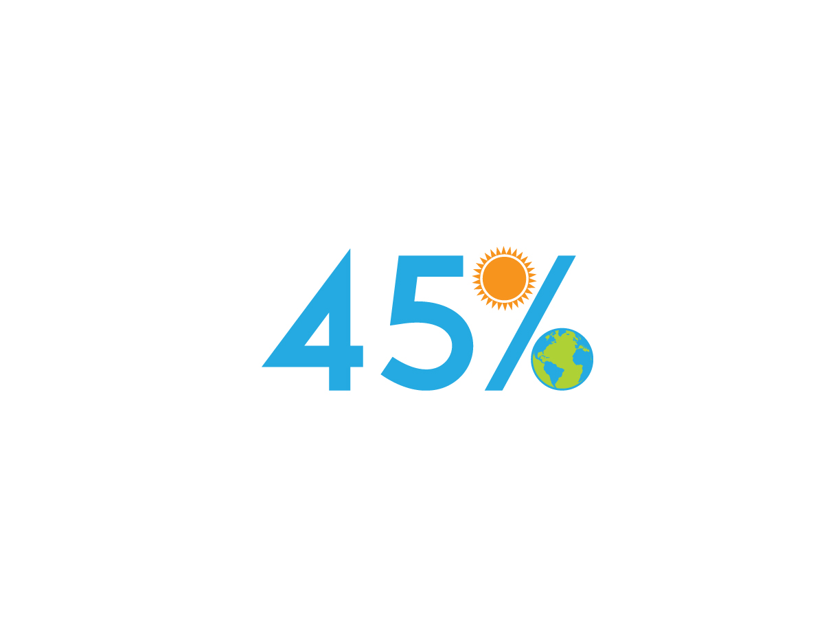
This customer received 90 logo designs from 46 designers. They chose this logo design from alex hop as the winning design.
Join for free Find Design Jobs-
 US$150
-
 90 designs
-
 46 designers
Logo Design Brief
45 % is a media campaign that challenges every household in America to reduce their carbon footprint by 45%. The challenge comes from the world’s top climate scientists, who issued a special report in 2019 that warned of a climate catastrophe if our global carbon footprint is not reduced by 40-50% before 2030. The campaign will include a website, social media accounts, a blog, and, as the centerpiece, a podcast that follows one family through the 45% challenge. The family's struggles with reducing CO2 emissions related to home energy consumption, driving, air travel, diet, and shopping habits will be followed and linked with interviews with the world experts and leaders on environmental issues.
The podcast cover art dimensions are 3000 x 3000 pixels, which is an 1:1 aspect ratio. In general, you should be using JPG or PNG files and if you're creating podcast cover art, it should have a minimum of 1400 x 1400 pixels
Target Market(s)
Young adults, 20-35
Logo Text
45%
Logo styles of interest
Abstract Logo
Conceptual / symbolic (optional text)
Font styles to use
Colors
Designer to choose colors to be used in the design.
Look and feel
Each slider illustrates characteristics of the customer's brand and the style your logo design should communicate.
Elegant
Bold
Playful
Serious
Traditional
Modern
Personable
Professional
Feminine
Masculine
Colorful
Conservative
Economical
Upmarket
Requirements
Nice to have
- You need to communicate that this is about the earth/climate/environment. The logo should be warm and eye catching. The themes to consider are the earth, households, children, family, food, transportation, carbon (or CO2), and sun. (You do not need to include all of these concepts.) You could also make use of the footprint in the design. Should work in black and white as well as color.
Should not have
- Would prefer three colors or fewer. If you use more, it would be good to have a three color alternative version. Avoid gradients or provide an non-gradient alternative.