My Awesome Aqua Design
Want to win a job like this?
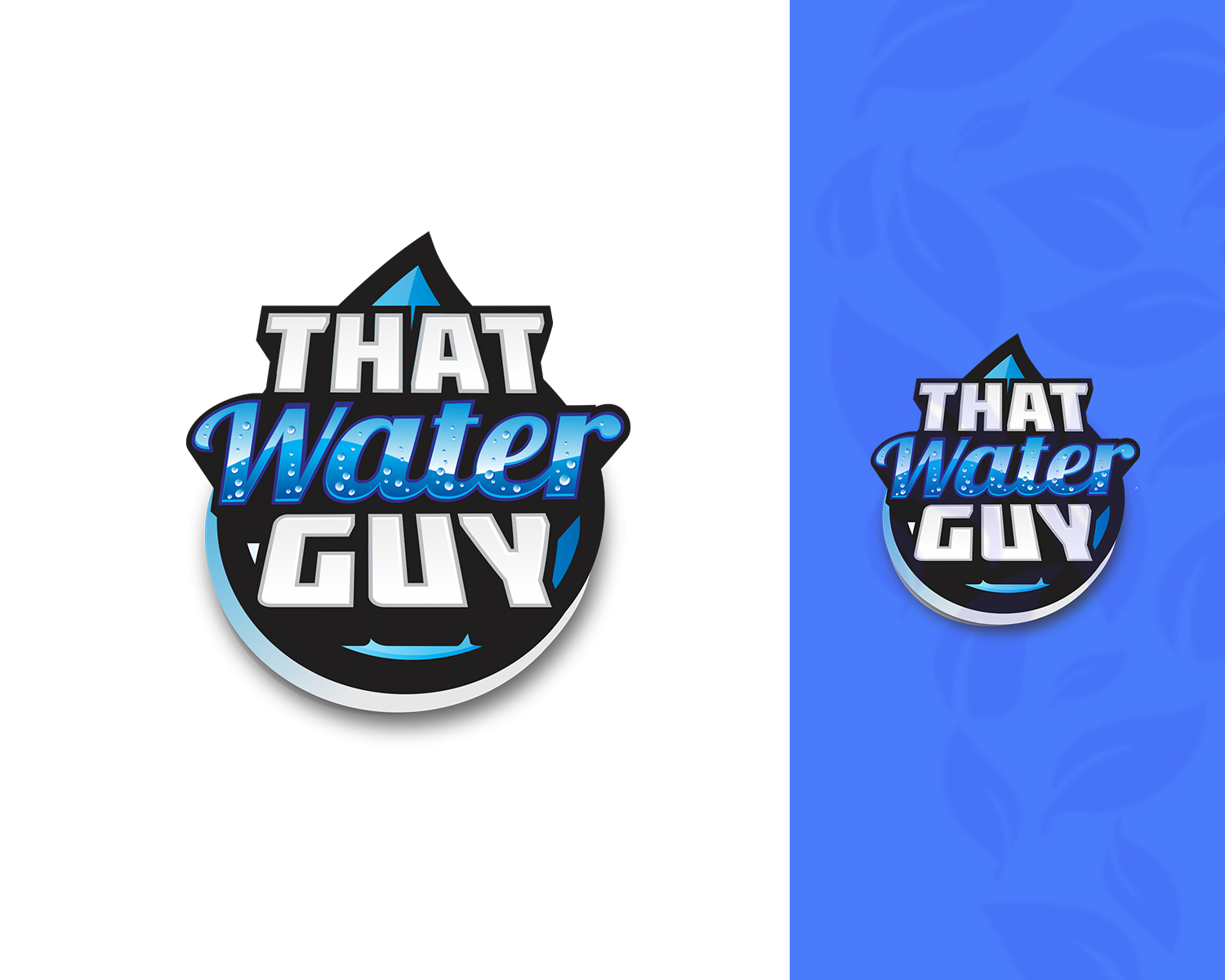
This customer received 81 logo designs from 33 designers. They chose this logo design from Djamdesign as the winning design.
Join for free Find Design Jobs-
 US$150
-
 81 designs
-
 33 designers
Logo Design Brief
Here is a video to help: http://somup.com/cYVlnJf7pZ
I want to be known as "ThatWaterGuy". I am an Independent Distributor, who helps people obtain great drinking water that will work wonders for their health. I am looking for a combination of the two logos that are in the upload files. From the "That Guy" image, I love the sizing, font and just how it's in your face with fun. For the "Kangen Water" logo, I really love the way the word "Water" was done. How it has the bubbles in the word, I love the colors used on that and how they were used. I think the green in the background makes it pop out even more but it is not mandatory to be in my logo.
So I want to combine both of those images to ultimately make the "That Water Guy" logo. Preferable with the words stacked on top of each other, like they are in both of the other logos. I want it to be fun, and I will leave it up to you to bring the creativity to make it something memorable.
Updates
The designer did not know that he was making social media banners in addition to the logo. We spent most of the time getting the logo made. now we are ready to do the banners and will need some more time
Industry/Entity Type
Water Company
Logo Text
That Water Guy
Logo styles of interest
Emblem Logo
Logo enclosed in a shape
Wordmark Logo
Word or name based logo (text only)
Font styles to use
Colors
Designer to choose colors to be used in the design.
Look and feel
Each slider illustrates characteristics of the customer's brand and the style your logo design should communicate.
Elegant
Bold
Playful
Serious
Traditional
Modern
Personable
Professional
Feminine
Masculine
Colorful
Conservative
Economical
Upmarket
Requirements
Must have
- Must say "That Logo Guy" Should be in BIG Font Letters
Nice to have
- I would love to see someone literally combine these two files and make it look great! That is ultimately what I saw in my head!
Should not have
- Thin fonts