redesign my existing logo with the new message
Want to win a job like this?
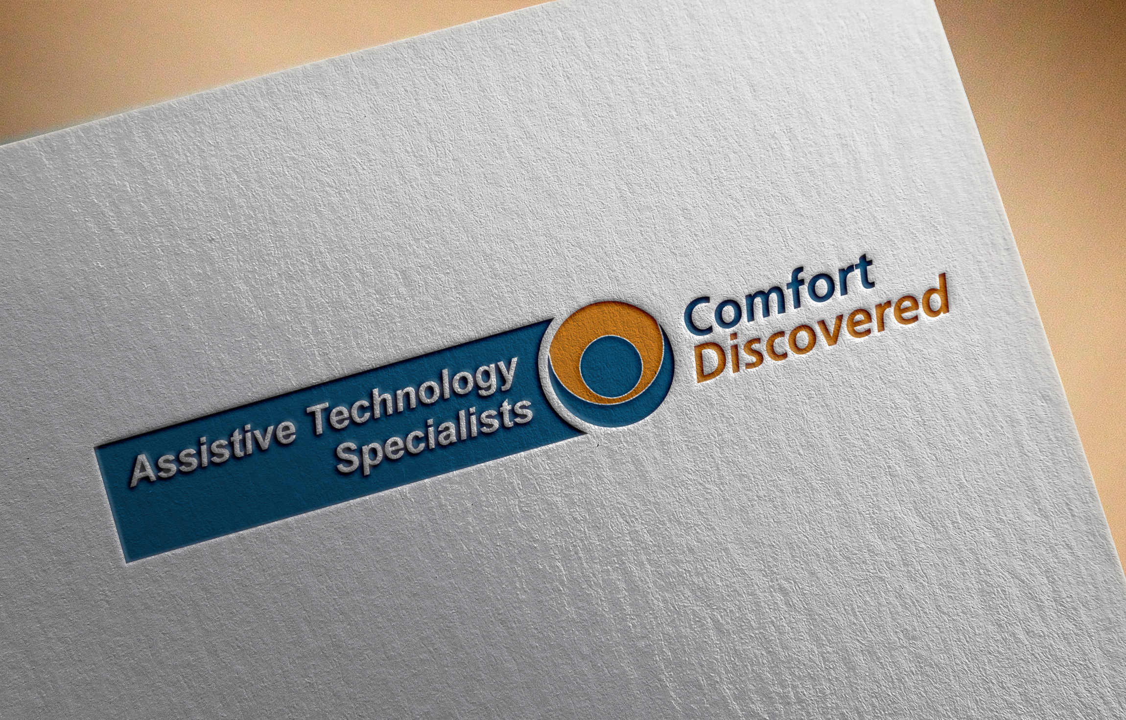
This customer received 89 stationery designs from 16 designers. They chose this stationery design from Graphic Media as the winning design.
Join for free Find Design Jobs- Guaranteed
-
 A$100
A$100
-
 89 designs
-
 16 designers
Stationery Design Brief
I need a logo redesign for an existing Sydney based business (retail and b2b ) providing independence, mobility and dignity products and services to old and people with disabilities(wheel chairs, bed, chairs, walkers etc). The logo "comfort discovered' has a great recall value and trust in the market. As part of our expansion and relocation to a new premises we have added the description "Assistive Technology Specialist" to our name. We have used this for the window graphics and the file of the window graphics is included (the are already installed).
I understand that this is like putting the cart before the horse. However I had to take a decision and finilise the window graphics due to other constraints. I therefore would like the new logo to be fitting in with the way "Assistive Technology Specialis" is being used in the window graphics. We will be using the images and messages similar to window graphics in the other marketing materials including brochures, fliers, etc. see more at www.comfortdiscovered.com
Target Market(s)
Older Australians, People with disability and their family and carers, their service providers like physios and Occupational therapists, business and corporate that is dealing with aged population providing aged care facility and disability services. Not definitely young people or young adults.
Industry/Entity Type
Retail
Logo Text
Comfort Discovered (name), Assistive Technology Specialists (description of what we do)
Look and feel
Each slider illustrates characteristics of the customer's brand and the style your logo design should communicate.
Elegant
Bold
Playful
Serious
Traditional
Modern
Personable
Professional
Feminine
Masculine
Colorful
Conservative
Economical
Upmarket
Requirements
Must have
- -Continuity with the old logo and name "Comfort discovered" its, color, font shape
-"Assistive Technology Specialists" in the same font style
-use colors that are in the logo of "Comfort Discovered"
-Easy to use in a business card, letter head, small vinyl stickers, tea shirts, email signatures
-In small print advertisements in the local publications
Nice to have
- -combine "Comfort Discovered" and "Assistive Technology Specialists" in a manner that is consistent in a way with the window graphics, or appear as flowing from the Window graphics
Should not have
- -No new symbols / variations /new colors other than those in the old logo and the window graphics
-not too broad making it difficult use on other marketing materials including small print ads.