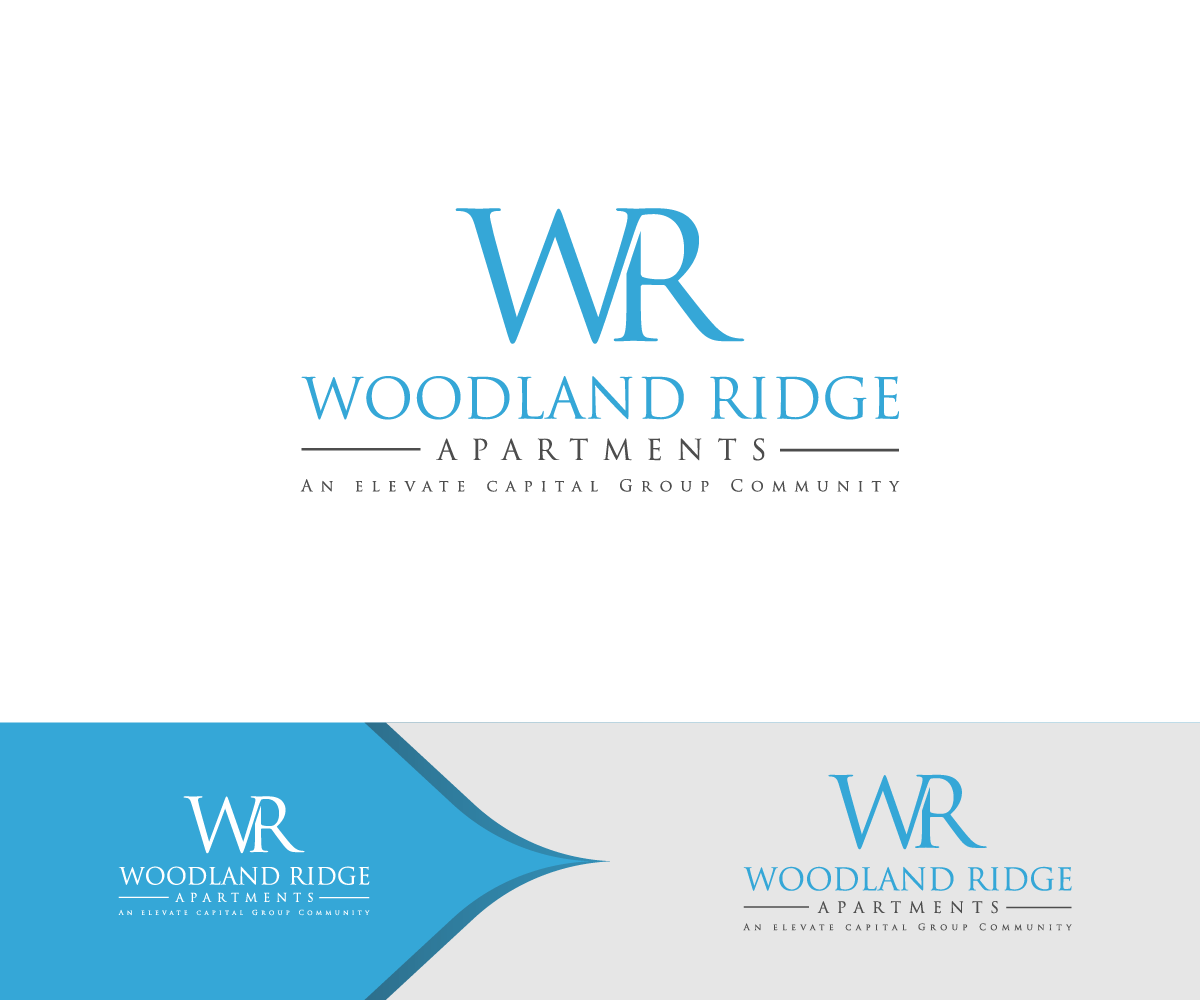
Rebranding an apartment community for a newer cleaner modern look .
Winner
Want to win a job like this?
This customer received 157 logo designs from 78 designers. They chose this logo design from NDRO as the winning design.
Join for free Find Design Jobs-
 US$150
-
 157 designs
-
 78 designers
Logo Design Brief
We need a logo for a multi family property in Fayetteville, NC. This will be used in online marketing, outdoor signage and collateral . This property was build in the 90's with a nice woods beside it. It is a mixture of men and women and a wide age groups from 25-65 year of age. The sign should be easy to read from driving by.
Target Market(s)
Age is 25-65 . The property is an older property that we are revitalizing
Logo Text
Woodland Ridge Apartments - An elevate capital Group Community
Logo styles of interest
Abstract Logo
Conceptual / symbolic (optional text)
Wordmark Logo
Word or name based logo (text only)
Lettermark Logo
Acronym or letter based logo (text only)
Font styles to use
Serif
Sans Serif
Decorative
Script
Colors
Colors selected by the customer to be used in the logo design:
35a7d7
33a6d7
86cae7
fbfdfd
ffffff
Requirements
Must have
- Blues, grey and white and black
Nice to have
- Modern clean lines if possible - Not too feminine , Easy to read , Apartments should be on the second line
Should not have
- Refrain from Reds, yellows, pinks,
Payments
1st place
US$150