Logo for natural supplements provider
Want to win a job like this?
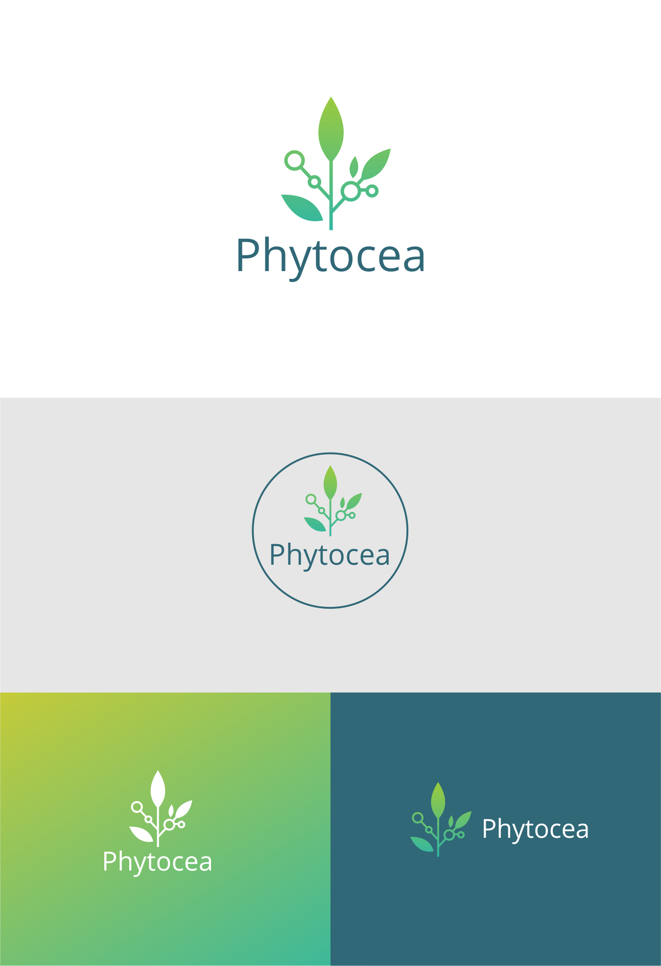
This customer received 238 logo designs from 104 designers. They chose this logo design from *mary as the winning design.
Join for free Find Design Jobs- Guaranteed
-
 €110
€110
-
 238 designs
-
 104 designers
Logo Design Brief
We need a logo for a vitamin / natural supplements brand called Phytocea based in France.
We develop advanced and complex natural supplements based on plants, minerals, vitamins and other organic products to improve the health of our customers and prevent degenerative pathologies from appearing in the long-term.
Our target audience is quite wide in terms of demographics: from 30 to 65+ y.o. so we are looking for a logo that is simple enough to talk to both young adults and senior generations.
We are looking for a minimalist and sleek logo that resonates with our core idea of combining science and nature to heal people.
Updates
Low design quality
Low design quality
Slow in providing feedback
Need extra days to review
Target Market(s)
30+ y.o. man / women looking for natural alternative to existing medical treatments for chronic pathologies or general wellbeing and preventive care
Industry/Entity Type
Healthcare
Logo Text
Phytocea
Logo styles of interest
Pictorial/Combination Logo
A real-world object (optional text)
Abstract Logo
Conceptual / symbolic (optional text)
Wordmark Logo
Word or name based logo (text only)
Font styles to use
Other font styles liked:
- we are using Basier Circle Regular and Eina for our content
Look and feel
Each slider illustrates characteristics of the customer's brand and the style your logo design should communicate.
Elegant
Bold
Playful
Serious
Traditional
Modern
Personable
Professional
Feminine
Masculine
Colorful
Conservative
Economical
Upmarket
Requirements
Must have
- 1) Must be customizable to squared format.
2) Should be reasonably small compared to the text
3) Must be able to be adjusted as a standalone logo without the full text
4) We are using currently a font named Basier Circle Regular for our website, and we also are looking at fonts like Eina, so the text with the logo should match the style of these types of fonts
Nice to have
- 1) Ok to have an animated logo
2) I like gradients so we can make use of some type of gradient within the logo
3) Our website base color is #2f6777 so we can use it within the logo (but not forced to)
Should not have
- The logo shouldn't be too literal about what we do, so we do not want any logo with flowers, or with people looking happy etc . . .
Additionally, the logo should not be specific on the type of vitamin used (e.g. no logo with pills, no logo with powder, ...)