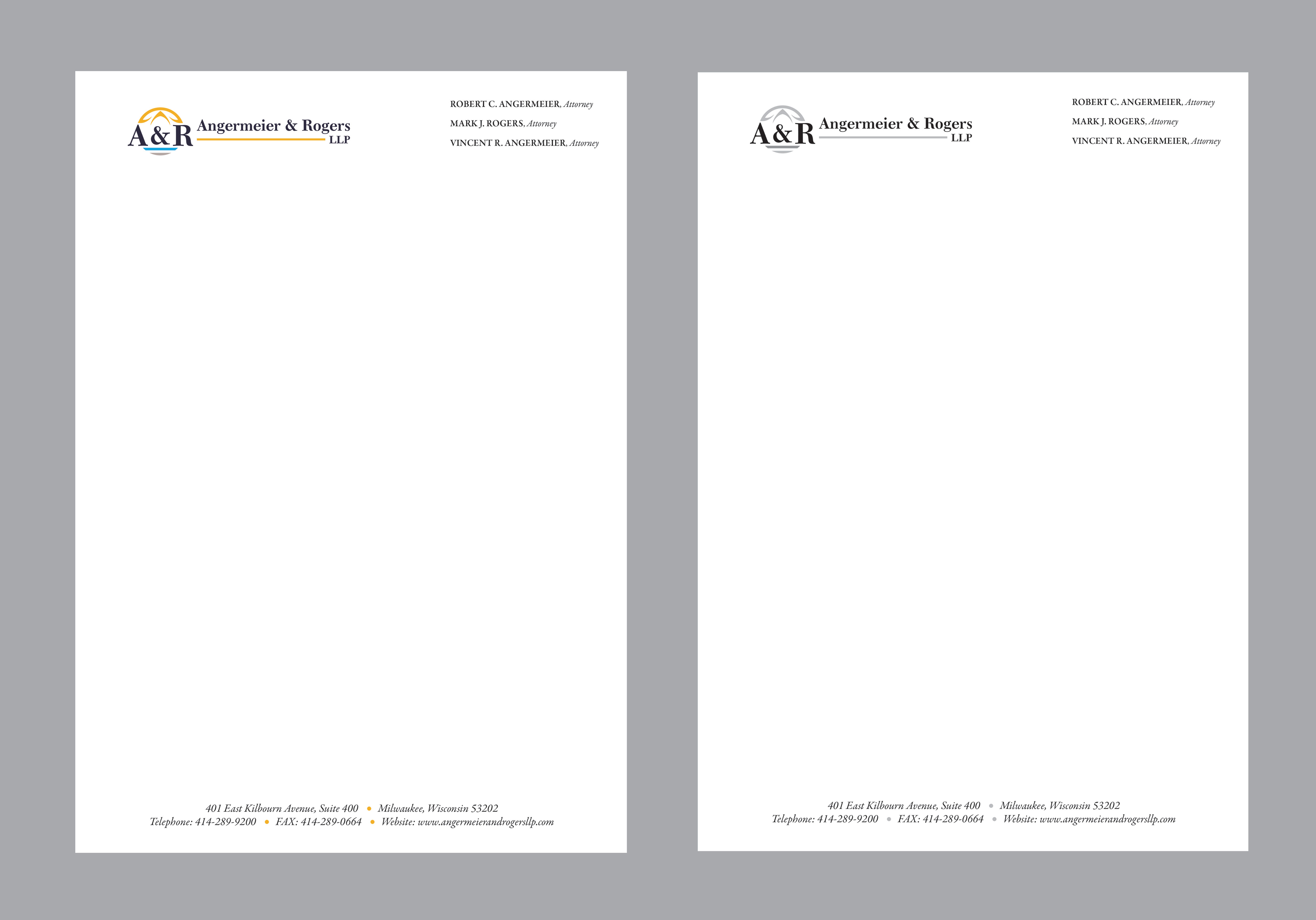
Letterhead for Midwest Law Firm
Want to win a job like this?
This customer received 64 stationery designs from 15 designers. They chose this stationery design from Creative D2024 as the winning design.
Join for free Find Design Jobs- Guaranteed
-
 US$100
-
 64 designs
-
 15 designers
Stationery Design Brief
Our law firm does estate planning and trust administration in Wisconsin and Illinois. We recently obtained a new logo and need to incorporate it into new stationary. The stationary needs to list out the attorneys at the firm, but we will want 3 variations, one with three attorneys, one with six, and one with six plus the names of states where each is licensed to practice (possibly as an asterisk with notation somewhere towards bottom of page. As with most traditional law practices, letterhead should be conservative and convey predictability and reliability. We view our brand as being primarily reliability, with prestige as a secondary element. We are upmarket, but would like to avoid seeming pretentious or "slick". We are a smaller firm with a personal touch.
Target Market(s)
Affluent Midwestern Americans approaching at or approaching retirement age.
Industry/Entity Type
Legal
Font styles to use
Look and feel
Each slider illustrates characteristics of the customer's brand and the style your logo design should communicate.
Elegant
Bold
Playful
Serious
Traditional
Modern
Personable
Professional
Feminine
Masculine
Colorful
Conservative
Economical
Upmarket
Requirements
Must have
- Must use our logo. Must comply with Wisconsin State Bar Ethics rules: https://www.wicourts.gov/courts/offices/docs/olrscr20annotated.pdf. Must be conventional. Must list names of attorneys and provide contact information for firm. Note that we are asking for three designs with very minor variations. Also, designer must provide letterhead in a format that is industry-standard for stationary printers.
Nice to have
- We would appreciate an alternate version that will look reasonable when printed on a black-and-white printer. Designer can use judgment as to whether to have use grayscale, black/white, or something in between.
Should not have
- No "motto" or "visit our website" extraneous materials. putting the website address somewhere is fine, but overall there is a lot of required text, and we'd like to not appear cluttered.