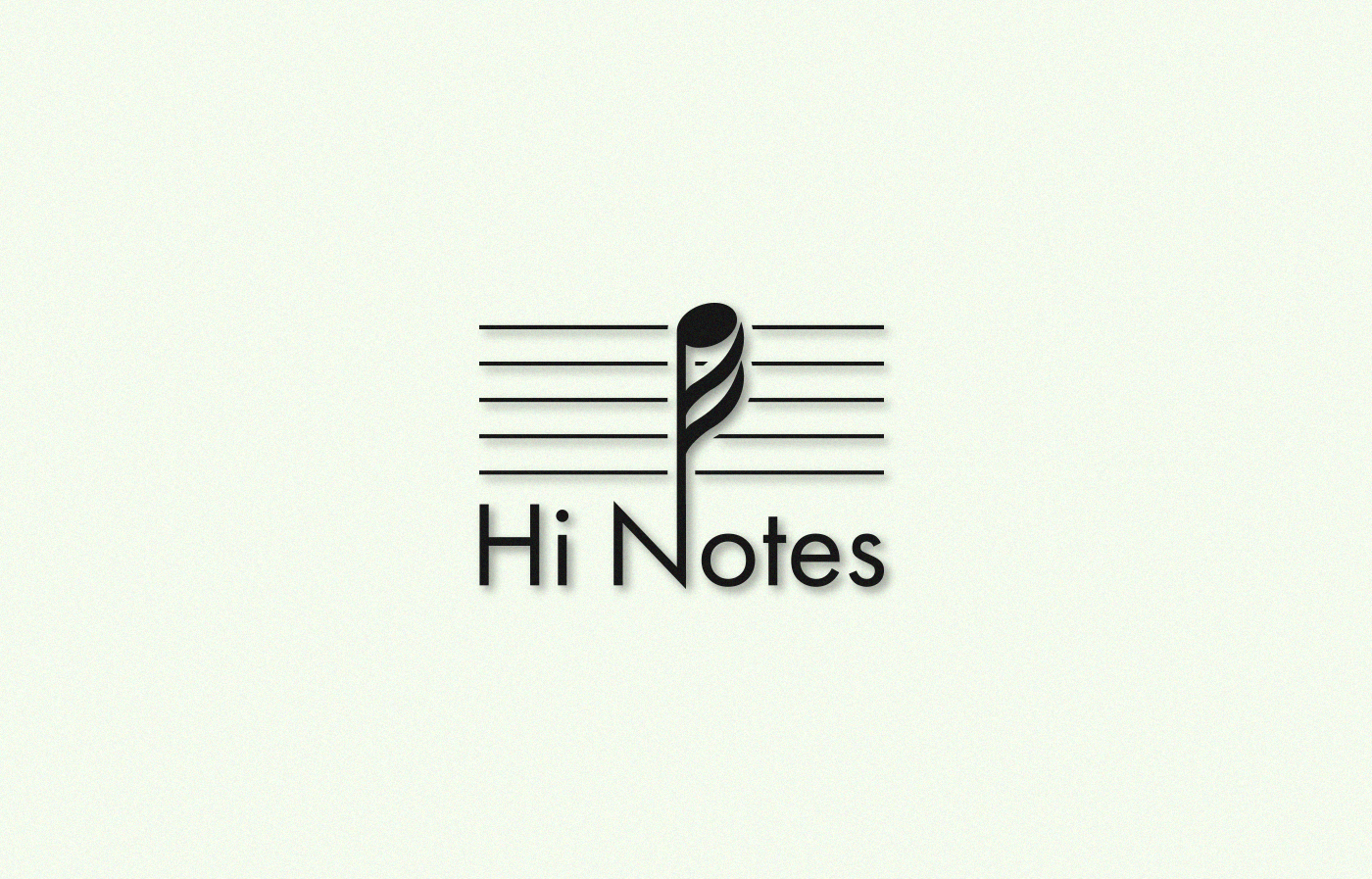
A revision of an existing logo needed.

Want to win a job like this?
This customer received 123 logo designs from 60 designers. They chose this logo design from dolisnk.de as the winning design.
Join for free Find Design Jobs- Guaranteed
Logo Design Brief
Hi Notes was a successful audio business located in the Southern region of the United States from the dates 1995 to 1999. The business is going to be revived this year. The logo was originally designed in 1995 and is in need of an update. I would like to pay homage to the existing design but also have something fresh and modern. Attached is the original logo, in very low resolution, found on the Wayback web search engine. The colors should be at your desire but have an excellent presence on a white background.
Target Market(s)
Audiophiles from all over the world. These are typically middle-aged or older men with a large disposable income.
Logo Text
Hi Notes
Logo styles of interest
Pictorial/Combination Logo
A real-world object (optional text)
Character Logo
Logo with illustration or character
Font styles to use
Look and feel
Each slider illustrates characteristics of the customer's brand and the style your logo design should communicate.
Elegant
Bold
Playful
Serious
Traditional
Modern
Personable
Professional
Feminine
Masculine
Colorful
Conservative
Economical
Upmarket
Requirements
Must have
- One clarification, the name Hi Notes is taking from the "high notes" above the musical staff. Any design should feature a high note and not a low note.
Nice to have
- I liked the suggestion of "high notes" on the original logo but did not like the deco font. The new logo should have a new font that would look good on the internet against a white background.
Should not have
- It should not be busy or difficult to read.