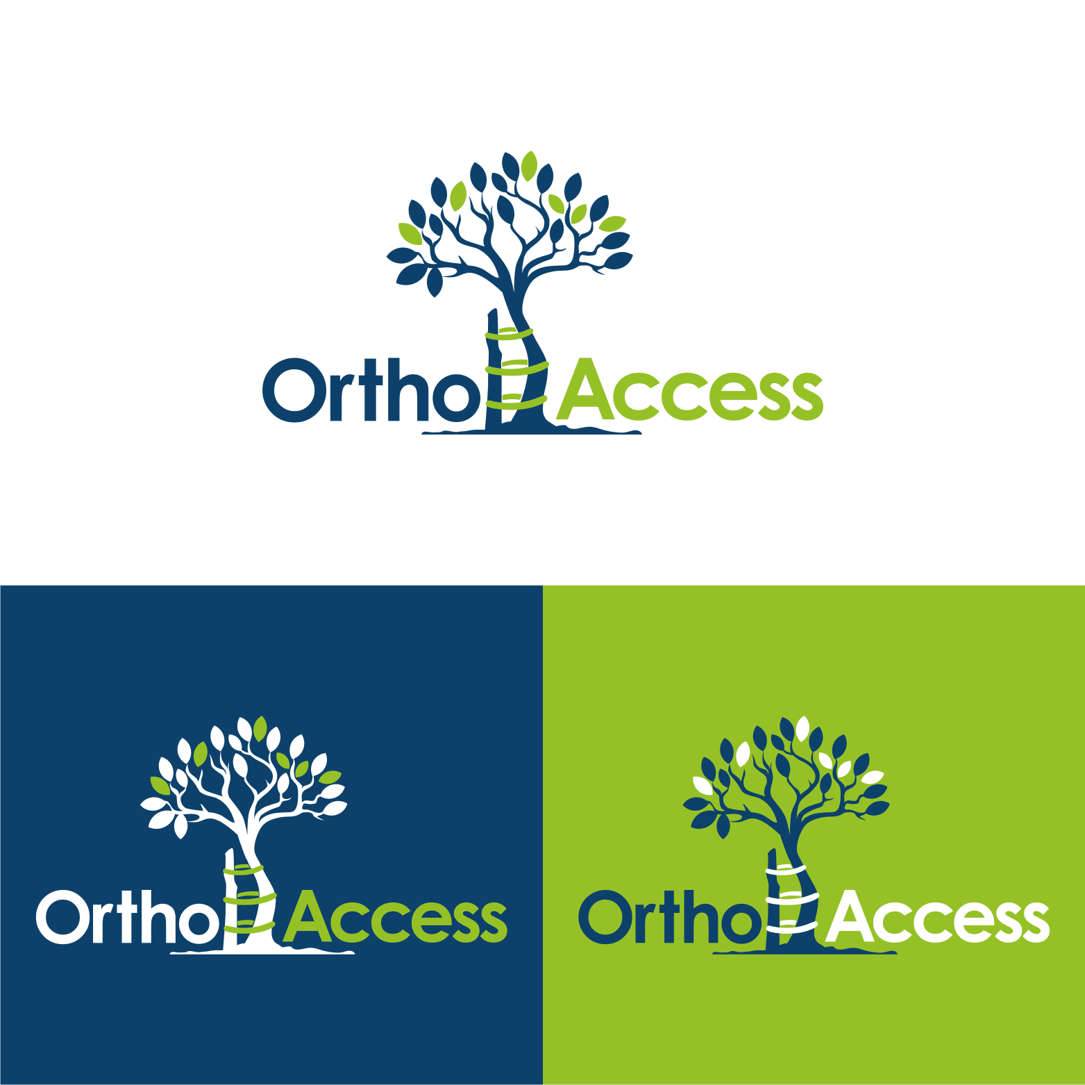
Logo design for non-profit organisation - OrthoAccess
Want to win a job like this?
This customer received 186 logo designs from 75 designers. They chose this logo design from rangga as the winning design.
Join for free Find Design Jobs- Guaranteed
-
 £190
£190
-
 186 designs
-
 75 designers
Logo Design Brief
OrthoAccess is a not-for-profit initiative launched by the AO Alliance as an integrated and practical response to the lack of affordable quality orthopaedic trauma implants needed to treat broken bones. We provide an online platform dedicated to providing orthopaedic trauma implants (plates, screws, nails, fixators, wires) to poor countries in sub-Saharan Africa. The platform will efficiently bring together the demand (patients who break their bones, surgeons who fix them) and supply side (companies that produce the metal implants that are used to fixed the broken bones) through efficient supply chain management, funders, governments, and stakeholders.
Updates
Slow in providing feedback
Target Market(s)
Sub-Saharan African countries, public hospitals, government employees including health ministers, health care practitioners
Logo Text
OrthoAccess
Logo styles of interest
Abstract Logo
Conceptual / symbolic (optional text)
Wordmark Logo
Word or name based logo (text only)
Font styles to use
Colors
Colors selected by the customer to be used in the logo design:
Look and feel
Each slider illustrates characteristics of the customer's brand and the style your logo design should communicate.
Elegant
Bold
Playful
Serious
Traditional
Modern
Personable
Professional
Feminine
Masculine
Colorful
Conservative
Economical
Upmarket
Requirements
Must have
- The Tree of Andry – historical symbol of orthopaedic surgery (fixing bones). See below
Nice to have
- the colours blue and green. See the AO Alliance logo. Symbol to signify access or availability of access.
Should not have
- appear commercial. Logo should be conservative and reflect the nature of our not-for-profit status and philosophy.