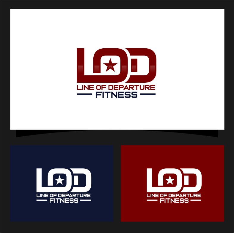
Line of Departure Fitness - Military based fitness Training
Winner
Want to win a job like this?
This customer received 53 logo designs from 20 designers. They chose this logo design from mhaxx8 as the winning design.
Join for free Find Design Jobs-
 US$210
-
 53 designs
-
 20 designers
Logo Design Brief
We are a virtual fitness company for people interested in joining the military. The staff is also primarily ex-military (mostly Marine Corps). The line of departure is a tactical term that means "the point in the operation where movement becomes maneuver." We get people up to the LOD and they cross it. Hope thats enough!
Target Market(s)
Men and Women 18-30
Industry/Entity Type
Fitness/ Military
Logo Text
Line of Departure Fitness or LOD Fitness
Logo styles of interest
Emblem Logo
Logo enclosed in a shape
Font styles to use
Sans Serif
Colors
Colors selected by the customer to be used in the logo design:
0054AA
0677BA
7BADD7
CADEEF
E8F1F8
EB3D1F
EC4F4E
F09395
F8D3D4
FCEDEE
Look and feel
Each slider illustrates characteristics of the customer's brand and the style your logo design should communicate.
Elegant
Bold
Playful
Serious
Traditional
Modern
Personable
Professional
Feminine
Masculine
Colorful
Conservative
Economical
Upmarket
Requirements
Must have
- must have "LOD" or "Line of Departure" in it
Nice to have
- unique look to distinguish from competition
Should not have
- profanity
Files
PNG
70922076_padded_logo
Tuesday, September 7, 2021
Payments
1st place
US$110
2nd place
US$100