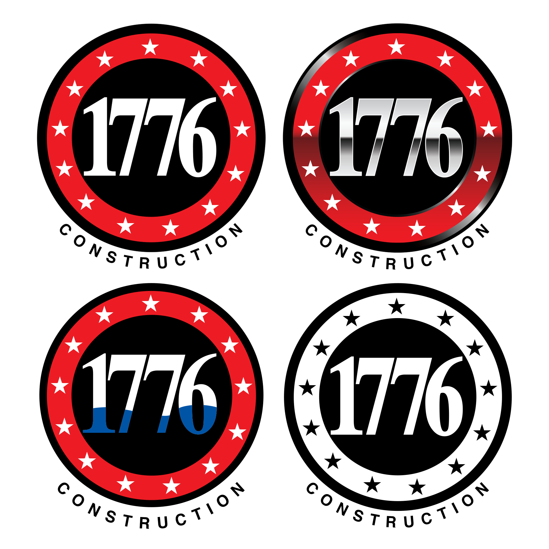
"1776 Construction" Logo Design in Circular form with 13 Stars like the 1776 American Flag
Want to win a job like this?
This customer received 203 logo designs from 73 designers. They chose this logo design from Dennis Jackson Design as the winning design.
Join for free Find Design Jobs- Guaranteed
-
 US$650
-
 203 designs
-
 73 designers
Logo Design Brief
I need a logo for my LLC. The name is 1776 Construction, but I want to use just "1776" in the "logo" portion because I have a lot of different companies and would like 1776 to be the blanket for all of them. Meaning it could be 1776 Design, 1776 Real Estate, etc. I would like it to have 13 stars incorporated around the circle of numbers, to represent the 1776 American Flag. Colors red, black & white are what a prefer. A touch of blue is ok but I don't want it to be over the top American themed.
Target Market(s)
Home buyers, people wanting construction work & other builders
Industry/Entity Type
Construction. I would like it to have a more modern feel than rustic construction feel, or at least a balance of the two. I like the idea of it looking tough and modern, not feminine.
Logo Text
"1776" in the actual Logo, in a circular form surrounded by 13 stars and "Construction" underneath
Logo styles of interest
Emblem Logo
Logo enclosed in a shape
Pictorial/Combination Logo
A real-world object (optional text)
Lettermark Logo
Acronym or letter based logo (text only)
Font styles to use
Other font styles liked:
- Nothing feminine. I actually want the numbers to be custom designed to make a circular shape that the 13 stars can surround, like the original American flag.
Colors
Colors selected by the customer to be used in the logo design:
Look and feel
Each slider illustrates characteristics of the customer's brand and the style your logo design should communicate.
Elegant
Bold
Playful
Serious
Traditional
Modern
Personable
Professional
Feminine
Masculine
Colorful
Conservative
Economical
Upmarket
Requirements
Must have
- 1776 in the form of a circle with 13 stars, like the original American Flag. Red, Black & White colors. A little bit of blue is ok. I prefer the numbers "1776" are what forms the circle, like they are squished or mashed together. I don't just want 1776 in a staright line with the 13 stars forming the circle. I think it would look unique if the stars kind of look like they are intruding on the edges of the numbers 1776
Nice to have
- I would like to see something fresh, modern and catchy. When people see it, I want them to think, I wish I thought of that!
Should not have
- "Construction" should not be in the circle with the stars because I will be using the 1776 logo for other companies also. It can be at the bottom or where you feel it would look good. But I will crop it and switch it for my other companies I plan on forming in the future. Please do not make it over-the-top American themed. The numbers and stars are enough. I would like to keep the rest subtle in regards to the USA theme.