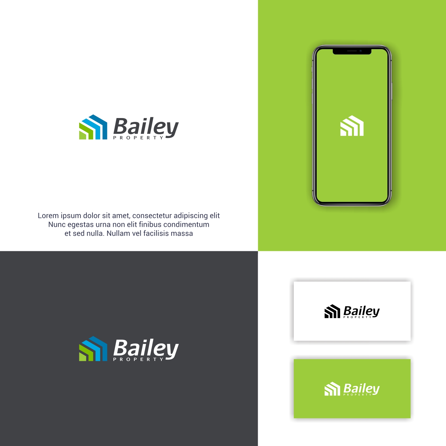
Real Estate Agency Tweak to Current Logo

Want to win a job like this?
This customer received 186 logo designs from 83 designers. They chose this logo design from COBU as the winning design.
Join for free Find Design Jobs- Guaranteed
Logo Design Brief
We are a residential real estate agency based in South Australia, currently we have two different brand identities (Property Group was originally created for our sales arm of the business to complement our original Property Management brand).
We have a strong brand identity within our local market (especially the green) so we are wanting to keep a similar look, feel and color schemes, but our aim is to combine the two identities into one under the name Bailey Property.
Happy to have 'Sales + Property Management' in the logo but it is not a necessity.
Industry/Entity Type
Real Estate
Logo Text
Bailey Property
Font styles to use
Other font styles liked:
- Aurulent Sans
Colors
Designer to choose colors to be used in the design.
Look and feel
Each slider illustrates characteristics of the customer's brand and the style your logo design should communicate.
Elegant
Bold
Playful
Serious
Traditional
Modern
Personable
Professional
Feminine
Masculine
Colorful
Conservative
Economical
Upmarket
Requirements
Must have
- Incorporate our current brand colors plus have a similar look and feel to our current branding. We don't want to be starting from scratch.