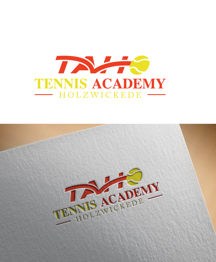
TaHo - Tennisacademy - Logo for a tennis school with a claim
Winner

Want to win a job like this?
This customer received 39 logo designs from 28 designers. They chose this logo design from Myartstyle as the winning design.
Join for free Find Design JobsLogo Design Brief
Logo for a tennis academy. It should express that playing tennis is fun, fast and instructive.
Target Market(s)
tennis players and beginners
Logo Text
Tennis Academy
Font styles to use
Serif
Colors
Colors selected by the customer to be used in the logo design:
FFF300
FFF600
FEFA6F
FFFEC7
FFFEE8
EB3D1F
EC4F4E
F09395
F8D3D4
FCEDEE
Look and feel
Each slider illustrates characteristics of the customer's brand and the style your logo design should communicate.
Elegant
Bold
Playful
Serious
Traditional
Modern
Personable
Professional
Feminine
Masculine
Colorful
Conservative
Economical
Upmarket
Requirements
Nice to have
- Tennis ball, wings... Claim: play tennis better
Files
JPG
0420bc68-862f-4503-af90-0afa55a5918f
Thursday, February 10, 2022
Payments
1st place
€80