Youth Program Logo Design
Want to win a job like this?
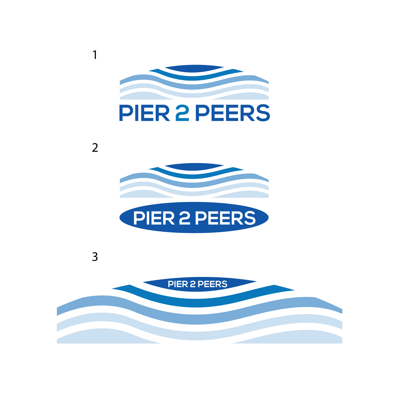
This customer received 132 logo designs from 57 designers. They chose this logo design from geni as the winning design.
Join for free Find Design Jobs- Guaranteed
-
 US$150
-
 132 designs
-
 57 designers
Logo Design Brief
Horizontal simple and modern looking logo suggesting waves and possibly a bridge (see attached examples of good ideas). Logo is for a youth mentorship program that fosters peer and intergenerational engagement.
Updates
Need extra days to review
Target Market(s)
Late Gen Z - Mid Millennials (18-35 yr olds)
Industry/Entity Type
Non profit, community youth programs
Logo Text
Pier 2 Peers, Pier to Peers
Logo styles of interest
Pictorial/Combination Logo
A real-world object (optional text)
Abstract Logo
Conceptual / symbolic (optional text)
Wordmark Logo
Word or name based logo (text only)
Lettermark Logo
Acronym or letter based logo (text only)
Font styles to use
Colors
Colors selected by the customer to be used in the logo design:
Look and feel
Each slider illustrates characteristics of the customer's brand and the style your logo design should communicate.
Elegant
Bold
Playful
Serious
Traditional
Modern
Personable
Professional
Feminine
Masculine
Colorful
Conservative
Economical
Upmarket
Requirements
Must have
- The name of the project, must be horizontal, must have some kind of water/wave reference.
Nice to have
- Text should ideally be some type of block letters connecting to any of the other imagery used such as some type of bridge formation related to the water/waves. Could be in a squared or rectangular formation.
Should not have
- No representations of people at all! No kids, no people holding hands in a circle. No representations of the planet.