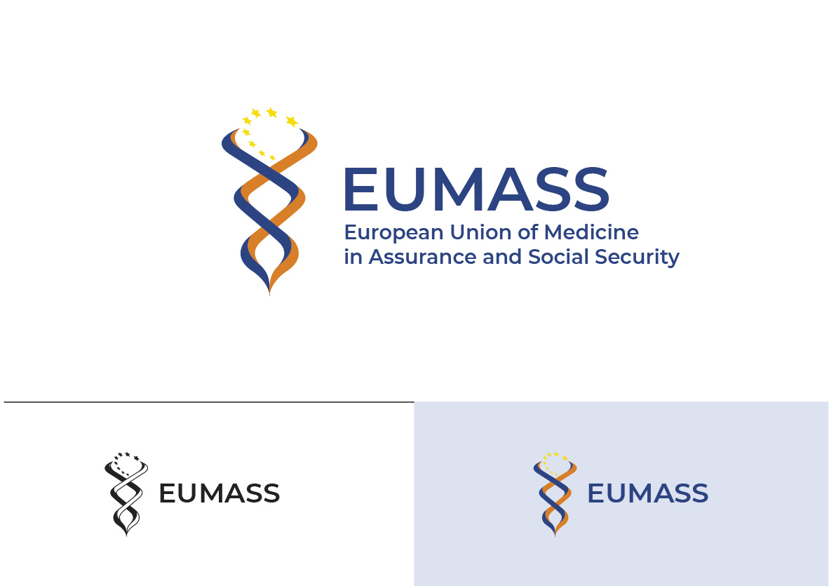
EUMASS MEDICAL SCIENTIFIC FEDERATION

Want to win a job like this?
This customer received 46 logo designs from 31 designers. They chose this logo design from MilM as the winning design.
Join for free Find Design JobsLogo Design Brief
On the occasion of our 50th anniversary, we want to change our logo to a more modern design. We are a European (wider than the European Community) scientific association of insurance physicians (www.eumass.eu)., a federation that regroups professional associations in 21 countries. Ervery two years we are organising a large scientific congress (> 800 participants) in one of our member states.
The new logo would preferably use the existing colors of the logo and should show the European connection. Must also be easily recognizable when printed in black and white. Modern.
'EUMASS' must appear in the logo.
Updates
the logo: European, federation, social security, quality, medical, expertise,
Added Thursday, May 12, 2022
Target Market(s)
insurance physicians and collaborators, universities, social security organisations
Industry/Entity Type
scientific organisation
Logo Text
EUMASS
Logo styles of interest
Pictorial/Combination Logo
A real-world object (optional text)
Abstract Logo
Conceptual / symbolic (optional text)
Look and feel
Each slider illustrates characteristics of the customer's brand and the style your logo design should communicate.
Elegant
Bold
Playful
Serious
Traditional
Modern
Personable
Professional
Feminine
Masculine
Colorful
Conservative
Economical
Upmarket
Requirements
Must have
- recognizable and European connection, for example by stars as in European flag or inspired by peristylium European council, ...
Nice to have
- The new logo would preferably use the existing colors of the logo and should show the European connection. Must also be easily recognizable when printed in black and white.