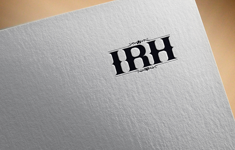
Iron Rings Holdings (General Branding Logo)
Want to win a job like this?
This customer received 73 logo designs from 30 designers. They chose this logo design from NewtonGain as the winning design.
Join for free Find Design Jobs-
 US$150
-
 73 designs
-
 30 designers
Logo Design Brief
We need to create a logo for our Parent Company. There are several companies that fall under this umbrella. We want a logo that is clean and simple and yet has an organic feel to it. Think of some of the iron work you see in the iron gates in Europe. The small detail you would see in fine China or the stamp you would see on the back fine silverware/stemware. Maybe a play off the Celtic knot would be interesting. Or the simple designs of the iron branding on cattle.
Industry/Entity Type
Iron Rings is a family office. We own and invest in hotels, residential property including hotel and Build for Rent, Finance , Whiskey, Textiles, Co-working space, aviation and land. Although we are not as large as other well known family foundations like the Bill & Melinda Gates Foundation, Rockefeller Foundation , we do have an initiative for charitable initiatives. Both of the logos from these two Foundations highlight the simplicity that we are looking for in our Iron Rings Holdings logo.
Logo Text
I.R.H. Periods are not necessary.
Font styles to use
Look and feel
Each slider illustrates characteristics of the customer's brand and the style your logo design should communicate.
Elegant
Bold
Playful
Serious
Traditional
Modern
Personable
Professional
Feminine
Masculine
Colorful
Conservative
Economical
Upmarket
Requirements
Must have
- I R H in logo
Nice to have
- Please ensure that the logo will still look good in black and white so that it photocopies well and printed as letterhead and other documents without it having to be printed in a color for it to be recognized.
Should not have
- It is very tempting to play on the basic iron, metal look. But we would like to see more creativity than just basic metal rings or logos that would remind someone of Harley Davidson or the Audi car symbol.