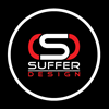
Georgia Dental Lab Logo with ATL in the design
Add your question or comments below
Not what I'm looking for. Sorry
Sorry. Not what I'm looking for.
Dear Project Owner,
I have submitted my logo design (#29456156, #29455469) for your project.
Please provide your comments, messages, and ratings (only if 3 stars and above) to contact for ideas, fonts, colors, etc. as well as changes and resubmissions if necessary.
We do not accept feedback, messages and ratings on our designs from some designer customers/project owners/design crowd teams where we are interested in communicating with them about our work.
Please leave feedback, messages and ratings about our work (3 stars or more only).
Thank you

Your feedback on #29455741 would be greatly appreciated

Looking forward to your valuable feedback, Thank you!
Can you flip the state back to the previous vertical orientation and leave the words in that same horizontal please.
getting closer. Move the words over to the left so that they complete the outline of the state on the right side and so that the ATL lines up straight up and down please.
You're going the wrong direction. This is not that difficult. Go back to the design that I declared the winner and using that exact same font line up the words Georgia Dental Lab in such a way that the ATL is perfectly vertical and use the new doubled border for the state shape.
#2 is aligned correctly. Now go back to the original font please.
-
 Previous page
- 1
- You're on page 2
- Page 2 of 2
-
 Next page
11 - 19 of 19 comments