Community Improvement logo design
Want to win a job like this?
This customer received 9 logo designs from 4 designers. They chose this logo design from Franabanana as the winning design.
Join for free Find Design Jobs-
 US$110
-
 9 designs
-
 4 designers
Logo Design Brief
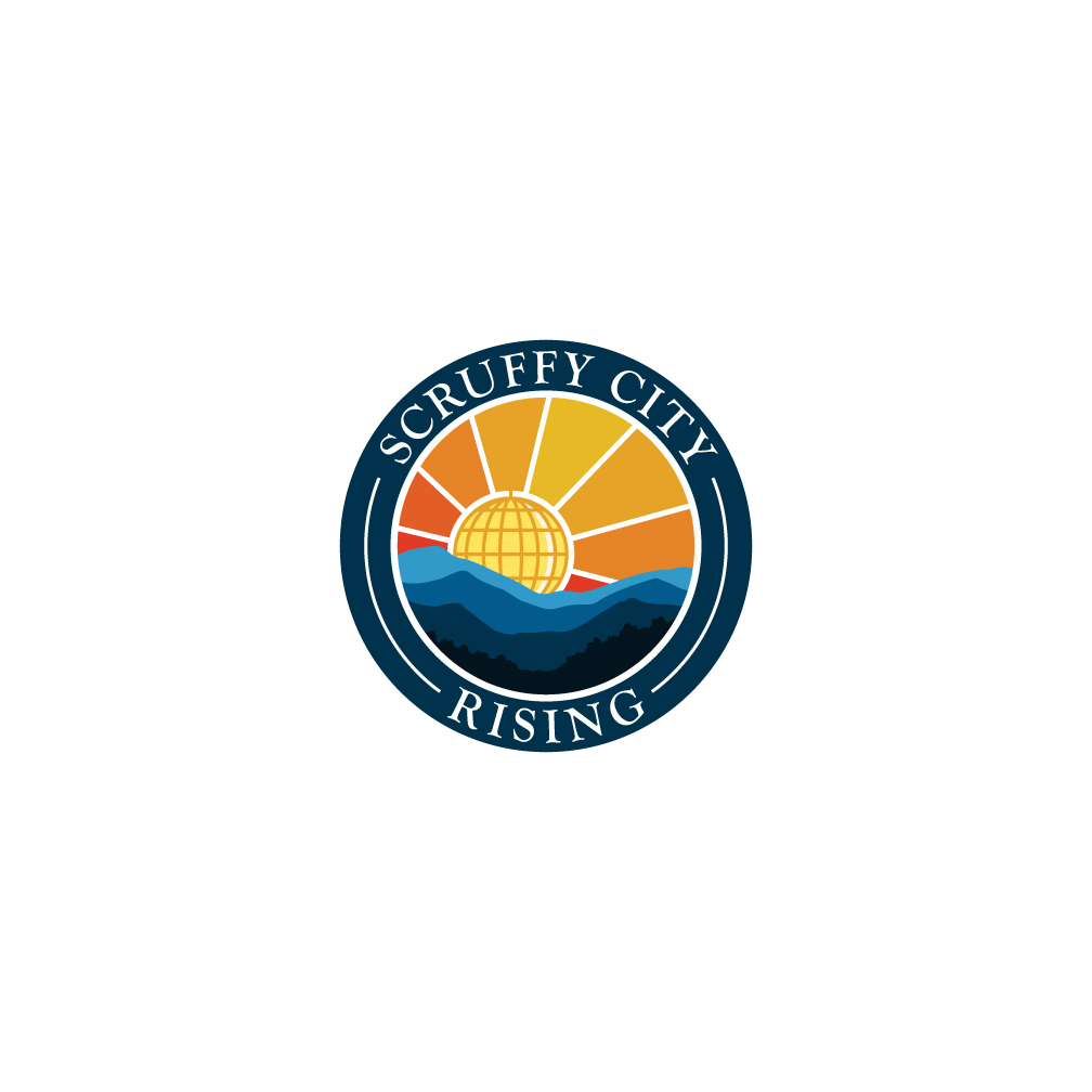
The business name is “Scruffy City Rising” and will be associated with home services/improvements, and the betterment of the community. Images in the PDF are seed ideas for your creativity that tie together (A) Knoxville’s skyline fixture (called the Sunsphere) and (B) its nickname “Scruffy City” with (C) its place in the foothills of the Smoky Mountains. (1) DO NOT USE THESE COPYRIGHTED IMAGES. (2) BONUS POINTS FOR IGNORING MY ADVICE WITH A CREATIVE IMPROVEMENT. Since this logo will serve as a parent company for several different home services, likely best NOT to incorporate hammers, etc. Looking for more of a general Knoxville-themed identity.
Logo Text
Scruffy City Rising
Logo styles of interest
Emblem Logo
Logo enclosed in a shape
Pictorial/Combination Logo
A real-world object (optional text)
Font styles to use
Look and feel
Each slider illustrates characteristics of the customer's brand and the style your logo design should communicate.