

 Refresh
Redesign of key pages of website
Want to win a job like this?
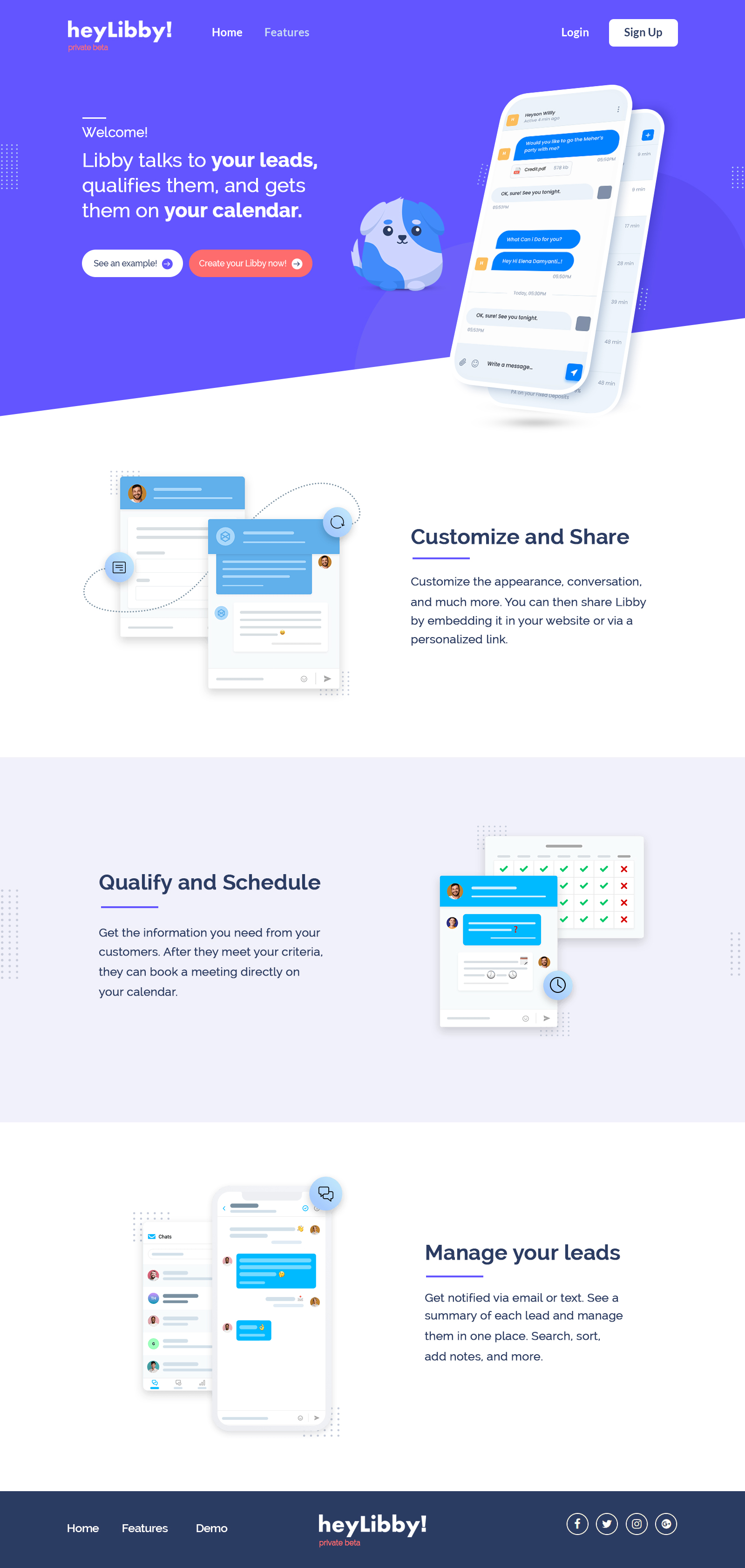
This customer received 83 web designs from 9 designers. They chose this web design from Shijo John as the winning design.
Join for free Find Design Jobs
- Guaranteed
-
 US$380
-
 83 designs
-
 9 designers
Web Design Brief
We have a website in development: (You can see the test version here: https://development.heylibby.ai) We want a redesign of a) the home page, b) the set up screens (all four steps), c) the account home page, and the chat page (all four linked below). It needs to look amazing in both desktop and mobile. Also, the chat page needs to have a few different versions to give people a choice between them.
Four areas:
1) Home page: https://development.heylibby.ai/
2) Account pages: https://development.heylibby.ai/account/chatsettings.php?step=1
3) Account home page (you'll need to set up an account which is free): https://development.heylibby.ai/account/summary.php
4) Chat page: https://development.heylibby.ai/chat.php?id=375
Also to clarify re: code, I don't need any of the interaction/behavior code. I just need the basic HTML and stylesheets so I can integrate that into the existing website.
Please feel free to pass by early versions to me or if you have any clarifications, let me know!

Updates
Need extra days to review
Industry/Entity Type
small businesses
Coding
Coded - Design and coding required
Number of Pages Required
5+ page
Font styles to use
Other font styles liked:
- keep the current font.
Look and feel
Each slider illustrates characteristics of the customer's brand and the style your logo design should communicate.
Elegant
Bold
Playful
Serious
Traditional
Modern
Personable
Professional
Feminine
Masculine
Colorful
Conservative
Economical
Upmarket
Requirements
Must have
- All the same elements/functionality on the current site. Just want a redesign. Also keep the dog visual. Also must work great in mobile and desktop and be really fun and modern and easy.
Nice to have
- Also in the setup pages, need a much better form of navigation (currently just have four circles.)