NEW ORIGINAL LOGO for a spine care center
Want to win a job like this?
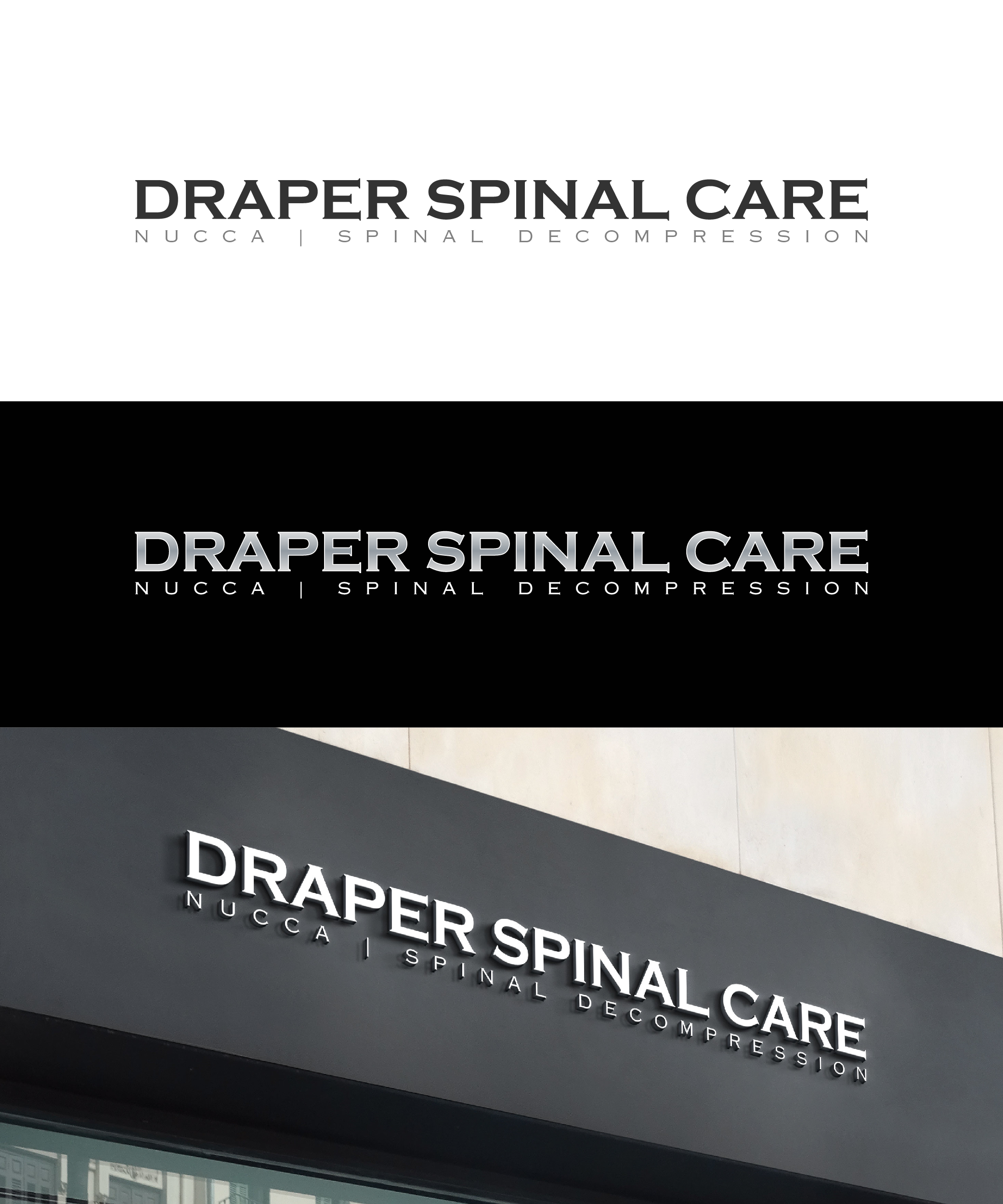
This customer received 386 logo designs from 135 designers. They chose this logo design from idea2Design as the winning design.
Join for free Find Design Jobs- Guaranteed
-
 US$400
-
 386 designs
-
 135 designers
Logo Design Brief
WHAT IS IMPORTANT IS HOW THE WORDS ARE STRUCTURED ON THE LOGO, lines can be used along with text, and The words "Spinal Care" should be emphasized. "NUCCA | Spinal Decompression" should appear together. Size differences, font differences, how many lines, etc, focusing on black silver and gray. So I want a logo that portrays technical excellence. I need the right font in black and silver coloring and maybe dark blue highlights. I am now an expert in my field, I'm not a novice any longer. I am trying to attract affluent business people that need help with their spines, so with my logo -I want to reflect professionalism, preciseness and excellence. I need the right font that conveys my purpose of technical excellence in caring for the spine.
Target Market(s)
People looking for an expert to fix their neck\back problems
Industry/Entity Type
Spinal Care/Decompression/Spinal corrections
Logo Text
Draper Spinal Care NUCCA | Spinal Decompression
Logo styles of interest
Wordmark Logo
Word or name based logo (text only)
Font styles to use
Other font styles liked:
- Copperplate gothic 32AB, humanist 521,
Colors
Colors selected by the customer to be used in the logo design:
Look and feel
Each slider illustrates characteristics of the customer's brand and the style your logo design should communicate.
Elegant
Bold
Playful
Serious
Traditional
Modern
Personable
Professional
Feminine
Masculine
Colorful
Conservative
Economical
Upmarket
Requirements
Must have
- Black and Silver colors with Dark Blue accents
Nice to have
- Mainly Black and silver
Should not have
- an icon