Cover design brief for the “Power at our service” collection
Want to win a job like this?
This customer received 32 book cover designs from 3 designers. They chose this book cover design from Amitaniya as the winning design.
Join for free Find Design Jobs- Guaranteed
-
 €90
€90
-
 32 designs
-
 3 designers
Book Cover Design Brief
This collection aims to publish articles by several authors who are practitioners specializing in sociocracy, a participatory mode of governance that is highly innovative, and even quite subversive of the autocratic way in which companies and public institutions operate. However, this method has been widely and increasingly implemented since its initial development in the Netherlands in the 1970s and 80s. It is currently of particular interest to non-profit and cooperative organizations, citizen projects and intentional communities, as well as IT work teams (due to its proximity to the spirit of Agile methods).
The content is intellectually demanding. It won't be a matter of popularization for promotional purposes, but rather of subjects for reflection or in-depth analysis of practices, and feedback from field experience. Nor is it an academic journal.
The language used for these publications is French.
The target audience is French-speaking Europe and Canada.
Target Market(s)
The collection is aimed both at other practitioners of this method who want to develop their knowledge, and at people interested in the subjects of collective intelligence, cooperation and organization, in response to social, ecological and/or political concerns.
Industry/Entity Type
Training and consultancy
Font styles to use
Look and feel
Each slider illustrates characteristics of the customer's brand and the style your logo design should communicate.
Elegant
Bold
Playful
Serious
Traditional
Modern
Personable
Professional
Feminine
Masculine
Colorful
Conservative
Economical
Upmarket
Requirements
Must have
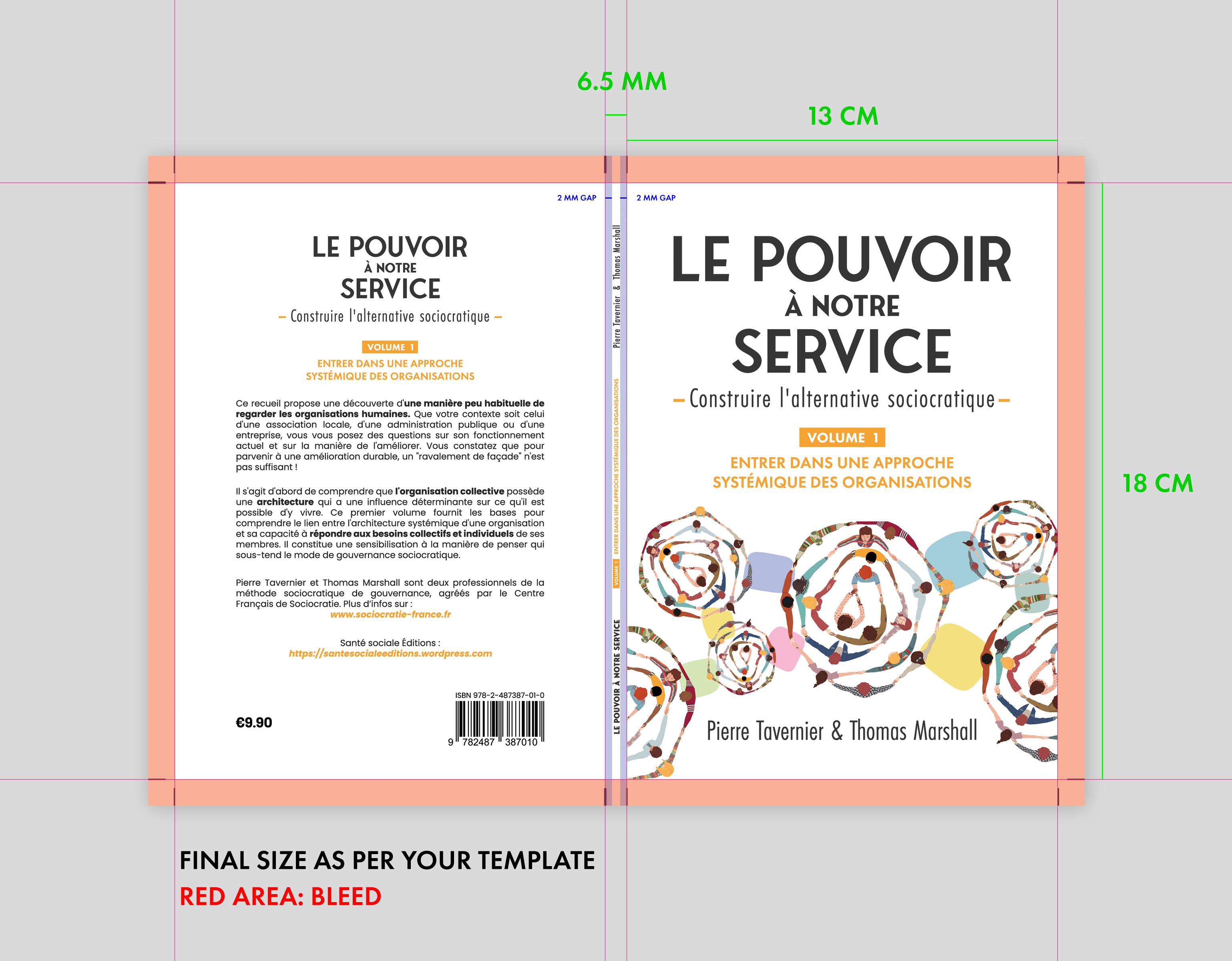
- The name of the collection: Power at our service - Building the sociocratic alternative Each volume will mention the name of the collection as well as the theme of the volume. First one: Volume 1 - Entering a systemic approach to organizations. Selection criteria: - A singular, recurring visual identity for the volumes in the collection, highlighting its theme. - Appeal to potential readers; arouse curiosity. - Good readability of the text (title and subtitle, authors; presentation on back cover). - Simplicity of design variation for the cover of subsequent volumes (changing only the text). - Reasonable price in relation to a hoped-for circulation of between 100 and 300 copies per volume (the theme is linked to a niche that is still fairly narrow in the French-speaking world).
Nice to have
- Suggested graphic design directions If you have another direction to suggest with convincing arguments, we're open to your proposal. - The name of the collection, and in particular "Power at our service", will be visible at first glance. - The overall visual impression is one of movement and dynamism. - The style will be based on illustration work, such as sketchnotes. - The tone is playful and humorous. For example, it may mirror back to the potential reader the cultural clichés and social norms about power that make the theme "power at our service" a challenge to his or her imagination. As stated in the preface to Volume 1: "Most people are used to social environments where the choice is limited to suffering or fighting against powers that seek in a multitude of ways to put us at their service..."