VORT-X Sand Trial Infographic Update
Want to win a job like this?
This customer received 17 infographic designs from 5 designers. They chose this infographic design from JanuXart as the winning design.
Join for free Find Design Jobs-
 US$100
-
 17 designs
-
 5 designers
Infographic Design Brief
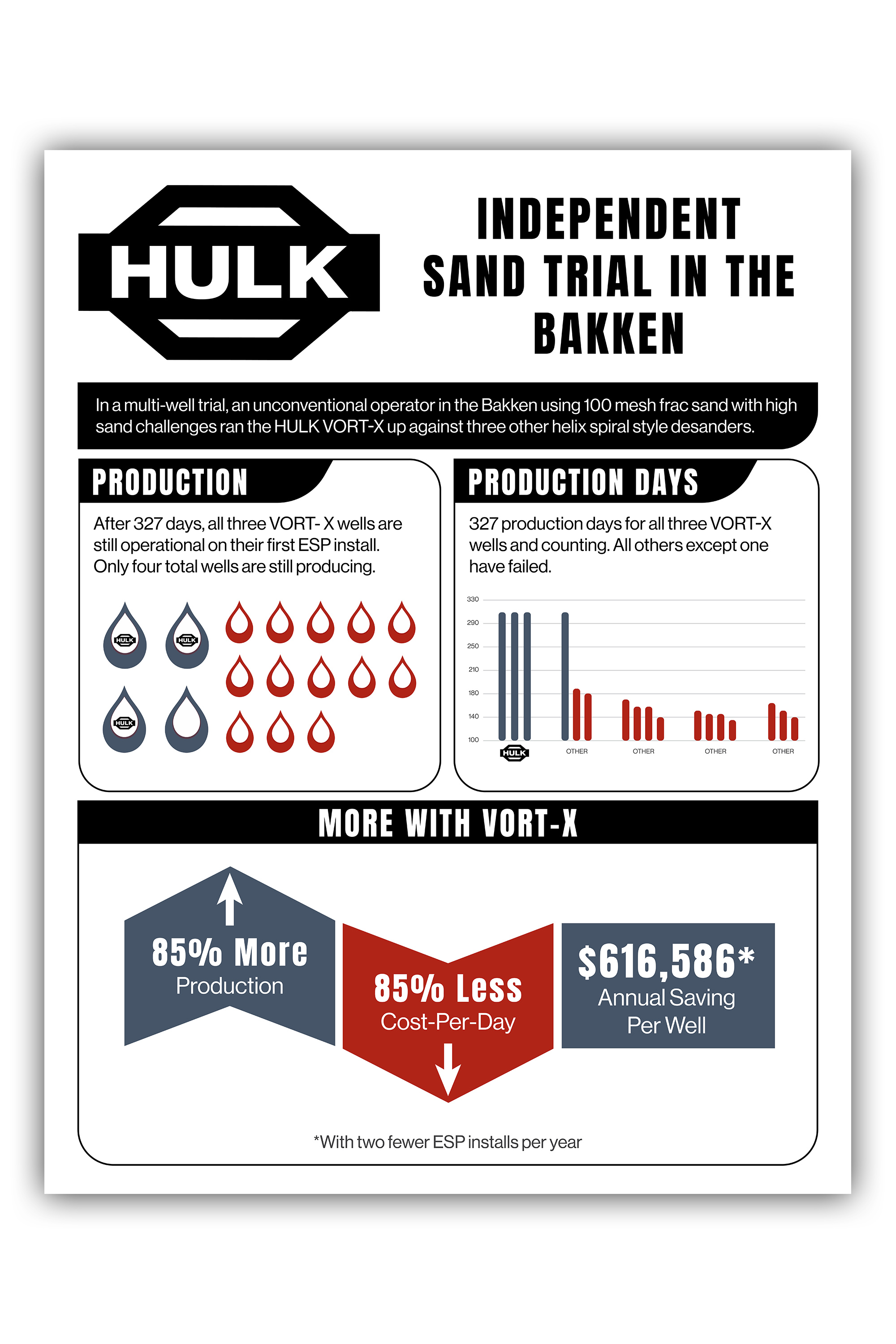
Make this infographic better, more slick, more interesting.
Basically our product has performed 85% better than our competition and we need to show that in a striking way. I have tried, but I do not think it is very successful.
I need to be able to change the information in the file as it gets updated.
Top box is the trial information. This info is evergreen.
Center left says that all 3 VORT-X wells are still producing oil (along with one other product we do not want to name. Let's change the number of days to 327.
Center right is the same data, just showing the performance of all 17 wells. All the numbers are arbitrary except the HULK, but the average is 166 days, so most of the wells stopped performing after that many days, or a few more. But HULK (and the one other) should look like it way over performed (85%+) better than the others.
Bottom is the most important data. It is self explanatory. Let's definitely highlight the annual savings.