Help Design the Packaging for our Nicotine Replacement Therapy
Want to win a job like this?
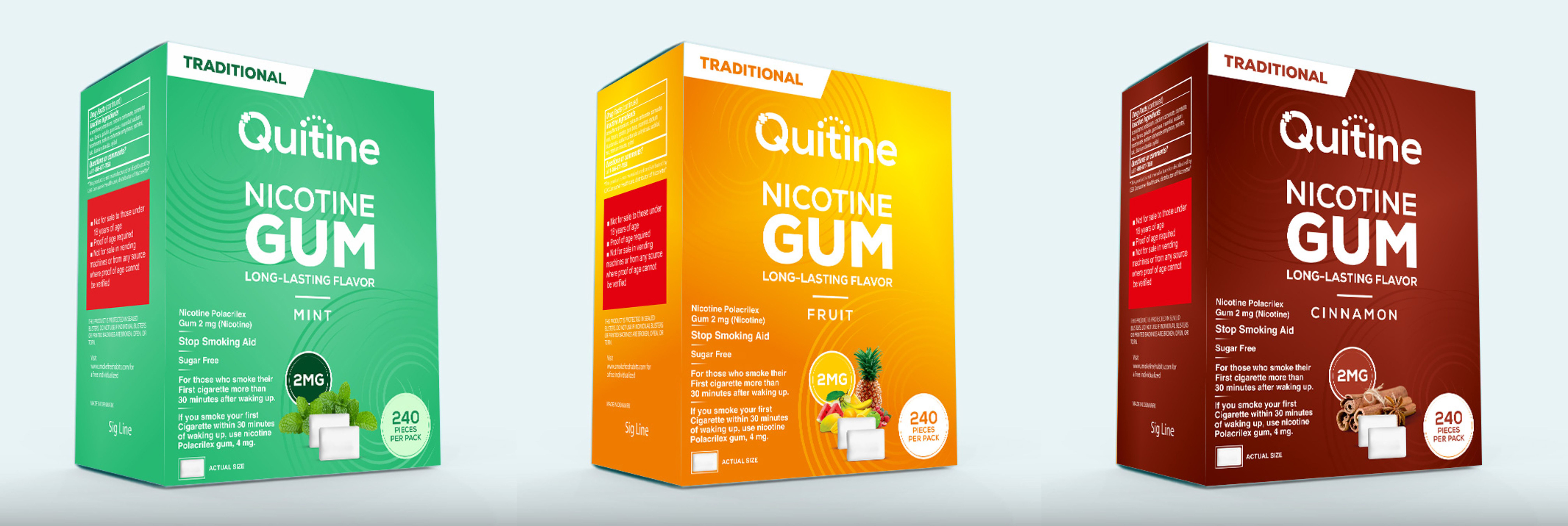
This customer received 78 packaging designs from 16 designers. They chose this packaging design from SAMPA DUARI as the winning design.
Join for free Find Design Jobs-
 US$390
-
 78 designs
-
 16 designers
Packaging Design Brief
Packaging Design Brief for Quitine
We are using this contest to find a designer who can design the packaging for the full line of products listed below for our new brand. This contest will require you to provide designs for the Traditional mint in both the 2mg and 4mg, and the Traditional Cinnamon 2 mg and 4mg, plus the mint in the Modern, 2mg and 4mg. We would like to see how you propose to tie the designs together so their is clear differentiate between the products and flavors, yet it maintains brand cohesiveness.
We would like to then work with the contest winner on a 1-1 project to develop the packaging for the remaining products.
Project Overview:
Quitine is launching a new line of nicotine replacement therapy (NRT) products, including gum and lozenges in multiple flavors and strengths. The packaging design needs to reflect Quitine’s brand values of trust, warmth, professionalism, and customer-centricity while being visually appealing, functional, and easily distinguishable.
Here is our full product line up so you can design product packaging that has the potential to expand as we add more flavors.
Product Line-Up:
1. Nicotine Gum ("Traditional" because it tastes and feels like wrigley's gum):
- Flavors: Mint, Fruit, Cinnamon
- Strengths: 2mg, 4mg
- Pack Size: 240 pieces per pack
2. Nicotine Gum (Stiffer, Playdough-Like Texture will be called "Classic"):
- Flavors: Mint, Fruit, Cinnamon
- Strengths: 2mg, 4mg
- Pack Size: 240 pieces per pack
3. Nicotine Lozenges:
- Flavors: Mint, Citrus, Berry
- Strengths: 2mg, 4mg
- Pack Size: 120 pieces per pack
Design Objectives:
1. Brand Consistency:
- The Quitine logo should be easily recognizable across all packaging.
- The design should reflect the brand’s personality: trustworthy, professional, warm, and approachable.
- Packaging should evoke a sense of reliability and comfort, appealing to a mature audience.
2. Differentiation:
- Flavor Differentiation:
- Use distinct colors for each flavor to ensure they are easily distinguishable.
- Incorporate icons or images that represent the flavor (e.g., mint leaves for Mint, cinnamon sticks for Cinnamon).
- Strength Differentiation:
- Clearly display the nicotine strength (2mg or 4mg) in a way that stands out at a glance.
- Gum Texture Differentiation:
- Create a visual distinction between the traditional chewing gum and the stiffer, playdough-like gum while maintaining a cohesive brand look.
- Consider using different background textures, patterns, or additional design elements to indicate the different textures while ensuring they still feel part of the same family.
3. Product Type Differentiation:
- Gum vs. Lozenges:
- The lozenges should be visually distinct from the gum products while still fitting within the overall Quitine brand aesthetic.
- Consider using a different shape or design element on the lozenge packaging (e.g., a lozenge icon or a unique pattern) to differentiate them from the gum.
- Maintain consistent use of colors for flavors across both gum and lozenge packaging (e.g., Mint gum and Mint lozenges should share the same color scheme) to unify the product line.
4. Scalability:
- The design should be flexible enough to accommodate additional flavors or product variations in the future.
- Ensure that any new flavor or product type can be easily integrated into the existing design template.
Content Requirements:
1. Front of Pack:
- Quitine logo
- Flavor name and representative image
- Nicotine strength (2mg or 4mg)
- Indication of gum type (Traditional or Stiffer texture)
- Pack size (e.g., "240 Pieces")
2. Here are the die lines from the manufacturer. You will see that there are certain things that must be included on the gum packaging:
https://drive.google.com/drive/folders/1wcs49Zl_K3u39DhEUcoh9-TSkp5FtZ6O?usp=drive_link
Overall Feel:
- The packaging should communicate that Quitine is a trustworthy, professional brand with a warm, supportive approach. It should feel modern and appeal to a broad audience both male and female.
Packaging design for all SKUs listed above, with clear differentiation between flavors, strengths, and product types.
Here is the link to the quitine logo. https://drive.google.com/file/d/1-NKlgKFftt668FjqfinczM5c7xIDEP2D/view?usp=sharing We are not opposed to the color of the dots and + sign changing to signify flavor either.
Target Market(s)
individuals 18-55+ looking to quit vaping and smoking
Industry/Entity Type
nicotine replacement therapy
Font styles to use
Other font styles liked:
- should compliment and look good with our logo and font which is Nexa bold
Look and feel
Each slider illustrates characteristics of the customer's brand and the style your logo design should communicate.
Elegant
Bold
Playful
Serious
Traditional
Modern
Personable
Professional
Feminine
Masculine
Colorful
Conservative
Economical
Upmarket
Requirements
Must have
- we want to look professional and trustworthy. . .and we want a design that is cohesive across the product set and can expand and stay on brand with additional flavors.
Nice to have
- We will pick a winner and then pay that winner to do the rest of the package designs for each sku and lozenges too.