Brochure Development Brief for Payment Solutions and EPOS Offerings
Want to win a job like this?
This customer received 48 brochure designs from 10 designers. They chose this brochure design from Fine Graphics House as the winning design.
Join for free Find Design Jobs- Guaranteed
-
 £130
£130
-
 48 designs
-
 10 designers
Brochure Design Brief
Update: Hi, All! All designers are making a mistake with the inner pages. These two pages should depict one complete restaurant from beginning to end, with the counter, dining area, and kitchen areas clearly visible. We DO NOT want to see these sections separately; they need to be shown in a single view like a live restaurant. Please do not use the images we provided. Draw your own.
Order and Collection area should be side by side with their own display boards (i.e. menu boards and collection boards, respectively)
Draw a small restaurant similar to McDonald's or Burger King that sells burgers, fries, and other items. Essentially, you are showcasing all our products in a restaurant setting. Please refer to the new brief I have shared for the two inner pages and revise them accordingly along with the pics. (Attached)
Some reference images:
https://ridge.co.uk/wp-content/uploads/2019/11/McDonalds-GalleryImage-06-scaled-1360x692.jpg
https://www.wrssystems.co.uk/wp-content/uploads/2023/12/Plymouth_Costa-Coffee_Touch-Screen-Ordering-1-768x829.png
Old brief:
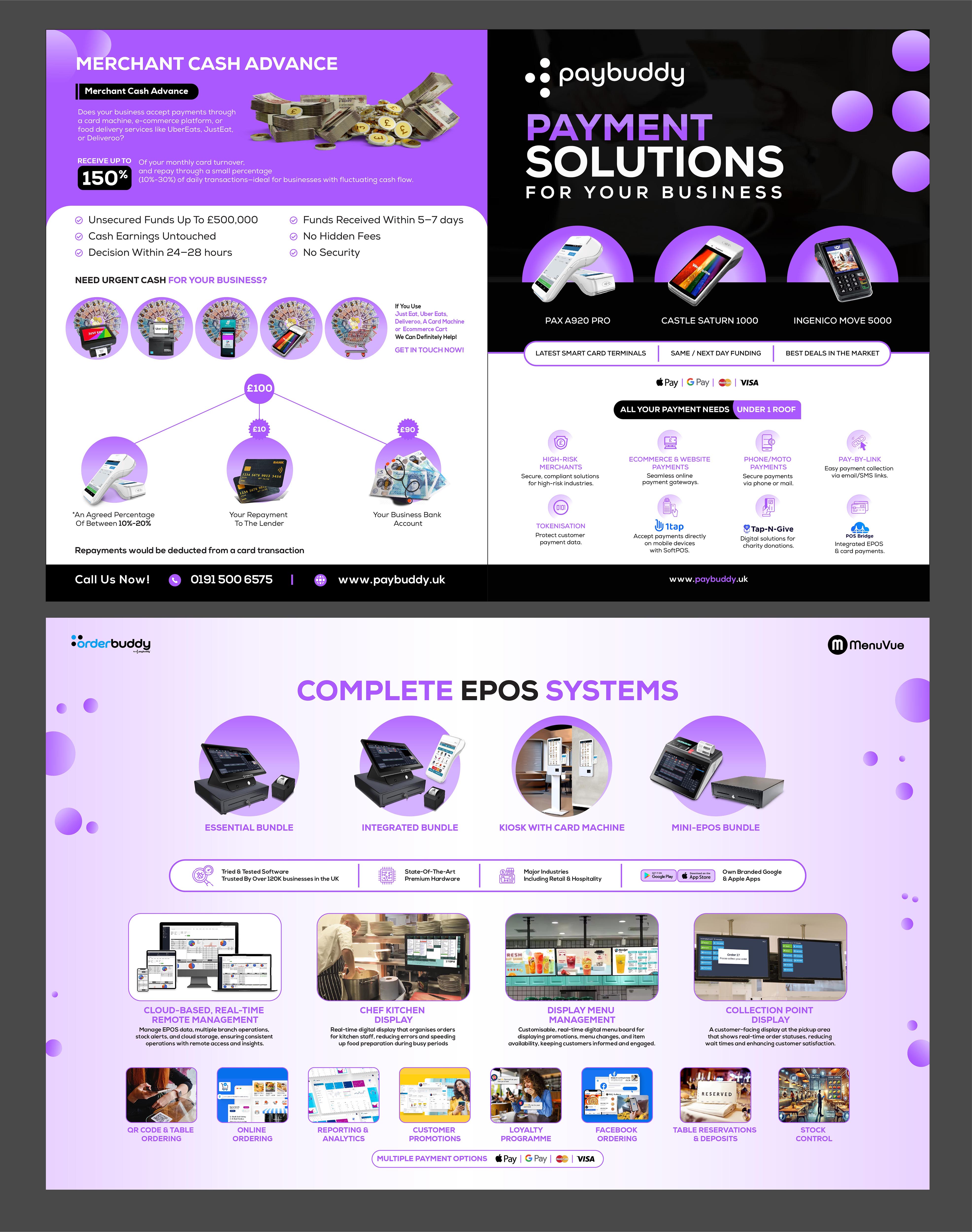
We want to create a comprehensive brochure of four pages (A4 size) for all our offerings.
Our brand colour is RGB (172, 89, 255). Use this as the main theme of the brochure and but try to keep the Paybuddy logo in black or white wherever possible
Page 1: This page will focus on our card machines and other payment solutions.
Pages 2 and 3: These pages will cover our EPOS and online ordering solutions, visually demonstrated through the layout of an actual restaurant. The design will encompass three areas: the counter with a bar, the dining area, and the kitchen and collection/delivery area.
Please see the link below for reference:
https://kuula.co/share/5gJft/collection/7cnlN?logo=1&info=1&fs=1&vr=0&sd=1&thumbs=1
Page 4: This page will be dedicated to our lending offering: Merchant Cash Advance.
Use the attached brief and artwork/collateral for reference.
Updates
Low design quality
Gathering more feedback
Hi, All! All designers are making mistakes with pages 2 and 3. We have updated the brief and shared 2 attachments. Kindly revise pages 2 and 3 accordingly.
Hi, all! There are. Everyone is making mistakes on page 2 and 3. These two pages should depict one complete restaurant from beginning to end, with the counter, dining area, and kitchen areas clearly visible. We do not want to see these sections separately; they need to be shown in a single view. Please do not use the images we provided. Draw your own. Order and Collection area should be side by side with their own display boards (i.e. menu boards and collection boards, respectively) Draw a small restaurant similar to McDonald's or Burger King that sells burgers, fries, and other items. Essentially, you are showcasing all our products in a restaurant setting. Kindly refer to the new brief along with the images. Here are also some reference images for you: https://ridge.co.uk/wp-content/uploads/2019/11/McDonalds-GalleryImage-06-scaled-1360x692.jpg https://www.wrssystems.co.uk/wp-content/uploads/2023/12/Plymouth_Costa-Coffee_Touch-Screen-Ordering-1-768x829.png
Hi everyone, I hope you’re all doing well! I want to bring to your attention that everyone is still making the same mistake on Pages 2 and 3. Please reread the brief. Here are some important points about the restaurant layout designs we’ve been working on: One Complete Layout: Ensure your drawings show one complete restaurant layout. Don’t separate the different areas into boxes. The two pages should come together as one cohesive design. Include All Areas: Make sure to incorporate the following important parts in your design: 1. Counter 2. Order area 3. Collection area 4. Dining area 5. Kitchen area (including a printer and kitchen display) 6. Pickup area Rear Display Screen Direction: Please paste the rear display screen onto the back display as mentioned in the brief. You don’t need to paste the front screen; instead, you can indicate it with an arrow in a separate box. Kiosk Menu: Don’t forget to paste the menu from the website I provided onto the kiosk. Double-Check Your Work: Before you submit, please read over your drafts to ensure everything is included and looks right. Thank you for your hard work! I’m excited to see your updated layouts! Please reread the brief
some changes needed
need some changes
editions needed
Gathering more feedback
Need extra days to review
Look and feel
Each slider illustrates characteristics of the customer's brand and the style your logo design should communicate.