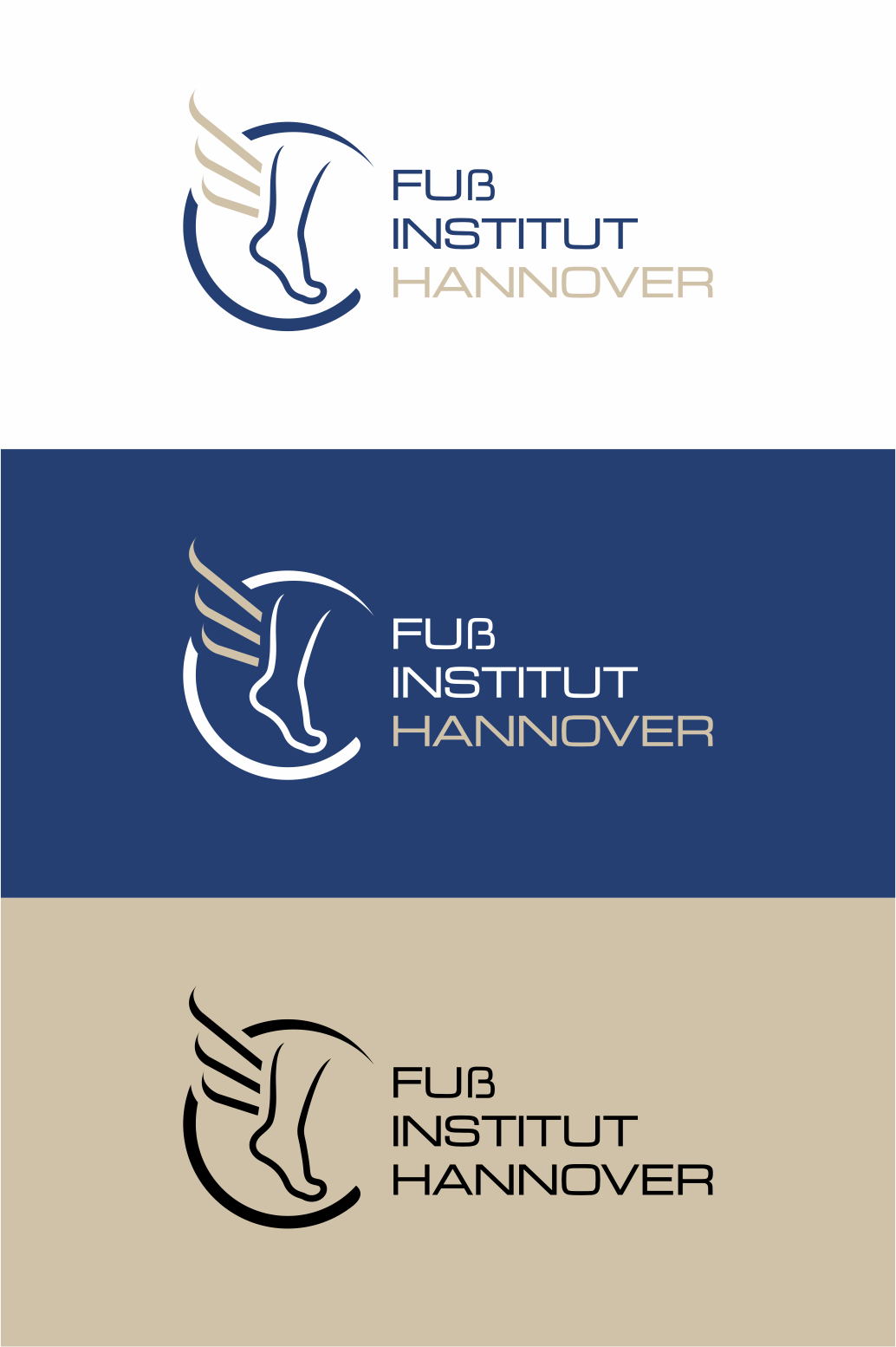
Logo for orthopedic practice with sub-logos for extremities
Want to win a job like this?
This customer received 111 logo designs from 31 designers. They chose this logo design from Sibyle as the winning design.
Join for free Find Design Jobs-
 €110
€110
-
 111 designs
-
 31 designers
Logo Design Brief
We would like to modernize our existing logo, get it in different formats, for print, web, etc. For this purpose, "sub-logos" are to be created in the same design concept on the topic of upper extremities (image of an arm), spine, lower extremities (image of a leg) and a foot. The basic design currently envisages a "little man" with wings, as an idea that the treatment makes you mobile again. For the foot, the basic idea would be a stylized Hermes foot. Primarily it should only be a graphic logo, if text can be easily integrated this would be: Orthopaedic Practice Nordstadt (abbreviation OPN) and Foot Institute Hanover.
The design should be modern and minimalist. The base color should be blue, the individual extremities could have different colors.
Target Market(s)
Patients for Orthopedic Practice
Logo Text
s.o.
Font styles to use
Colors
Colors selected by the customer to be used in the logo design:
Look and feel
Each slider illustrates characteristics of the customer's brand and the style your logo design should communicate.
Elegant
Bold
Playful
Serious
Traditional
Modern
Personable
Professional
Feminine
Masculine
Colorful
Conservative
Economical
Upmarket
Requirements
Must have
- recognition value, clarity