VeroVeri Logo Revision/Redesign
Want to win a job like this?
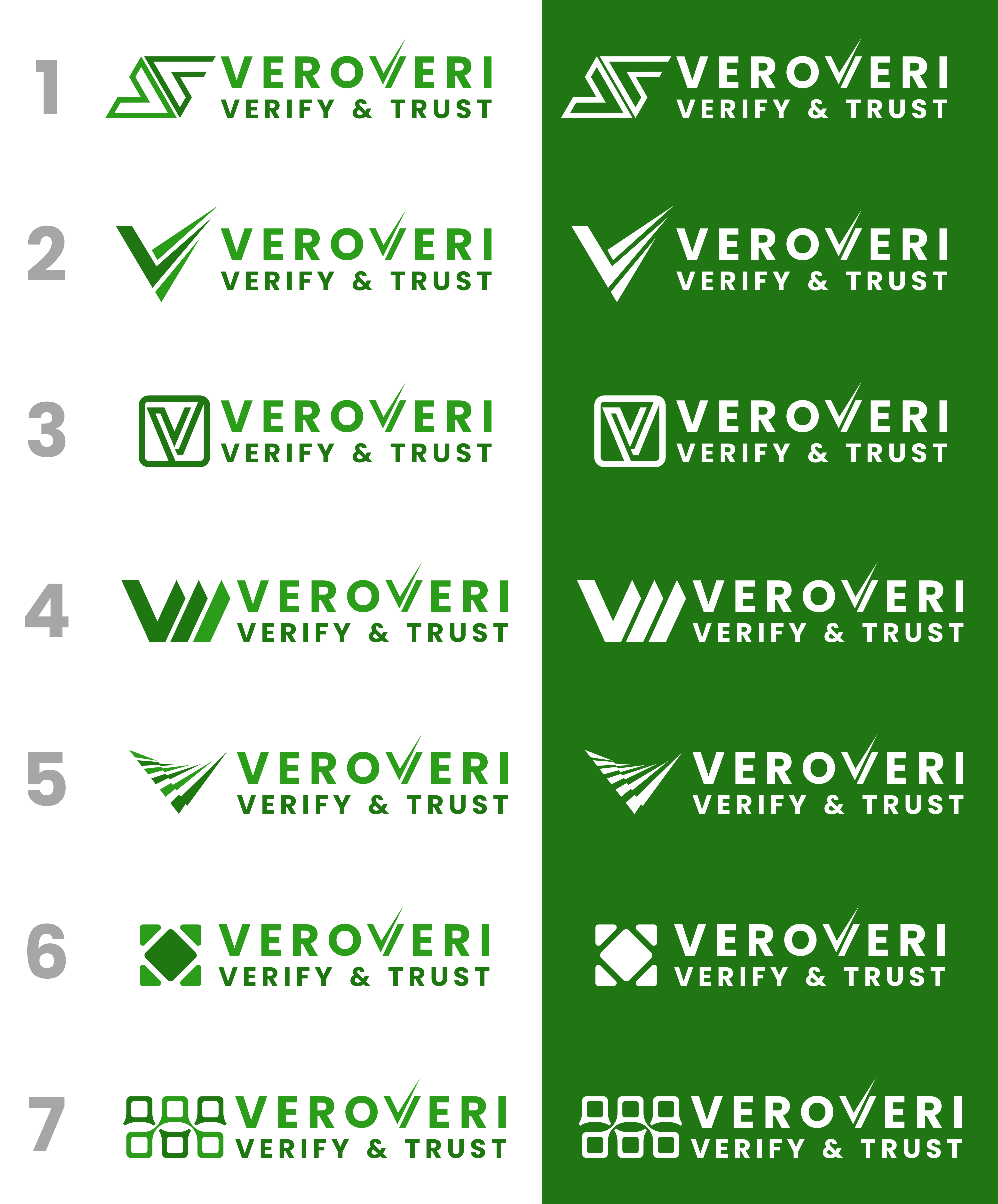
This customer received 14 logo designs from 3 designers. They chose this logo design from SOE DSGN as the winning design.
Join for free Find Design Jobs- Guaranteed
-
 US$110
-
 14 designs
-
 3 designers
Logo Design Brief
The original logo (fulllogo_transparent_nobuffer.png) was designed with AI assistance using design.com. Although I like the style very much, it needs to be improved (or recreated entirely).
BRIEF:
VeroVeri is an information auditing service. We review a customer's (commercial enterprise, no media, maybe government) digital content - usually web content - and provide a reliability grade and certification - the higher the grade, the more reliable and trustworthy the content. As such, I modified one of the Vs to a checkmark/tick-like shape (see revised VV logo... files attached).
In an effort to make it a little more visually interesting, I added the lines above the e and o this also serves to reinforce the pronunciation - a long e (vee) and a long o (roh) in Vero, as opposed to the short e sound in V(eh)ri.
The files with names ending in chks have a light green checksum on the right of the logo. The idea here was to make it a little more appealing to a tech audience... this can remain or not, your decision.
Target Market(s)
The target markets are mid to large commercial businesses.
Industry/Entity Type
technology, financial services (banking, insurance, etc.), pharmaceuticals, retail, manufacturing
Logo Text
VeroVeri | Verify & Trust
Logo styles of interest
Emblem Logo
Logo enclosed in a shape
Pictorial/Combination Logo
A real-world object (optional text)
Abstract Logo
Conceptual / symbolic (optional text)
Font styles to use
Colors
Colors selected by the customer to be used in the logo design:
Look and feel
Each slider illustrates characteristics of the customer's brand and the style your logo design should communicate.
Elegant
Bold
Playful
Serious
Traditional
Modern
Personable
Professional
Feminine
Masculine
Colorful
Conservative
Economical
Upmarket
Requirements
Must have
- The logo should be flat (no shadowing) and must be suitable for use in a certification badge graphic. The design should be able to stand alone in mono (just white or just black).
Nice to have
- I would like the flexibility to structure the graphic part of the logo to the side of the test AND above the text.